RibbonControlStyle Enum
Enumerates paint styles for a RibbonControl.
Namespace: DevExpress.XtraBars.Ribbon
Assembly: DevExpress.XtraBars.v26.1.dll
Declaration
Members
| Name | Description |
|---|---|
Default
|
The same as the RibbonControlStyle.Office2013 option. See Version Compatibility: Default Property Values. |
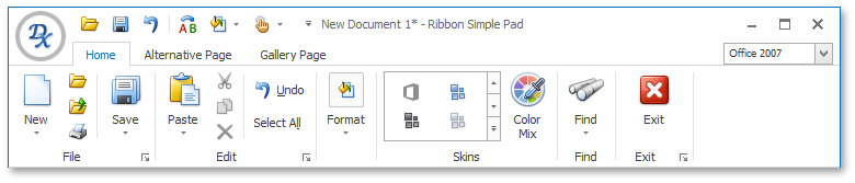
Office2007
|
The Office2007 style. The following image shows this style with the Office 2007 Blue skin:
|
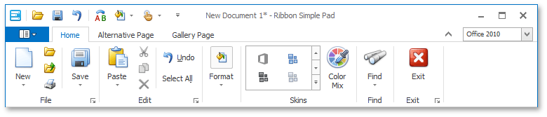
Office2010
|
The Office2010 style. The following image shows this style with the Office 2010 Blue skin:
|
Office2013
|
Emulates the Microsoft Office 2013 UI and its behavior, which includes a modified BackstageViewControl, a Full-Screen Mode button, and touch-input device mode support. The following image shows this style with the Office 2013 skin:
|
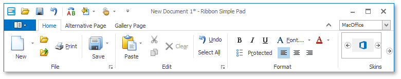
MacOffice
|
The MacOffice style. The following image shows this style with the Office 2010 Blue skin:
To display the Application Button in the MacOffice style, ensure that the RibbonControl.ShowApplicationButton property is set to True. |
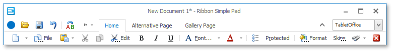
TabletOffice
|
The Ribbon style inspired by the UI found in Microsoft Office for iPad. The following image shows this style with the Office 2013 skin:
|
TabletOfficeEx
|
Obsolete. This value is obsolete, use the OfficeUniversal style instead. |
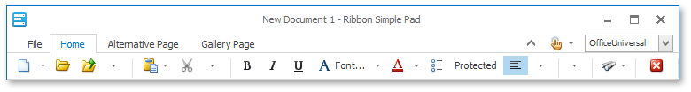
OfficeUniversal
|
The Ribbon style inspired by the Ribbon UI introduced in Microsoft “Office Universal” apps. The following image shows this style with the Office 2013 skin:
|
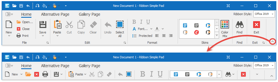
Office2019
|
The Office 2019-inspired style. It features a flat appearance, tab animations (when the “Office 2019 Colorful”, “Office 2019 Black”, “Office 2019 White”, or “Office 2019 Dark Gray” vector skin is applied), and the capability to collapse into a single-row (the “Simplified” state). The following image shows this style with the Office 2019 Colorful skin:
|
Office365
|
The Office 365 style. The following image shows this style with the WXI skin:
|


Remarks
You can customize a RibbonControl‘s paint style via the RibbonControl.RibbonStyle property.