BackstageView Control
- 4 minutes to read
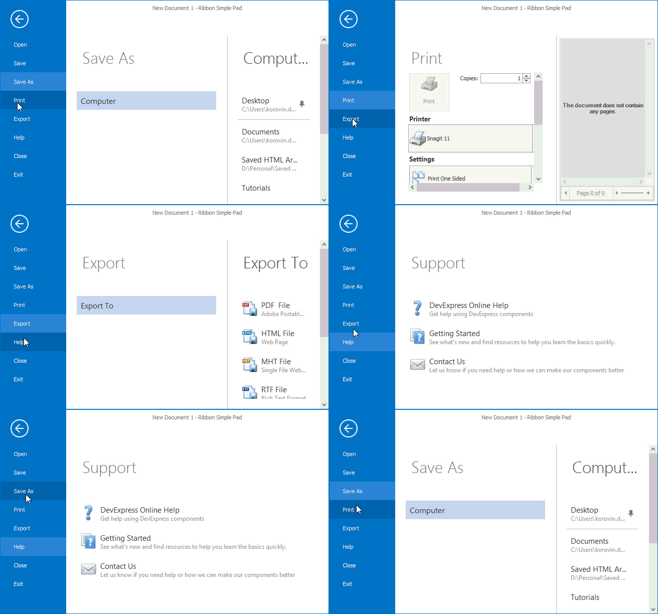
The BackstageViewControl emulates the main application menu in Ribbon-based Office 2010 (and newer) applications. You can also use the Backstage View separately from a RibbonControl to implement a multi-level navigation control.
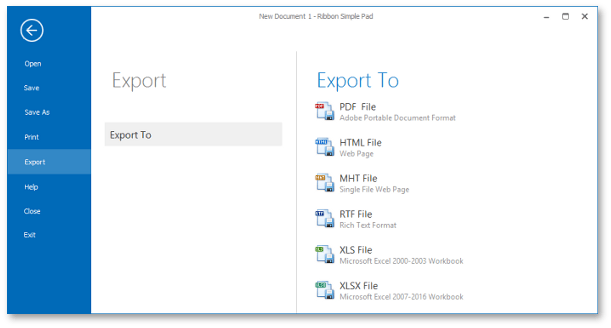
The Backstage View supports DirectX Hardware Acceleration to ensure smoother and memory-efficient animations, especially on high-resolution displays. You can enable DirectX in the Project Settings.
Create a Backstage View
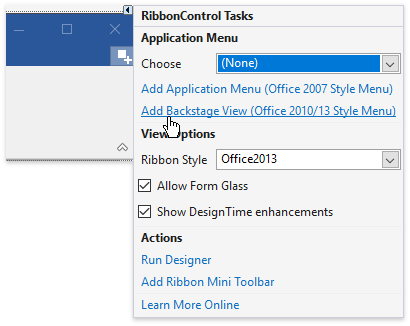
In a Ribbon’s smart tag menu, click Add Backstage View to create a Backstage View and associate it with the Ribbon.
You can also drop the BackstageViewControl item from Visual Studio’s Toolbox window (the Navigation & Layout section) onto your form and assign it to the RibbonControl.ApplicationButtonDropDownControl property.
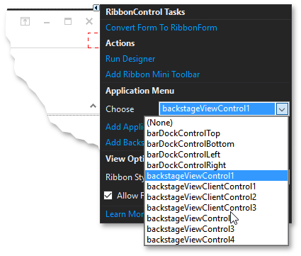
To hide/display the Backstage View at design time, use the Hide in DesignTime / Show BackStageView commands in the smart tag menu.
Backstage View Styles
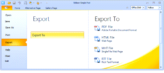
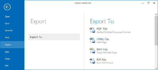
A Backstage View synchronizes its style with the parent Ribbon’s style. It supports the Office 2010 and Office 2013 styles.
The table below compares styles.
Office 2010 | Office 2013 | |
|---|---|---|
Related Ribbon styles | ||
Size and position | Leaves the Quick Access Toolbar and page headers visible. | Covers the entire parent form. |
Back button | No | Yes |
Additional Features | The Image and ShowImage properties — allow you to modify or remove the background image displayed at the Backstage View’s bottom right corner. | The BackstageViewShowRibbonItems property — specifies whether to display the Ribbon’s buttons and page header items when the Backstage View is open. This feature requires any Office 2013 DevExpress Skin. The Office2013StyleOptions property — specifies animation and offset settings of a Backstage View. |
To obtain or set a Backstage View’s style in code, use the Style property.
Regions and Items in a Backstage View
A Backstage View consists of the main region on the left and a content region on the right. You can display the following items in the main region:
- BackstageViewButtonItem — a push button that invokes a command when clicked.
- BackstageViewTabItem — a Tab that displays an associated control in the content region.
- BackstageViewItemSeparator — a line that delimits neighboring items.
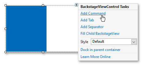
To populate a Backstage View with items at design time, use corresponding commands in the smart tag menu.
In code, you can modify the BackstageViewControl.Items collection.
BackstageViewButtonItem button1 = new BackstageViewButtonItem() {
    Caption = "Save",
    Glyph = DevExpress.Images.ImageResourceCache.Default.GetImage("office2013/save/save_32x32.png")
};
BackstageViewTabItem tab1 = new BackstageViewTabItem() {
    Caption = "Save As...",
    Glyph = DevExpress.Images.ImageResourceCache.Default.GetImage("office2013/save/saveas_32x32.png")
};
backstageViewControl1.Items.Add(button1);
backstageViewControl1.Items.Add(tab1);
backstageViewControl1.Items.Insert(1, new BackstageViewItemSeparator());
Alignment of Items
Use the Alignment property to align an item to the top or bottom of the Backstage View.
optionsBackstageViewItem.Alignment = DevExpress.XtraBars.Ribbon.BackstageViewItemAlignment.Bottom;
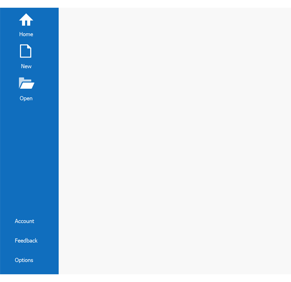
Tabs
Drop one of the following controls from Visual Studio’s Toolbox window onto a Tab to specify its content:
A UserControl descendant — a custom control that contains any other controls: buttons, editors, labels, etc.
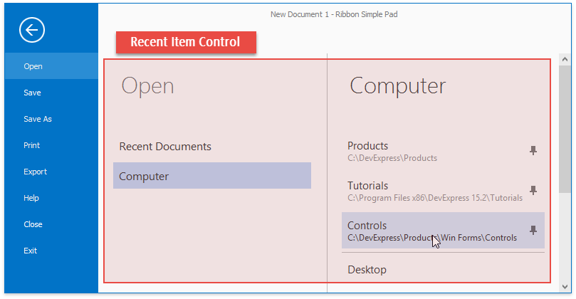
The RecentItemControl — a predefined control that contains specialized elements: regular and pin buttons, labels, hyperlinks, and so on. You can also use this control to create a complex 3-tier Backstage View. See the following help topic for more information: Recent Item Control.
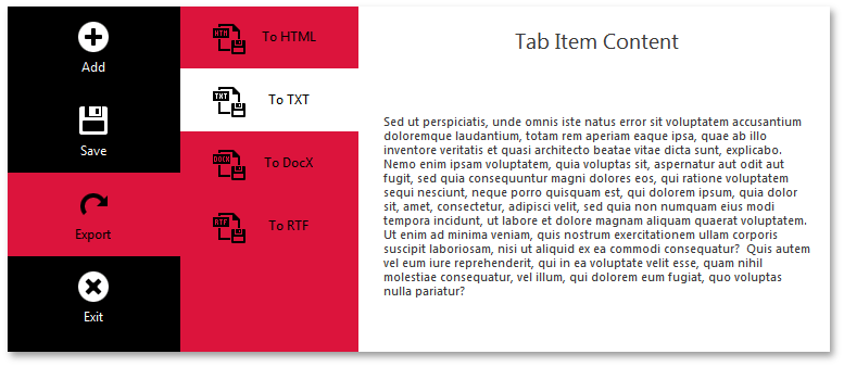
Another BackstageViewControl — use nested Backstage Views to create multi-level navigation menus. See the following help topic for more information: How to: Create a multi-level BackstageView Control.
Tip
You can also use nested Backstage Views as a side navigation control that is separate from the Ribbon.
BackstageViewTabItem uses BackstageViewClientControl to display content. A BackstageViewClientControl is automatically created when you add a Tab to a Backstage View at design time.
If you create a Backstage View in code, use the BackstageViewTabItem.ContentControl property to access the BackstageViewClientControl. To add a content to a Tab, use the BackstageViewClientControl‘s Controls property. The sample below adds a user control to a Tab.
