Custom Painting Scenarios
- 6 minutes to read
Custom draw events provide complete control over the appearance of grid elements. This document provides examples illustrating common scenarios for custom draw events. For basic information on custom painting in Grid Control, refer to the Custom Painting Basics topic.
Note
Custom painting and alpha blending features are not applied to the print and export versions of the Grid Control.
Note
In specific paint themes (e.g., skins and Office2003), you are not able to change the background of some elements. Changing the background of these elements via the Appearance parameter of custom draw events is also not supported.
There are three main scenarios for custom draw event usage.
- Manual Element Rendering
- Combining Default Painting and Custom Painting
- Customizing Element Display Information for Default Rendering
Manual Element Rendering
Custom draw events allow you to manually render grid elements using the methods provided by the event’s CustomDrawEventArgs.Cache and CustomDrawEventArgs.Appearance objects. These objects’ methods allow you to draw various graphics primitives (lines, rectangles, ellipses, images, etc.). When performing manual element rendering, you typically need to set the event’s CustomDrawEventArgs.Handled parameter to true. Otherwise, the default painting mechanism will be invoked after event execution, and it will override your rendering.
The following example demonstrates how to use the GridView.CustomDrawCell event to custom paint the RequiredDate column’s cells. If a cell refers to the current or following date, its background is filled with a gradient brush. If the cell contains a date that is greater than the current date, the cell will display the number of days left until the specified date. The appearance of the other cells is not affected.

using System.Drawing.Drawing2D;

private void gridView1_CustomDrawCell(object sender, DevExpress.XtraGrid.Views.Base.RowCellCustomDrawEventArgs e) {
    if (e.Column.FieldName != "RequiredDate") return;
    DateTime requiredDate = (DateTime)e.CellValue;
    if (requiredDate < DateTime.Today) return;
    //The text to display in the cell
    string displayText;
    if (requiredDate > DateTime.Today)
        displayText = ((TimeSpan)(requiredDate - DateTime.Today)).Days.ToString() + " day(s) left";
    else
        displayText = e.DisplayText;
    LinearGradientBrush brush = new LinearGradientBrush(e.Bounds, Color.Pink, Color.White, LinearGradientMode.ForwardDiagonal);
    using (brush) {
        e.Cache.FillRectangle(brush, e.Bounds);
    }
    e.Cache.DrawString(displayText, e.Appearance.Font, Brushes.Black, e.Bounds);
    //Prohibit default painting
    e.Handled = true;
}
Combining Default Painting and Custom Painting
The following scenario allows you to paint custom information over the default rendering. To accomplish this task, first invoke the default painting mechanism for an element using the CustomDrawEventArgs.DefaultDraw method. Then, you can paint additional information over the default rendering using the methods of the event’s CustomDrawEventArgs.Graphics and CustomDrawEventArgs.Appearance properties.
Before invoking the default painting mechanism, you can modify an element’s display information. The default rendering mechanism, when invoked, will apply these changes. For instance, you can modify the appearance of an element using the event’s CustomDrawEventArgs.Appearance property. Custom draw events for some elements (filter panel, band and column headers, view footer, group footer, group rows, preview section, row indicator and footer cells) provide the Info parameter, which contains element-specific view information. For these events, you can change the Info object’s properties to customize an element’s display text or change the boundaries of inner elements. If an event contains a DisplayText property, you can set it to a custom value before invoking the default rendering.
A call to the CustomDrawEventArgs.DefaultDraw method automatically sets the event’s Handled parameter to true. This prevents the default painting mechanism from being re-invoked after event execution.
Note that modifying the boundaries of elements or inner elements changes the View layout. If you need to change the boundaries of elements for the purpose of custom painting, you should restore the boundaries immediately after the default painting mechanism is invoked.
In the sample below, the GridView.CustomDrawCell event is handled to custom-paint data cells.
The CustomDrawEventArgs.DefaultDraw method applies the default draw to all cells. For all “Units in Stock” cells that display 0, a custom icon is drawn on top of this default cell rendering.
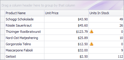
Image warningImage = Image.FromFile("c:\\warning.png");

private void gridView1_CustomDrawCell(object sender, DevExpress.XtraGrid.Views.Base.RowCellCustomDrawEventArgs e) {
    if (e.Column.FieldName == "UnitsInStock") {
        e.DefaultDraw();
        if (Convert.ToInt32(e.CellValue) == 0)
            e.Cache.DrawImage(warningImage, e.Bounds.Location);
    }
}
Customizing Element Display Information for Default Rendering
When handling a custom draw event, you can change an element’s view information (e.g., appearance or content) and set the event’s CustomDrawEventArgs.Handled property to false (the default value). In this case, the default rendering will automatically be invoked after the event execution. The painting mechanism will use the modified view information to render the element.
The following table describes custom draw events that allow you to customize an element’s display information.
Custom draw event | Allows you to … |
|---|---|
GridView.CustomDrawColumnHeader ColumnView.CustomDrawFilterPanel GridView.CustomDrawRowFooterCell GridView.CustomDrawRowIndicator |
|
|
CardView.CustomDrawCardFieldValue CardView.CustomDrawCardFieldCaption CardView.CustomDrawCardCaption LayoutView.CustomDrawCardCaption |
|
The following example demonstrates how to specify a custom background for footer cells using the GridView.CustomDrawFooterCell event. The default appearance settings specified by the View’s GridViewAppearances.FooterPanel property will be ignored.
The image below shows the result.

gridView1.PaintStyleName = "Flat";

private void gridView1_CustomDrawFooterCell(object sender, DevExpress.XtraGrid.Views.Grid.FooterCellCustomDrawEventArgs e) {
    if (e.Column.SummaryItem.SummaryType == DevExpress.Data.SummaryItemType.Count)
        e.Appearance.BackColor = Color.Pink;
    else {
        if (e.Column.SummaryItem.SummaryType == DevExpress.Data.SummaryItemType.Average)
            e.Appearance.BackColor = Color.Thistle;
        else
            e.Appearance.BackColor = Color.Moccasin;
    }
}