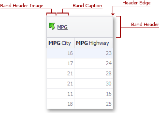
Band Header
- 2 minutes to read
The band header identifies a band in banded and Advanced Banded Grid Views. The end-user can move a band to another position or to the Customization Form by dragging its header. Dragging the header edge allows a user to change the band’s width.
Visible band headers are presented within the band panel. Hidden band headers are displayed within the Customization Form.

The table below lists the main properties affecting visual element appearance.
Appearance | The BandedViewAppearances.BandPanel property determines the default appearance settings applied to all band headers. The GridBand.AppearanceHeader property allows you to override the default style for individual bands. |
Custom Draw Event | |
Visibility | The BandedGridOptionsView.ShowBands property specifies whether the band panel is visible. The OptionsBand.ShowInCustomizationForm band option specifies whether hidden bands are displayed within the Customization Form. |
Text | |
Image | |
Height | GridBand.RowCount, BandedGridColumn.AutoFillDown, BandedGridView.BandPanelRowHeight, BandedGridView.MinBandPanelRowCount Banded and Advanced Banded Grid Views allow you to change the band header height and arrange band headers in several rows via the GridBand.RowCount property The GridBand.AutoFillDown property specifies whether or not a header should be automatically stretched vertically if there is an empty space below it. This has been provided because users can sometimes rearrange bands leaving an empty space within a band panel. Setting the GridBand.AutoFillDown property to true (the default) avoids this. The image below shows the relation between the GridBand.RowCount and GridBand.AutoFillDown properties.
|
Tooltips |
