Drop Marker
- 3 minutes to read
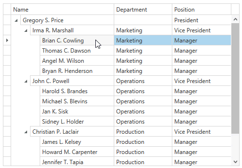
The GridControl shows a drop marker when dragging records over another record. The drop marker is a visual element that indicates a drop target element.
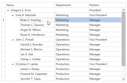
The images below show drag-and-drop operations. If you reorder records (the first image), the drop marker is shown before or after target element. If you move records to another child collection (the second image), the target element is highlighted.

Specifying Drop Position
You can set a drop position that specifies:
- How to place the drop marker concerning a target record.
- How to place the dragged record after dropping.
The DropPosition enumeration lists possible drop position values.
The image below shows a drag-and-drop operation that does not allow moving a node to another child collection; it means the DropPosition.Inside is not allowed:
Handle the DataViewBase.DragRecordOver event and specify the DragEventArgsBase.DropPosition property to set the required drop position. The following code sample demonstrates how to prohibit end-users from moving nodes to another node’s child collection:
<dxg:TreeListView AllowDragDrop="True" DragRecordOver="OnDragRecordOver" />
void OnDragRecordOver(object sender, DragRecordOverEventArgs e) {
   if(e.DropPosition == DropPosition.Inside) {
      e.DropPosition = e.DropPositionRelativeCoefficient > 0.5 ? DropPosition.After : DropPosition.Before;
      e.Handled = true;
   }
}
In the demonstrated code sample, the DragRecordOverEventArgs.DropPositionRelativeCoefficient property is used to determine the exact drop position.
Drop Marker Customization
You can customize the drop marker’s appearance. The image below shows an example of a custom drop marker:

Specify the DataViewBase.DropMarkerTemplate property to customize the drop marker’s appearance. This property defines the drop marker’s template. The binding source for this template is the DropMarkerData class.
The following code sample demonstrates how to change the drop marker’s color and size:
<dxg:TableView AllowDragDrop="True">
   <dxg:TableView.DropMarkerTemplate>
      <DataTemplate>
         <Grid Margin="0,-3,0,-3" IsHitTestVisible="False">
            <Border Height="6" Background="Orange" BorderBrush="Gray" BorderThickness="1"
               VerticalAlignment="{Binding Position, Converter={StaticResource dropPositionConverter}}" />
         </Grid>
      </DataTemplate>
   </dxg:TableView.DropMarkerTemplate>
</dxg:TableView>
public class DropPositionConverter : IValueConverter {
   public object Convert(object value, Type targetType, object parameter, CultureInfo culture) {
      return (DropPosition)value == DropPosition.Before ? VerticalAlignment.Top : VerticalAlignment.Bottom;
   }
   // ...
}
In the demonstrated code sample, the DropMarkerData.Position property is used to define how to place the drop marker.
Example: Customize Drop Marker
The following example customizes the drop marker: