Common Selection Features
- 2 minutes to read
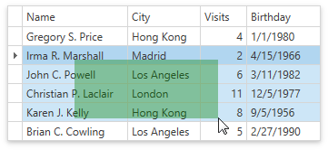
Selection Rectangle
The selection rectangle allows users to drag the mouse pointer over rows, cells, or cards to select a range of items.
To enable content selection, ensure that DataControlBase.SelectionMode and DataViewBase.NavigationStyle properties are set to Row or Cell.
To enable the selection rectangle, set the DataViewBase.ShowSelectionRectangle property to true.
You cannot use the selection rectangle when:
- The Drag-and-Drop feature is enabled.
- The DataControlBase.SelectionMode property is set to MultiSelectMode.MultipleRow.
- TableView.ShowCheckBoxSelectorColumn and TableView.RetainSelectionOnClickOutsideCheckBoxSelector properties are set to
true.
To modify selection rectangle appearance, use the DataViewBase.SelectionRectangleStyle property:
<dxg:TableView.SelectionRectangleStyle>
    <Style TargetType="Border">
        <Setter Property="Opacity" Value="0.37" />
        <Setter Property="Background" Value="Green" />
    </Style>
</dxg:TableView.SelectionRectangleStyle>
Selector Column
The GridControl allows users to select rows within the check box selector column (the “Web Style Row Selection” mode).
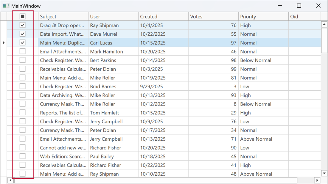
To display the check box selector column, enable the ShowCheckBoxSelectorColumn property and set the DataControlBase.SelectionMode property to Row or MultipleRow.
Use the CheckBoxSelectorColumnPosition property to specify the required check box selector column position. The CheckBoxSelectorColumnVisibleIndex property allows you to move the check box selector column (for any position, except Left and Right).
The following code sample displays the check box selector as the sixth column from the left border of the scrollable content area:
<Window
        xmlns="http://schemas.microsoft.com/winfx/2006/xaml/presentation"
        xmlns:x="http://schemas.microsoft.com/winfx/2006/xaml"
        xmlns:dxg="http://schemas.devexpress.com/winfx/2008/xaml/grid"
        x:Class="WpfApp41.MainWindow">
    <Grid>
        <dxg:GridControl ...
                         SelectionMode="MultipleRow">
            <dxg:GridControl.View>
                <dxg:TableView ShowCheckBoxSelectorInGroupRow="False"
                               ShowCheckBoxSelectorColumn="True"
                               CheckBoxSelectorColumnPosition="None"
                               CheckBoxSelectorColumnVisibleIndex="5"/>
            </dxg:GridControl.View>
        </dxg:GridControl>
    </Grid>
</Window>
The TableView.RetainSelectionOnClickOutsideCheckBoxSelector property specifies whether users can select rows only in the check box selector column.
The selector column FieldName is set to the CheckBoxSelectorColumnName field value. You can use this field to access the selector column in code.
Note
- You cannot sort, filter, and group data by the check box selector column.
- You cannot resize or drag & drop the check box selector column.
- When you set the TableView.RetainSelectionOnClickOutsideCheckBoxSelector property to
true, the Selection Rectangle is disabled.
Row and Cell Hover Effects
Set the TableView.HighlightItemOnHover / TreeListView.HighlightItemOnHover property to true to enable hover effects:
 = **Row** / **MultipleRow**](/WPF/images/highlight-rows.gif)
DataControlBase.SelectionMode = Row / MultipleRow
 = **Cell**](/WPF/images/highlight-cells.gif)
Selection Fade
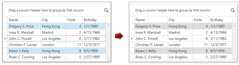
The GridControl fades selected rows when it loses focus.
To disable selection fading, set the DataViewBase.FadeSelectionOnLostFocus to false. This property does not affect the GridControl in multiple cell selection mode.