TdxCustomRibbon.Style Property
Specifies the Ribbon UI style.
#Declaration
property Style: TdxRibbonStyle read; write; default rs2007;#Property Value
| Type | Default | Description |
|---|---|---|
| Tdx |
rs2007 | The active Ribbon UI style. |
#Remarks
The Ribbon control allows you to create a UI that imitates the Ribbon UI found in different versions of Microsoft Office® products. Different Ribbon styles significantly change the Ribbon control’s appearance and behavior.
#Property Value Examples
- rsOffice365
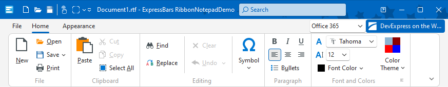
- rs2016Tablet
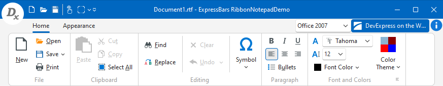
- rs2007 (default)
Refer to the TdxRibbonStyle type description for detailed information on all available options.
Tip
The Express
Refer to the Tdx
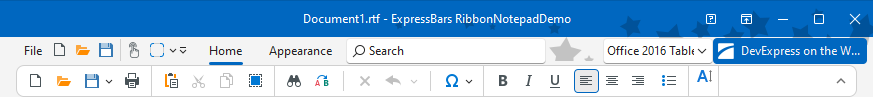
#UI Element Visibility in Compact Ribbon Layouts
The Ribbon control has a compact (simplified) layout when one of the following conditions is met:
- The
Styleproperty is set to rs2016Tablet. - The
Styleand Layout properties are set to rsOffice365 and TdxRibbonLayout.Simplified, respectively.
A compact Ribbon layout contains only one row of buttons and does not include multi-level drop-down menus. If a user activates a submenu, it appears in the same drop-down container.
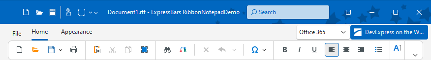
A compact Ribbon layout displays only those UI elements whose corresponding item links include ivlSmallIconWithText and ivlSmallIcon flags in the ViewLevels property value.
Tip
You can use a bar item’s Glyph property to load an icon to mark the bar item in a compact Ribbon layout.
#Ribbon UI Styles and the Application Icon
The Ribbon Form hides or displays the application icon depending on the Style property if the ShowFormIcon property is set to bDefault:
- rsOffice365 | rs2013 | rs2010
- The application icon is visible.
- rs2007 | rs2016 | rs2016Tablet | rs2019
- The application icon is hidden.
#Default Value
The Style property’s default value is rs2007.
Note
The Style property value is rsStyle property value.