List of Bar Item Types
- 4 minutes to read
This topic lists types of bar items that you can display in toolbars, menus, and Ribbon controls.
All available bar item types are implemented as TdxBarItem class descendants. The TcxBarEditItem class implements a special bar item container that allows you to embed editors from the ExpressEditors Library in the same manner as in other container controls, such as VCL Data Grid, Tree List, Vertical Grid, etc.
Bar Item | Bar Item Control | Description |
|---|---|
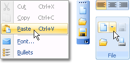
TdxBarButton | TdxBarButtonControl
| A toolbar button that allows you to create:
To define a button’s action, handle the OnClick event. A standard toolbar button can display large images if its LargeGlyph property is specified. |
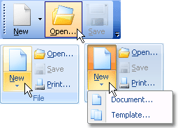
TdxBarLargeButton | TdxBarLargeButtonControl
| A large toolbar button that allows you to do the following in addition to the TdxBarButton functionality:
|
TcxBarEditItem | TcxBarEditItemControl
| A container for in-place editors from the ExpressEditors Library. Use the item’s PropertiesClass or PropertiesClassName property to specify the type of editor to display. These property descriptions list all available in-place editor types. |
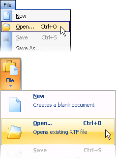
TdxBarSubItem | TdxBarSubItemControl
| A submenu (a subitem with nested toolbar items). In addition to settings that define subitem appearance in toolbars and menus, this submenu allows you to customize the following item appearance settings:
Refer to the following topic for details on submenu customization: Customizing Toolbar Items and Item Controls. |
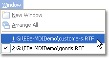
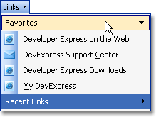
TdxBarListItem | TdxBarContainerItemControl
| A numbered string list that is useful when you need to list recently used files or active windows in an MDI application. Tip You can use the ShowNumbers property to hide or display list item numbering. |
TdxBarContainerItem | TdxBarContainerItemControl
| A submenu that can contain a different number of bar items. You can manage nested items in code. |
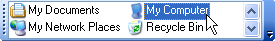
TdxBarStatic | TdxBarStaticControl
| A static text label that can execute required actions when clicked. To implement this functionality in your application, you need to set the label’s AllowClick property to |
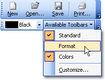
TdxBarToolbarsListItem | TdxBarToolbarsListItemControl
| A checked list of existing toolbars. A user can click a check box to hide or display the corresponding toolbar. The Quick Customization Popup Menu has similar functionality. Note This bar item type is not intended for use in the Ribbon control. |
TdxBarControlContainerItem | TdxBarControlContainerControl
| A container for external controls. Use the Control property to embed a control into a toolbar. Note Only controls that have no window handles can be placed into submenus. |
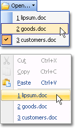
TdxBarMRUListItem | TdxBarContainerItemControl
| A list of most recently used (MRU) items (such as opened files and documents). Users can click a list item to execute the action associated with it. This bar item allows you to do the following:
|
TdxBarInplaceSubItem | TdxBarInPlaceSubItemControl
| An expandable item in a submenu. Unlike TdxBarSubItem, this bar item displays its content in a parent submenu. This bar item allows you to do the following:
|
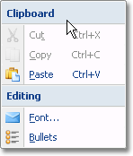
TdxBarSeparator | TdxBarSeparatorControl
| An item separator in context menus and submenus. You can use the ShowCaption property to hide or display the separator. |
TdxRibbonGalleryItem | TdxRibbonGalleryItemControl
| An in-Ribbon gallery. To populate the gallery, use the GalleryCategories property. To customize Ribbon gallery appearance, use the GalleryOptions property. |
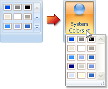
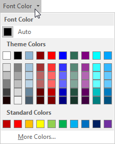
TdxRibbonColorGalleryItem | TdxBarContainerItemControl
| A bar item with advanced color selection functionality. Refer to the TdxRibbonColorGalleryItem class description for details. |