TdxRibbonStatusBar Class
A status bar component designed for the Ribbon UI.
Declaration
TdxRibbonStatusBar = class(
    TdxCustomStatusBar,
    IdxRibbonFormNonClientPart,
    IdxRibbonFormStatusBar,
    IdxSpecialAlignedControl
)
Remarks
Status bars are horizontal panels designed to display information on the current application state (the caret position in a document, key states, custom indicators, etc.). The TdxRibbonStatusBar component is designed to complement the Ribbon UI.
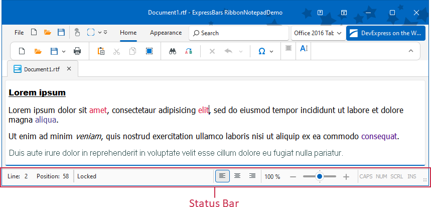
Status Bar Panels
Use the Panels property to manage panels. You can switch each panel between the following styles/usage scenarios:
- TdxStatusBarContainerPanelStyle
- A panel designed to embed a control (a TControl descendant instance).
- TdxStatusBarKeyboardStatePanelStyle
- Indicates Caps Lock, Num Lock, Scroll Lock, and Insert key states.
- TdxStatusBarStateIndicatorPanelStyle
- A panel that can display simple colored indicators.
- TdxStatusBarTextPanelStyle
- A text label panel.
- TdxStatusBarToolbarPanelStyle
- A Ribbon UI-specific panel designed to embed a toolbar.
Main API Members
The list below outlines key members of the TdxRibbonStatusBar class.
Appearance Settings
- BorderWidth
- Adjusts border width for the status bar.
- DefaultUseGlobalSkin
- Enables or disables synchronization with global skin and palette for all status bar controls in the application.
- Images
- Specifies the image source for UI icons.
- LookAndFeel
- Provides access to look & feel settings.
Content-Related and User Interaction Options
- OnHint
- Allows you to customize AutoHint mode behavior for text-based panels.
- Panels
- Provides access to the panel collection.
- Ribbon
- Allows you to associate the status bar with a TdxRibbon control.
- SimplePanelStyle
- Allows you to display a single text panel instead of all panels defined in the Panels collection.
- SizeGrip
- Specifies if the status bar displays a size grip.
Related Compiled Demo
To see the TdxRibbonStatusBar component in action, run the Ribbon Control demo in the VCL Control Center installed with compiled DevExpress VCL Demos.
Compiled DevExpress demos ship with source code installed in the Public Documents folder (%PUBLIC%) for all users (default). You can find all project and source code files for the Ribbon Control demo in the following folder:
%PUBLIC%\Documents\DevExpress VCL Demos\MegaDemos\Product Demos\ExpressBars\RibbonNotepadDemo\
Tip
Project and source code files for all compiled DevExpress VCL Demos are maintained in a public repository hosted on GitHub: