TdxStatusBar Class
A simple status bar.
Declaration
TdxStatusBar = class(
    TdxCustomStatusBar
)
Remarks
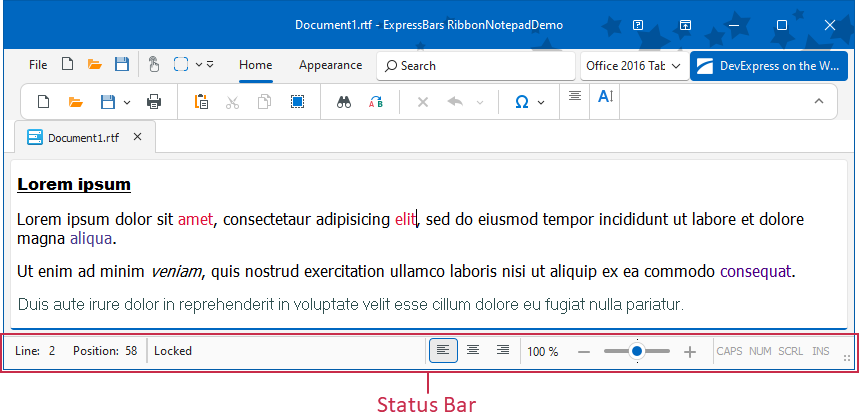
Status bars are horizontal panels designed to display information on the current application state (the caret position in a document, key states, custom indicators, etc.).
Main API Members
The list below outlines key members of the TdxStatusBar class. These members allow you to manage status bar panels and configure general appearance settings.
- BorderWidth
- Adjusts border width for the status bar.
- Color
- Specifies status bar color.
- DefaultUseGlobalSkin
- Enables or disables synchronization with global skin and palette for all status bar controls in the application.
- Images
- Specifies the image source for UI icons.
- LookAndFeel
- Provides access to look & feel settings.
- Panels
- Provides access to the panel collection.
- SizeGrip
- Specifies if the status bar displays a size grip.
Code Examples
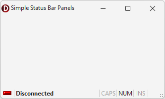
Create Three Status Bar Panels
The following code example creates indicator, text label, and keyboard status panels in a TdxStatusBar control:
uses
  dxStatusBar;  // Declares the TdxStatusBar control and related types
// ...

procedure TMyForm.FormCreate(Sender: TObject);
var
  ATextPanel, AIndicatorPanel, AKeyboardPanel: TdxStatusBarPanel;
  AIndicators: TdxStatusBarStateIndicators;
  AKeyboardPanelStyle: TdxStatusBarKeyboardStatePanelStyle;
begin
  dxStatusBar1.Panels.BeginUpdate;  // Initiates the following batch change
  try
    // Create and configure an indicator panel
    AIndicatorPanel := dxStatusBar1.Panels.Add;
    AIndicatorPanel.PanelStyleClass := TdxStatusBarStateIndicatorPanelStyle;
    AIndicators := TdxStatusBarStateIndicatorPanelStyle(AIndicatorPanel.PanelStyle).Indicators;
    AIndicators.Add.IndicatorType := sitRed;  // Creates a red indicator
    // Create and configure a text panel
    ATextPanel := dxStatusBar1.Panels.Add;
    ATextPanel.PanelStyleClass := TdxStatusBarTextPanelStyle;
    (ATextPanel.PanelStyle as TdxStatusBarTextPanelStyle).Font.Style := [fsBold];
    ATextPanel.Text := 'Disconnected';  // Defines a status message for the created text panel
    ATextPanel.Fixed := False;  // Disables panel width limitations
    // Create and configure a keyboard status panel
    AKeyboardPanel := dxStatusBar1.Panels.Add;
    AKeyboardPanel.PanelStyleClass := TdxStatusBarKeyboardStatePanelStyle;
    AKeyboardPanelStyle := AKeyboardPanel.PanelStyle as TdxStatusBarKeyboardStatePanelStyle;
    // Hide the scroll lock status
    AKeyboardPanelStyle.KeyboardStates := [dxksCapsLock, dxksNumLock, dxksInsert];
  finally
    dxStatusBar1.Panels.EndUpdate;  // Calls EndUpdate regardless of the batch operation's success
  end;
end;
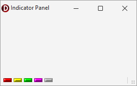
Create and Populate Indicator Panels
The following code example creates an indicator panel in an existing TdxStatusBarPanel component and populates the panel with five different indicators:
uses
  dxStatusBar;  // Declares the TdxStatusBarPanel component and all related types
// ...

var
  AIndicatorPanel: TdxStatusBarPanel;
  AIndicators: TdxStatusBarStateIndicators;
begin
  AIndicatorPanel := dxStatusBar1.Panels.Add;
  AIndicatorPanel.PanelStyleClass := TdxStatusBarStateIndicatorPanelStyle;
  AIndicators := (AIndicatorPanel.PanelStyle as TdxStatusBarStateIndicatorPanelStyle).Indicators;
  AIndicators.BeginUpdate;  // Initiates the following batch change
  try
    AIndicators.Add.IndicatorType := sitRed;
    AIndicators.Add.IndicatorType := sitYellow;
    AIndicators.Add.IndicatorType := sitGreen;
    AIndicators.Add.IndicatorType := sitPurple;
    AIndicators.Add.IndicatorType := sitOff;
  finally
    AIndicators.EndUpdate;  // Calls EndUpdate regardless of the batch operation's success
  end;
end;
Inheritance
See Also