TdxRibbon Class
A Ribbon control.
Declaration
TdxRibbon = class(
    TdxCustomRibbon
)
Remarks
The Ribbon control allows you to create a Ribbon UI inspired by Microsoft Office® applications. A Ribbon UI arranges user commands into tabs and tab groups that include UI elements with common and related functionality.

Ribbon Control and Ribbon Form
We recommend that you use the TdxRibbon control together with a form derived from the TdxRibbonForm class. A Ribbon form can integrate a TdxRibbon control into its caption bar as the main application UI and display additional UI elements and toolbars in non-client areas.
Ribbon-Based Application Template
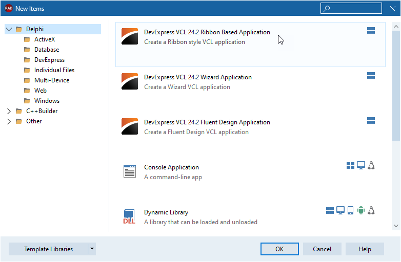
To create a new Ribbon-based application, click File | New → Other… in the main menu of your RAD Studio IDE and select the DevExpress VCL 25.2 Ribbon Based Application template in the New Items dialog.

Derive a Form from TdxRibbonForm in Code
To create a new Ribbon form in an existing application project, create a new form in the RAD Studio IDE, add the dxRibbonForm unit to the uses clause, and replace TForm with TdxRibbonForm in the form class declaration as follows:
uses dxRibbonForm;  // Declares the TdxRibbonForm class
// ...
type
  TMyForm = class(TdxRibbonForm)
  private
    { Private declarations }
  public
    { Public declarations }
  end;
Main API Members
The list below outlines key members of the TdxRibbon class. These members allow you to create and configure the Ribbon UI in your application.
General Ribbon UI Appearance Settings
- BackgroundImage
- Allows you to load and display a background image for the Ribbon tab area and Ribbon Form non-client areas (only for supported Ribbon styles).
- CapitalizeTabCaptions
- Specifies if Ribbon tab captions are capitalized like in Microsoft Office® 2013.
- ColorSchemeAccent | ColorSchemeName
Allows you to specify an individual skin and a Microsoft Office-inspired color accent[1] for the Ribbon UI.
Note
These settings automatically synchronize with a TdxSkinController component in the project to ensure consistent application appearance. You can set the UseGlobalSkin property to bFalse to explicitly disable global skin synchronization and use ColorSchemeName and ColorSchemeAccent properties to define a different appearance for your Ribbon UI.
- DefaultFormIconPlaceholderWidth
- Allows you to adjust the size of the area allocated for the application icon when it is hidden. This setting affects all Ribbon controls in the application.
- DefaultUseGlobalSkin
- Enables or disables synchronization with global skin and palette for all Ribbon controls in the application. The UseGlobalSkin property allows you to override this setting at the level of an individual Ribbon control.
- DocumentName
- Allows you to display the opened document’s name in the application title bar, similar to Microsoft Office® applications.
- EnableTabAero | SupportNonClientDrawing
- Allow you to decorate the parent form’s non-client areas.
- Fonts
- Provides access to font settings of all Ribbon UI elements.
- FormIconPlaceholderWidth
- Allows you to adjust the size of the area allocated for the application icon when it is hidden.
- OptionsFading
- Allows you to configure fading animation effects for Ribbon UI elements.
- ShowFormIcon
- Allows you to explicitly hide or display the application icon regardless of the selected Ribbon UI style.
- UseGlobalSkin
- Specifies if the Ribbon control synchronizes ColorSchemeName and ColorSchemeAccent properties with global skin and palette defined through a TdxSkinController component affect the current Ribbon control instance.
Ribbon UI Elements and Layout
- ApplicationButton | OnApplicationMenuClick
- Allow you to display and configure the Application button.
- CaptionAreaSearchToolbar | TabAreaToolbar | TabAreaSearchToolbar | QuickAccessToolbar
Allow you to configure docked toolbar containers in the Ribbon UI.
Note
The Style property value limits the availability of certain toolbar containers in the Ribbon UI.
- HelpButton | HelpButtonScreenTip | OnHelpButtonClick
- Allow you to display and configure the Help button in the Ribbon UI.
- Layout | Style
- Specify the active Ribbon UI style and layout. Different styles significantly affect Ribbon UI appearance and functionality.
- ShowMinimizeButton
- Specifies if the Ribbon minimization button is visible.
- ShowTabGroups | ShowTabHeaders
- Specify if Ribbon tab groups and headers are visible.
Ribbon UI Behavior Settings
- MinimizeOnTabDblClick
- Specifies if users can double-click a Ribbon tab to minimize the Ribbon UI.
- OnHideMinimizedByClick
- Allows you to execute additional actions when a user double-clicks a Ribbon tab to minimize the Ribbon UI.
- OnMinimizedChanged
- Allows you to respond to Ribbon UI collapse and expand operations.
Ribbon Tab Management
- ActiveTab
- Specifies the active Ribbon tab.
- OnTabChanged | OnTabChanging | OnTabGroupCollapsed | OnTabGroupExpanded
- Allow you to respond to Ribbon tab and tab group state changes.
- TabCount | VisibleTabCount
- Return the total number of tabs and the number of currently visible tabs in the Ribbon UI.
- Tabs | VisibleTabs
- Provide access to visible and hidden Ribbon UI tabs.
General-Purpose API Members
- BarManager
- Specifies the parent bar manager component.
- BeginUpdate | EndUpdate
- Allow you to avoid excessive redraw operations during batch appearance and behavior setting changes.
- Hidden
- Specifies if the Ribbon UI is hidden.
Inheritance
-
The ColorSchemeAccent property allows you to switch between Microsoft Office-inspired color accents when a built-in Ribbon skin is active and the Ribbon style is Office 2010 or newer.