Ribbon Status Bar
- 2 minutes to read
The ExpressBars Suite includes a status bar control designed to support the Ribbon UI.
Our Ribbon Status Bar implementation is represented by a TdxRibbonStatusBar component, derived from TdxCustomStatusBar. Along with the Ribbon, this component  is located on the Component Palette’s ExpressBars page. When dropped onto the form, the Ribbon and the Ribbon Status Bar controls are automatically docked to the form’s top and bottom, respectively.
To enable proper Ribbon and Status Bar interaction, bind the Ribbon to the Status Bar’s Ribbon property. In this instance, the Status Bar will automatically obtain paint style settings from the bound Ribbon. To learn more, see the Ribbon’s ColorSchemeName property.
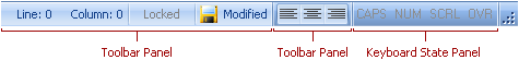
You can split the Ribbon status bar into any number of sections, also called panels. Each section can have its own style based upon the information it displays. There are five pre-defined styles that can be specified by a Ribbon status bar section’s PanelStyle property:
Text panel – Allows you to display simple text labels or control hints.
Container panel – Allows you to embed any control.
Keyboard State panel – Indicates CAPS LOCK, NUM LOCK, SCROLL LOCK and INSERT key states. In order to apply the Ribbon’s paint style to state messages, set the panel’s TdxStatusBarKeyStateAppearance.ActiveFontColor and TdxStatusBarKeyStateAppearance.InactiveFontColor properties to clDefault.
State Indicator panel – Allows you to display colored indicators to inform end-users about processes performed in the application.
Toolbar panel – Allows you to embed a toolbar. Each toolbar is a unique entry in a status bar. You cannot place the same toolbar in a status bar two or more times.
To create and customize panels at design time, you can do one of the following:
Double click the status bar;
Invoke the status bar’s context menu and select ‘Panels Editor…’;
Press the ellipsis button corresponding to the Panels property.
Once the panels are set up, set the AutoSize property to True to cause the status bar to automatically resize in order to accommodate its panels. In addition, you can use the status bar’s SimplePanelStyle.Active property to optionally switch the status bar to display a single text panel rather than all the created panels. This functionality is similar to the SimplePanel property found in the standard VCL TStatusBar component.