ResourcesCheckedListBoxControl Class
Represents a check-list box that filters resources in the attached scheduler.
Namespace: DevExpress.XtraScheduler.UI
Assembly: DevExpress.XtraScheduler.v24.2.dll
NuGet Package: DevExpress.Win.Scheduler
#Declaration
[ComVisible(false)]
public class ResourcesCheckedListBoxControl :
CheckedListBoxControl,
IResourceFilterControl
#Related API Members
The following members return ResourcesCheckedListBoxControl objects:
#Remarks
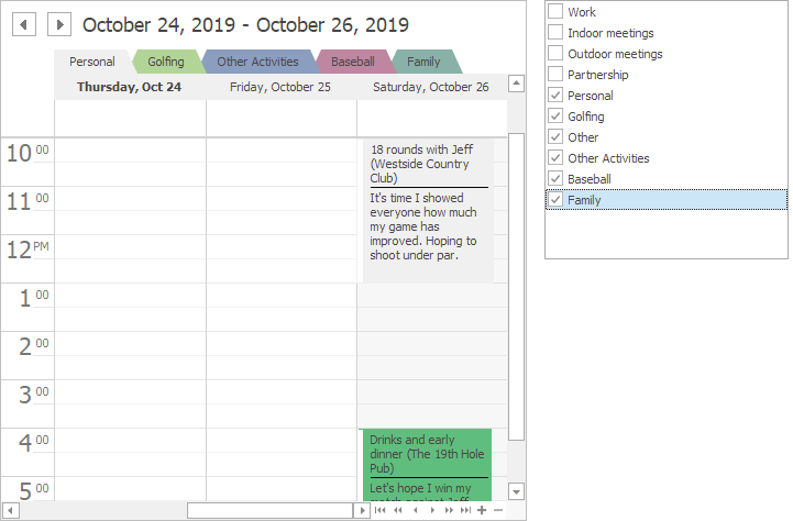
The ResourcesCheckedListBoxControl
class represents a supplementary control that allows a user to filter resources in the attached scheduler. To attach a scheduler to the control, use the ResourcesCheckedListBoxControl.SchedulerControl property. When you drop the control from the toolbox to a form that already contains a scheduler, the property is specified automatically.
In the figure below, you can see how the control filters resources in the attached scheduler.
#Tooltips
DevExpress controls support regular and super tooltips. Enable the ShowToolTips option to display tooltips when the mouse pointer hovers over the control.
Customize Regular Tooltip Text
Use the following properties of the target control to specify regular tooltip text and title:
API | Description |
---|---|
Specifies tooltip text. You can use line breaks in regular tooltips. | |
Specifies whether to parse HTML tags in text. | |
Specifies the tooltip title. If you do not specify tooltip text, the tooltip is not displayed even if you specify the title. |
The following code snippet specifies tooltip text and title for a TextEdit
editor:
public Form1() {
InitializeComponent();
textEdit1.ShowToolTips = true;
textEdit1.ToolTipTitle = "Name";
textEdit1.ToolTip = "Please enter your name";
}
Assign an Image to Regular Tooltips
Use the control’s ToolTipIconType property to assign a predefined icon. The ToolTipController.IconSize property specifies icon size.
Assign a custom image as follows:
- Create a ToolTipController and assign it to the control’s ToolTipController property.
- Create an image collection and assign it to the ToolTipController.ImageList property.
- Handle the ToolTipController.BeforeShow event. Use the e.ImageOptions parameter to assign a raster or vector image to the tooltip.
Note
The Tool
property has priority over e.
. If you assign a custom image, set Tool
to None
.
The following code snippet assigns a custom image to the TextEdit
tooltip:
Note
text
, tool
, and svg
were created at runtime.
public Form1() {
InitializeComponent();
textEdit1.ShowToolTips = true;
textEdit1.ToolTipTitle = "Name";
textEdit1.ToolTip = "Please enter your name";
textEdit1.ToolTipController = toolTipController1;
toolTipController1.ImageList = svgImageCollection1;
toolTipController1.BeforeShow += ToolTipController1_BeforeShow;
}
private void ToolTipController1_BeforeShow(object sender, ToolTipControllerShowEventArgs e) {
ToolTipController controller = sender as ToolTipController;
if (e.ToolTip == textEdit1.ToolTip)
e.ImageOptions.SvgImage = (controller.ImageList as SvgImageCollection)["personalCard"];
}
Display a Super Tooltip
Use the control’s SuperTip property to assign a super tooltip. If you wish to use HTML tags in a super tooltip, enable the SuperToolTip.AllowHtmlText property.
Setting the ToolTipController.ToolTipType property to SuperTip converts existing regular tooltips to super tooltips.
Tip
Read the following help topic for information on how to customize super tooltips: Hints and Tooltips.