OfficeNavigationBar Class
The MS Outlook-inspired navigation bar that supports integration with the NavBarControl.
Namespace: DevExpress.XtraBars.Navigation
Assembly: DevExpress.XtraBars.v25.1.dll
NuGet Package: DevExpress.Win.Navigation
Declaration
Remarks
The OfficeNavigationBar is capable of displaying navigation links (items), which can be clicked to invoke a specific functionality. Items can be added and accessed with the OfficeNavigationBar.Items property. A click on an item can be handled via the OfficeNavigationBar.ItemClick event.

The main feature of the OfficeNavigationBar control is its ability to integrate with a NavBarControl. Two integration scenarios are supported:
An external NavBarControl‘s groups can be displayed as an OfficeNavigationBar‘s items.
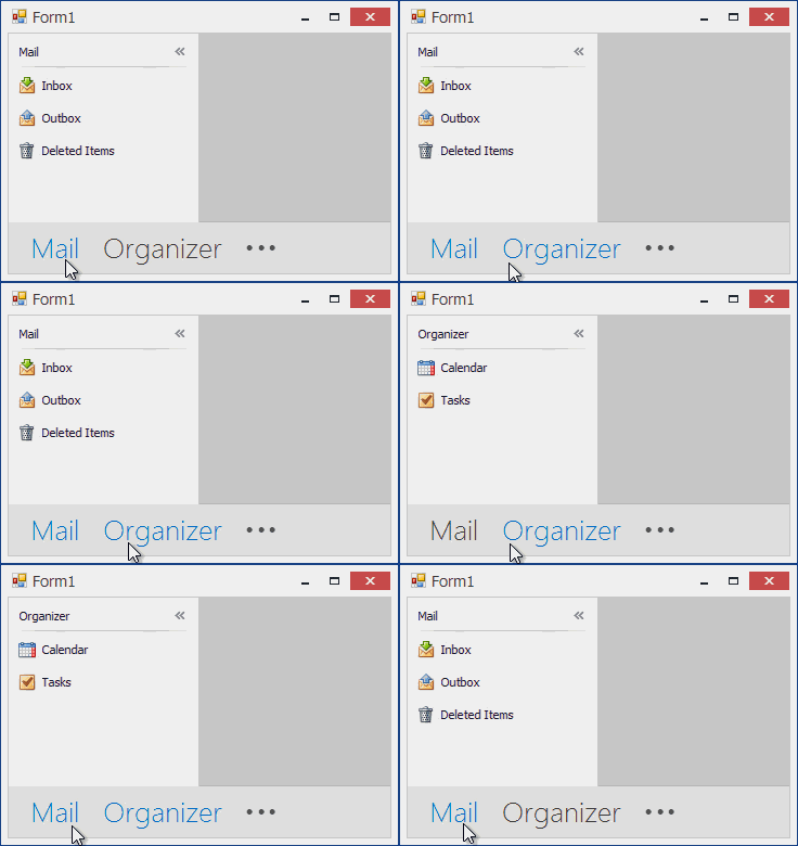
Once you assign a NavBarControl to the OfficeNavigationBar.NavigationClient property, the OfficeNavigationBar fetches groups from the NavBarControl.Groups collection and adds items to the OfficeNavigationBar.Items collection that correspond to the NavBarControl’s groups. At runtime, when an end-user clicks any of these items, a corresponding group is automatically activated in the bound NavBarControl.
The following animation shows a NavBarControl (painted in the NavigationPane style and containing two groups - Mail and Organizer) and an OfficeNavigationBar control bound to this NavBarControl. The OfficeNavigationBar displays two links used to activate the nav bar groups:

Note that group activation is only noticeable when the NavBarControl is painted using the NavigationPane or SideBar View. See Views.
When the Navigation Pane View is applied to the NavBarControl, the group selector is automatically hidden from the NavBarControl after it is bound to the OfficeNavigationBar.
When the NavBarControl is collapsed and is painted using the NavigationPane style, you can embed any control (including the OfficeNavigationBar) into the collapsed NavBarControl. Embedding the OfficeNavigationBar is useful if you want to display custom items in the collapsed NavBarControl to emulate the UI found in MS Outlook 2013.

To accomplish this task, create an OfficeNavigationBar and assign it to the NavBarControl’s OptionsNavPane.CollapsedNavPaneContentControl or NavBarGroup’s NavBarGroup.CollapsedNavPaneContentControl property. Set the OfficeNavigationBar.Orientation property to Vertical, since the collapsed Navigation Pane has a vertical orientation. Add required items and buttons to the OfficeNavigationBar using the OfficeNavigationBar.Items collection.
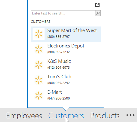
For OfficeNavigationBar items, a popup Peek Form can be displayed to provide custom content for end-users. By default, the Peek Form is displayed when hovering over items.

The content for the Peek Form needs to be provided via the OfficeNavigationBar.QueryPeekFormContent event. See OfficeNavigationBar.ShowPeekFormOnItemHover to learn more.
The OfficeNavigationBar supports the Customization Button ( ), whose visibility and position is specified by the OfficeNavigationBar.CustomizationButtonVisibility property. A click on the Customization Button invokes a dialog that allows an end-user to change the order of items and customize the number of visible items. The number of visible items can be set in code via the OfficeNavigationBar.MaxItemCount property.