BarItemLinkBase.CustomGlyphSize Property
Gets or sets the size of the associated BarItem‘s glyph. This property affects the glyph size if the BarItem.GlyphSize property is set to Custom. This is a dependency property.
Namespace: DevExpress.Xpf.Bars
Assembly: DevExpress.Xpf.Core.v26.1.dll
Declaration
Property Value
| Type | Description |
|---|---|
| Size | A Size structure that is the size of the glyph. |
Remarks
Use the BarItemLink.CustomGlyphSize property to specify the exact width and height of the item’s glyph.
The BarItemLink.CustomGlyphSize property has a higher priority than the BarItem.CustomGlyphSize property.
Example
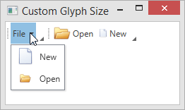
The following example illustrates the bar item glyph size customization capabilities.
<Window
        xmlns="http://schemas.microsoft.com/winfx/2006/xaml/presentation"
        xmlns:x="http://schemas.microsoft.com/winfx/2006/xaml"
        xmlns:d="http://schemas.microsoft.com/expression/blend/2008"
        xmlns:mc="http://schemas.openxmlformats.org/markup-compatibility/2006"
        xmlns:dxb="http://schemas.devexpress.com/winfx/2008/xaml/bars"
        xmlns:dxc="http://schemas.devexpress.com/winfx/2008/xaml/core"
        x:Class="CustomGlyphSizeTestApp.MainWindow"
        mc:Ignorable="d"
        Title="Custom Glyph Size" Height="350" Width="525">
    <Grid>
        <dxb:BarManager VerticalAlignment="Top">
            <dxb:BarManager.Bars>
                <dxb:Bar>
                     <!--BarSubItem.SubItemsCustomGlyphSize property specifies the glyph size for its items. -->
                    <dxb:BarSubItem x:Name="barFile" Content="File"
                                    SubItemsCustomGlyphSize="24,24" SubItemsGlyphSize="Custom" >
                        <!-- The item's glyph size (24x24) is specified by the container's SubItemsCustomGlyphSize property. -->
                        <dxb:BarButtonItem x:Name="barNew" Content="New" Glyph="{dxc:DXImage Image=New_32x32.png}"
                                           BarItemDisplayMode="ContentAndGlyph" GlyphSize="Custom"/>
                        <!-- The BarButtonItem.CustomGlyphSize property has higher precedence than the container's SubItemsCustomGlyphSize property. -->
                        <!-- The item's size is 16x16. -->
                        <dxb:BarButtonItem x:Name="barOpen" Content="Open"  Glyph="{dxc:DXImage Image=Open_32x32.png}"
                                           BarItemDisplayMode="ContentAndGlyph" GlyphSize="Custom" CustomGlyphSize="16,16"/>
                    </dxb:BarSubItem>
                </dxb:Bar>
                <dxb:Bar>
                     <!-- The BarButtonItemLink.CustomGlyphSize property has the highest precedence. -->
                    <dxb:BarButtonItemLink BarItemName="barOpen" CustomGlyphSize="24,24"/>
                    <dxb:BarButtonItemLink BarItemName="barNew" CustomGlyphSize="12,12"/>
                </dxb:Bar>
            </dxb:BarManager.Bars>
        </dxb:BarManager>
    </Grid>
</Window>
See Also