Items and Links
- 3 minutes to read
What are Bar Items
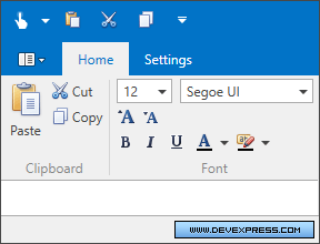
If you look at ribbon page groups, the status bar or the Quick Access Toolbar, you may see various visual elements (command buttons, static text, editors, menus, galleries, etc.), each of which provides specific functionality.

To add a command button, static text or any other element to a RibbonControl, RibbonStatusBarControl, any bar or popup menu you need to create a specific bar item. Bar items provide multiple display and behavior options that can be customized: content, large and small images, a command and event that occur when corresponding elements are clicked, etc. For instance, to add a regular button to a Ribbon, you need to create a BarButtonItem object. Its Content and Glyph properties allow you to assign a specific content and image to the button. The item’s BarItem.ItemClick event allows you to implement the button’s functionality. You can specify a command for a bar item by using the BarItem.Command property.
The following code defines two buttons in the Ribbon Control’s Home page.

<dxr:RibbonControl DockPanel.Dock="Top" RibbonStyle="Office2010">
    <dxr:RibbonDefaultPageCategory>
        <dxr:RibbonPage Caption="Home">
            <dxr:RibbonPageGroup Caption="File">
                <dxb:BarButtonItem x:Name="biOpen" Content="Open" Glyph="{dx:DXImage Image=Open_16x16.png}" LargeGlyph="{dx:DXImage Image=Open_32x32.png}"/>
                <dxb:BarButtonItem x:Name="biNew" Content="New" Glyph="{dx:DXImage Image=New_16x16.png}" LargeGlyph="{dx:DXImage Image=New_32x32.png}"/>
            </dxr:RibbonPageGroup>
        </dxr:RibbonPage>
    </dxr:RibbonDefaultPageCategory>
</dxr:RibbonControl>
For simplicity, no command or event handler is assigned to buttons in this example. See Bar Item Behavior Options to learn how to assign actions to bar items.
There are multiple bar item types that can be used to add various elements to Ribbon controls. The BarButtonItem mentioned above is used to create regular buttons. The BarSubItem object is used to add a submenu, etc. For a complete list of bar items, see The List of Bar Items and Links.
What are Bar Item Links
In specific cases, you may want to add the same command (e.g., button) in multiple places. For instance, you may want to add the Open button to the Home tab and to the Ribbon Quick Access Toolbar at the same time. The two buttons should have the same caption, hint and image, and invoke the same action. Bar item links come into play in these scenarios.
A bar item link is a visual element that refers to a specific bar item (using the BarItemLinkBase.BarItemName property). It is rendered onscreen using the settings of the source bar item, and it acts like the source bar item, as it is aware of the item’s settings and action assigned. You can create multiple links to the same bar item and display them in different places. Clicking on either of them will invoke the same event handler or command that is assigned to the source bar item.
For each bar item type, there is a corresponding bar item link object. For instance, the BarButtonItemLink is a link that corresponds to the BarButtonItem object. See The List of Bar Items and Links, for more information.
The following code defines three bar items in the Home page and adds links to these items on the Quick Access Toolbar, Page Header region and Ribbon Status Bar.

<dxr:RibbonControl DockPanel.Dock="Top" RibbonStyle="Office2010">
    <dxr:RibbonControl.PageHeaderItems>
        <dxb:BarButtonItemLink BarItemName="biAbout"/>
    </dxr:RibbonControl.PageHeaderItems>
    <dxr:RibbonControl.ToolbarItems>
        <dxb:BarButtonItemLink BarItemName="biNew"/>
        <dxb:BarButtonItemLink BarItemName="biOpen"/>
    </dxr:RibbonControl.ToolbarItems>
    <dxr:RibbonDefaultPageCategory>
        <dxr:RibbonPage Caption="Home">
            <dxr:RibbonPageGroup Caption="File">
                <dxb:BarButtonItem x:Name="biNew" Content="New" Glyph="{dx:DXImage Image=New_16x16.png}" LargeGlyph="{dx:DXImage Image=New_32x32.png}"/>
                <dxb:BarButtonItem x:Name="biOpen" Content="Open" Glyph="{dx:DXImage Image=Open_16x16.png}" LargeGlyph="{dx:DXImage Image=Open_32x32.png}"/>
                <dxb:BarButtonItem x:Name="biAbout" Content="About" Glyph="{dx:DXImage Image=Question_16x16.png}" LargeGlyph="{dx:DXImage Image=Question_32x32.png}"/>
            </dxr:RibbonPageGroup>
        </dxr:RibbonPage>
    </dxr:RibbonDefaultPageCategory>
</dxr:RibbonControl>
<dxr:RibbonStatusBarControl DockPanel.Dock="Bottom">
    <dxr:RibbonStatusBarControl.RightItems>
        <dxb:BarButtonItemLink BarItemName="biAbout" RibbonStyle="SmallWithoutText"/>
    </dxr:RibbonStatusBarControl.RightItems>
</dxr:RibbonStatusBarControl>