Dock UI Items
- 3 minutes to read
Dock UI items are objects that support the docking functionality. You can use them as blocks to build a docking interface for your application.

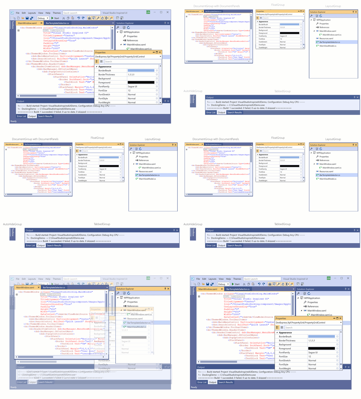
Available Groups and Panels
You can use the following objects to build a docking interface for your application:
LayoutPanel
LayoutPanel - A dock panel. You can use a LayoutPanel in dock and layout UIs.
LayoutGroup
LayoutGroup - A container for panels and groups.
TabbedGroup
TabbedGroup - A tabbed group of dock panels (LayoutPanel objects).
Use the TabbedGroup object if you need to display tab headers at the bottom of the group.

DocumentGroup and DocumentPanel
DocumentGroup - A container for DocumentPanel and LayoutPanel objects. The DocumentGroup uses child DocumentPanel objects to build tabbed or regular MDI.
Use the DocumentGroup object if you need to display tab headers at the top of the group.
You can also use the ClosePageButtonShowMode property to specify which child DocumentPanels should have the Close (x) button.
AutoHideGroup
AutoHideGroup - A container for auto-hidden dock panels.

FloatGroup
FloatGroup - A container for floating panels. You can move these panels to another display or dock them back to the application’s layout.

You can use Layout Control Items and Document Panels as dock objects but this scenario is not typical.
Refer to the following topic for more information on the Dock UI Items: Dock Layout Manager: Visual Elements.
Limitations
Do not combine dock and layout items within a single LayoutGroup.
Do not combine LayoutGroups that contain dock items with groups that contain layout items. If you need to arrange layout items next to dock items, add the layout items into a LayoutPanel.
Do not use dock items outside the DockLayoutManager control.
Do not add LayoutControlItems in LayoutPanels. Instead, wrap LayoutControlItems with a LayoutGroup and then add the LayoutGroup in a LayoutPanel:
<dxdo:LayoutPanel>
    <dxdo:LayoutGroup>
        <dxdo:LayoutControlItem>
            <!-- ... -->
        </dxdo:LayoutControlItem>
    </dxdo:LayoutGroup>
</dxdo:LayoutPanel>
Document Selector
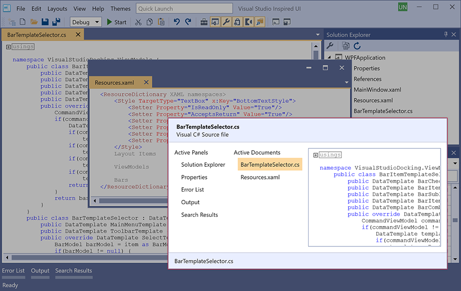
The Document Selector allows users to switch between panels and documents. The window displays the Dock Panels and Document Panels that exist in your application’s layout.

At runtime, press Ctrl+Tab to display the Document Selector.
Your users can use the Tab and Arrow keys to navigate within the Document Selector. A selected panel’s preview is displayed on the right side of the Document Selector window. Release the Ctrl key to activate the selected panel/document.
Document Selector Availability
Set DockLayoutManager.AllowDocumentSelector to false
to disable the Document Selector.
Hide a Panel from the Document Selector
Set the LayoutPanel‘s ShowInDocumentSelector property to false to hide the panel from the Document Selector.
Specify a Panel’s Text Displayed in the Document Selector
Use the BaseLayoutItem.Description and BaseLayoutItem.FooterDescription properties to specify a panel’s text descriptions. These descriptions are displayed within the Document Selector‘s header and footer, respectively, when you navigate to the panel.
Context Menus

The DockLayoutManager includes APIs that allow you to customize context menus of dock UI items. You can remove context menu items, create your own, or change actions of the existing menu items.
Refer to the following topic for more information: Dock Layout Manager: Visual Elements - Context Menus.

