Layout UI Items
- 4 minutes to read
A Layout Item contains a labeled UIElement. You can organize Layout Items into automatically-aligned Layout Groups to build user-friendly and customizable entry forms.
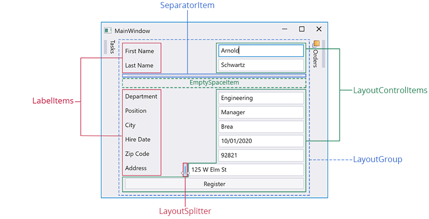
LayoutGroup
The LayoutGroup object is a container that arranges its items either vertically or horizontally. The LayoutGroup class can contain a LayoutControlItem and/or other LayoutGroup objects.

LayoutControlItem
The LayoutControlItem object is a wrapper class that displays a label next to a UIElement. A LayoutControlItem object aligns its child controls to its left edge.

You can place the LayoutControlItem only inside LayoutGroup.
Specify Content
Use the LayoutControlItem.Control property to specify the LayoutControlItem‘s content. In XAML, any element that is declared between the LayoutControlItem start and end tags initializes the Control property.
<dxdo:LayoutControlItem Caption="Title">
    <dxe:TextEdit/>
</dxdo:LayoutControlItem>
SeparatorItem

The SeparatorItem object is a line that you can place between neighboring UI elements to improve the display of your application’s layout.
LayoutSplitter
The LayoutSplitter object allows you to resize a layout item at runtime.

EmptySpaceItem
The EmptySpaceItem object is an element that adds a whitespace to your layout.

LabelItem
The LabelItem object is a label that displays custom text.
Customize Layout Control Item and Layout Groups
Label
The following table lists the properties that allow you to customize a LayoutControlItem / LayoutGroup‘s label:
| Property | Description |
|---|---|
| BaseLayoutItem.Caption | Gets or sets a label next to the item’s control. |
| BaseLayoutItem.ShowCaption | Gets or sets whether the item’s label is displayed. |
| BaseLayoutItem.CaptionFormat | Gets or sets the item label’s custom format string. |
| BaseLayoutItem.CaptionLocation | Gets or sets the position of the item’s caption. |
Image
| Property | Description |
|---|---|
| BaseLayoutItem.CaptionImage | Gets or sets an image that is displayed next to the item’s control. |
| BaseLayoutItem.CaptionImageLocation | Gets or sets the item’s image location. |
Control’s Alignment
The LayoutControlItem and LayoutGroup classes inherit the BaseLayoutItem.CaptionAlignMode property that allows you to customize a control’s alignment.
Limitations
Do not combine dock and layout items within a single LayoutGroup.
Do not combine LayoutGroups that contain dock items with groups that contain layout items. If you need to arrange layout items next to dock items, add the layout items into a LayoutPanel.
Do not use dock items outside the DockLayoutManager control.
Do not add LayoutControlItems in LayoutPanels. Instead, wrap LayoutControlItems with a LayoutGroup and then add the LayoutGroup in a LayoutPanel:
<dxdo:LayoutPanel>
    <dxdo:LayoutGroup>
        <dxdo:LayoutControlItem>
            <!-- ... -->
        </dxdo:LayoutControlItem>
    </dxdo:LayoutGroup>
</dxdo:LayoutPanel>
Runtime Layout Customization
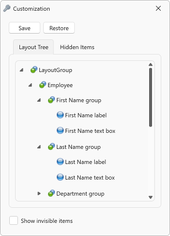
Your users can use Customization Mode and the Customization Window to customize the layout of controls at runtime.
Customization Mode
Customization Mode Availability
Use the DockLayoutManager.AllowCustomization property to specify whether Customization Mode can be enabled.
Enable Customization Mode
You can enable this mode in any of the following ways:
- Call the DockLayoutManager.BeginCustomization method.
- Right-click the layout and select the Begin customization menu item.
When Customization Mode is run, the Customization Window is opened.
Disable Customization Mode
Use any of the following to disable Customization Mode:
- Call the DockLayoutManager.EndCustomization method.
- Close the Customization Window.
Customization Window
The Customization Window is displayed when Customization Mode is enabled.
Hide Customization Window
Call the DockLayoutManager.HideCustomizationForm method to hide the Customization Window but do not disable customization mode.
Restore Customization Window
Call the DockLayoutManager.ShowCustomizationForm method to restore the Customization Window.
Show/Hide Invisible Items
The Customization Window contains the Show invisible items checkbox that specifies whether the Customization Window displays hidden layout UI items. The DockLayoutManager‘s item is hidden if its Visibility property is Hidden or Collapsed. The Show invisible items checkbox value is bound to the ShowInvisibleItems property value.
The following table lists possible Show invisible items checkbox states and the display status of the DockLayoutManager‘s invisible layout items:
Show invisible items state |
Display status |
|---|---|
checked |
Always displayed |
unchecked |
Hidden |
indeterminate (default state) |
Displayed when the Customization Window is invoked |
Save and Restore Layout
The Customization Window contains the Save and Restore buttons that allow your users to save the DockLayoutManager‘s layout to an XML file and then restore it. When they click the save/restore button, the save/open file dialog is opened. In the dialog, they can specify the name and location of the file that contains the DockLayoutManager‘s layout.
Refer to the following topic for more information on how to save and restore the DockLayoutManager‘s layout in code: Save and Restore the Layout of Dock Panels and Controls.
Specify a Layout Item’s Caption
Specify the layout item’s CustomizationCaption property to set its caption displayed in the Customization Window.