Dock Layout Manager: Visual Elements
- 3 minutes to read
This topic describes visual element types that are included in the DockLayoutManager control.
Dock UI
| Element | Description |
|---|---|
| LayoutPanel | A dock panel. You can use a LayoutPanel in dock and layout UIs. |
| AutoHideGroup | A container for auto-hidden dock panels. |
| LayoutGroup | A container for items and groups. |
| FloatGroup | A container for floating panels. |
| TabbedGroup | A tabbed group of dock panels (LayoutPanel objects). |
| DocumentGroup | A container for DocumentPanel and LayoutPanel objects. The DocumentGroup displays child DocumentPanel‘s in tabbed or MDI UIs. |
| DocumentPanel | A child panel in a DocumentGroup. The DocumentPanel supports the MDI and Tabbed UIs. |
Refer to the following topic for more information on how to customize the DockLayoutManager‘s visual elements: Customize Appearance.
LayoutPanel
This section lists LayoutPanel‘s elements.
Caption

- Caption Image
- Caption Text
- Pin Button
Refer to the following topic for more information on how to customize the LayoutPanel‘s caption: Customize Appearance - LayoutPanel’s Caption.
Tab Caption

- Tab Caption Image
- Tab Caption Text
Refer to the following topic for more information on how to customize the LayoutPanel‘s tab caption: Customize Appearance - LayoutPanel’s Tab Caption.
Dock Guides and Hints

| Element | Description |
|---|---|
| DockGuide | Contains values that specify dock hint sections. Each DockGuide consists of multiple DockHints. |
| DockHint | Contains values that specify the dock hint. |
Closed Panel Bar
The Closed Panel Bar allows you to access closed panels that are stored in the DockLayoutManager.ClosedPanels collection.

Customize Closed Panel Bar
Use the DockLayoutManager.ClosedPanelsBarPosition and DockLayoutManager.ClosedPanelsBarVisibility properties to specify the position and visibility of the Closed Panel Bar:
dockLayoutManager.ClosedPanelsBarVisibility = ClosedPanelsBarVisibility.Auto;
dockLayoutManager.ClosedPanelsBarPosition = Dock.Left;
Document Selector
At runtime, users can press Ctrl+Tab to display the Document Selector. It allows them to switch between panels and documents in your application’s layout.
Refer to the following topic for more information: Document Selector.
Layout UI
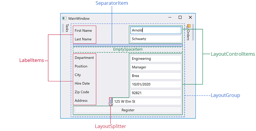
| Element | Description |
|---|---|
| SeparatorItem | A line that you can place between neighboring UI elements to improve the display of your application’s layout. |
| LabelItem | A label that displays custom text. |
| LayoutControlItem | A Layout Group‘s child element that can display a control with a label. |
| LayoutGroup | A container for items and groups. |
| LayoutSplitter | Allows you to resize a layout item at runtime. |
| EmptySpaceItem | Adds whitespace to a UI. The whitespace is a rectangle object with invisible bounds that has its own height and width. |
Customization Window
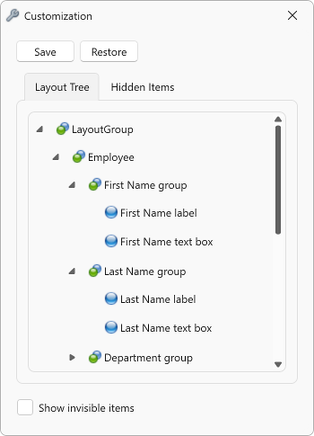
Refer to the following topic for more information on the Customization Window and Customization Mode: Layout UI Items.
Context Menu

Customize Context Menu
| Member | Description |
|---|---|
| ContextMenuCustomizations | Allows you to add new menu items or remove existing items from the layout item’s context menu. |
| ContextMenuCustomizationsTemplate | Gets or sets a template used to customize menu items in all affected dock layout items. This is a dependency property. |
| DefaultMenuItemNames | Contains names of the context menu items. |
| ShowingMenu | Fires before showing a context menu, and allows it to be customized. |
Add/Remove a Menu Item
Use the RemoveAction / InsertAction bar items to remove/add menu items from the context menu.
The following code sample removes the Closed Panels bar item and adds the About menu item:
<Window ...
        xmlns:dxdo="http://schemas.devexpress.com/winfx/2008/xaml/docking"
        xmlns:dxc="http://schemas.devexpress.com/winfx/2008/xaml/core"
        xmlns:dxb="http://schemas.devexpress.com/winfx/2008/xaml/bars">
    <Grid>
        <dxdo:DockLayoutManager>
            <dxdo:LayoutGroup>
                <dxdo:LayoutPanel Caption="Panel1" >
                    <dxdo:LayoutPanel.ContextMenuCustomizations>
                        <dxb:InsertAction Index="0">
                            <dxb:BarButtonItem Content="About" ItemClick="BarButtonItem_ItemClick" />
                        </dxb:InsertAction>
                        <dxb:RemoveAction ElementName="{x:Static dxdo:DefaultMenuItemNames.ClosedPanels}"/>
                    </dxdo:LayoutPanel.ContextMenuCustomizations>
                </dxdo:LayoutPanel>
                <!-- ... -->
            </dxdo:LayoutGroup>
        </dxdo:DockLayoutManager>
    </Grid>
</Window>