Group Summary
- 4 minutes to read
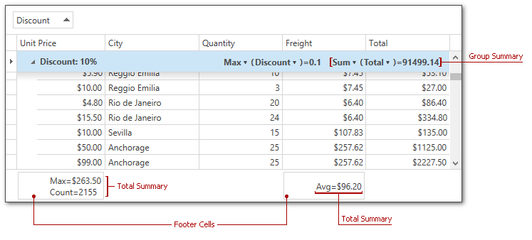
A group summary is a value of the aggregate function calculated over all data rows within a group. Group summaries are displayed in group rows and stored in the GridControl.GroupSummary collection.
Display Group Summaries
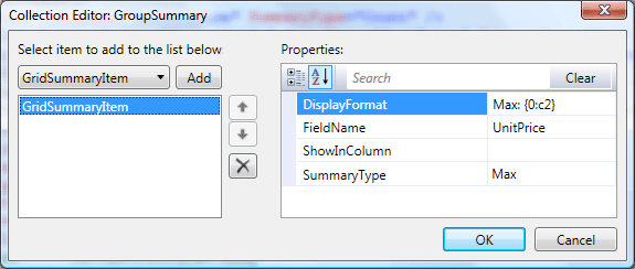
To create a group summary item at design time, use the GroupSummary Collection Editor.
<dxg:GridControl.GroupSummary>
    <dxg:GridSummaryItem DisplayFormat="Max: {0:c2}" FieldName="UnitPrice"
        ShowInColumn="" SummaryType="Max" />
</dxg:GridControl.GroupSummary>
To display group summaries in code, create a new instance of the GridSummaryItem class, specify its properties, and add it to the GridControl.GroupSummary collection.
DevExpress.Xpf.Grid.GridSummaryItem groupSummaryItem = new DevExpress.Xpf.Grid.GridSummaryItem();
groupSummaryItem.FieldName = "UnitPrice";
groupSummaryItem.DisplayFormat = "Max: {0:c2}";
groupSummaryItem.SummaryType = DevExpress.Data.SummaryItemType.Max;
grid.GroupSummary.Add(groupSummaryItem);
Use the AddRange method to add multiple summary items.
Note
If you use ColumnBase.Binding properties to populate columns with data, their ColumnBase.FieldName property values have the following format: RowData.Row.{Your binding path}.
Refer to the following help topic for more information: How the GridControl Identifies Columns.
Obtain Summary Values
To obtain a group summary value displayed within the specified group row, use the GridControl.GetGroupSummaryValue method.
Update Summary Values
The GridControl updates its summaries after you post an edited row’s changes to a data source. Call the DataViewBase.CommitEditing method in the GridViewBase.CellValueChanged event handler to update summaries each time a user edits a cell value:
void view_CellValueChanged(object sender, DevExpress.Xpf.Grid.CellValueChangedEventArgs e) {
    view.CommitEditing();
}
The GridControl does not update its summaries if you bypass the control’s UI and modify the control’s data source directly. Set the DataControlBase.AllowLiveDataShaping property to true to make the control recalculate summaries when the data source changes.
You can also call the GridControl.UpdateGroupSummary method to recalculate summary values.
Align Group Summaries by Columns
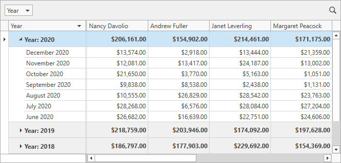
Group summaries are initially displayed to a group row’s right. To display group summaries under corresponding columns, set the TableView.GroupSummaryDisplayMode to GroupSummaryDisplayMode.AlignByColumns.
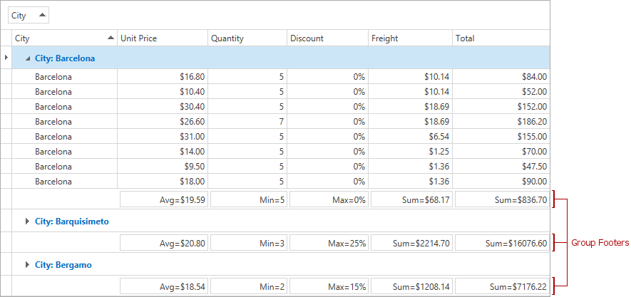
Group Footers
To display group footer rows, use the view’s TableView.ShowGroupFooters property. To display a summary item in group footer rows, use its GridSummaryItem.ShowInGroupColumnFooter property.
Customize Group Summaries
The following table lists properties that allow you to customize group summaries:
| Property | Description |
|---|---|
| GroupSummaryDisplayMode | Gets or sets the position of group summaries within a group row. This is a dependency property. |
| GroupSummaryContentStyle | Gets or sets the style applied to group summary items. This is a dependency property. |
| GroupBandSummaryContentStyle | Gets or sets the style applied to group summary items aligned by bands. This is a dependency property. |
| GroupColumnSummaryContentStyle | Gets or sets the style applied to group summary items aligned by columns. This is a dependency property. |
| GroupColumnSummaryElementStyle | Gets or sets the style applied to individual text elements in group summary items that are aligned by columns. This is a dependency property. |
| GroupFooterSummaryContentStyle | Gets or sets the style applied to summary items displayed within group footers. This is a dependency property. |
| GroupColumnFooterElementStyle | Gets or sets the style applied to individual text elements in the group summary item that is displayed within the group footer. This is a dependency property. |
| GroupSummaryItemTemplate | Gets or sets the template that defines the presentation of summary items displayed within group rows. This is a dependency property. |
| GroupSummaryItemTemplateSelector | Gets or sets an object that chooses a group summary template based on custom logic. This is a dependency property. |
| GroupColumnSummaryItemTemplate | Gets or sets the template that defines the presentation of group summary items aligned by columns. This is a dependency property. |
| GroupFooterSummaryItemTemplate | Gets or sets the template that defines the appearance of group footer summary items. This is a dependency property. |
| GroupFooterSummaryItemTemplateSelector | Gets or sets an object that chooses a group footer summary item template based on custom logic. This is a dependency property. |
Examples
The following code sample demonstrates how to use the GridViewBase.GroupSummaryItemTemplate property to change the group summary caption and background color:
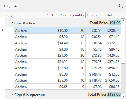
<dxg:GridControl ItemsSource="{Binding Orders}">
    <dxg:GridControl.GroupSummary>
        <dxg:GridSummaryItem SummaryType="Sum" FieldName="UnitPrice" />
    </dxg:GridControl.GroupSummary>
    <dxg:GridControl.View>
        <dxg:TableView>
            <dxg:TableView.GroupSummaryItemTemplate>
                <DataTemplate>
                    <StackPanel Orientation="Horizontal" Background="Bisque">
                        <TextBlock Text="Total Price: "/>
                        <TextBlock Text="{Binding Value}" Background="LightBlue"/>
                    </StackPanel>
                </DataTemplate>
            </dxg:TableView.GroupSummaryItemTemplate>
        </dxg:TableView>
    </dxg:GridControl.View>
</dxg:GridControl>
You can also define multiple templates and implement custom logic to choose a template. To do this, use the GridViewBase.GroupSummaryItemTemplateSelector property.
If the TableView.GroupSummaryDisplayMode property is set to AlignByColumns, use the TableView.GroupColumnSummaryItemTemplate property to define a group summary template. The code sample below displays group summaries aligned by columns with a custom background:
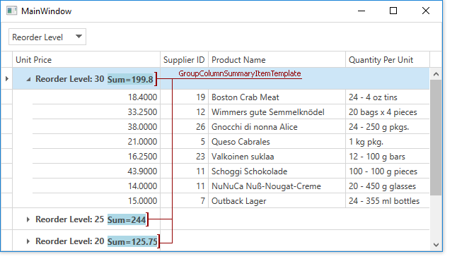
<dxg:GridControl>
    <dxg:GridControl.GroupSummary>
        <dxg:GridSummaryItem SummaryType="Sum" FieldName="UnitPrice" />
    </dxg:GridControl.GroupSummary>
    <dxg:GridControl.View>
        <dxg:TableView GroupSummaryDisplayMode="AlignByColumns">
            <dxg:TableView.GroupColumnSummaryItemTemplate>
                <DataTemplate>
                    <StackPanel Orientation="Horizontal">
                        <TextBlock Text="{Binding Value}" Background="LightBlue" Margin="130,0,0,0"/>
                    </StackPanel>
                </DataTemplate>
            </dxg:TableView.GroupColumnSummaryItemTemplate>
        </dxg:TableView>
    </dxg:GridControl.View>
</dxg:GridControl>