Tooltips
- 3 minutes to read
The GridControl allows you to display tooltips (hints) when end users move the mouse over particular visual elements, such as column headers, band headers or data cells.
Column and Band Header Tooltips
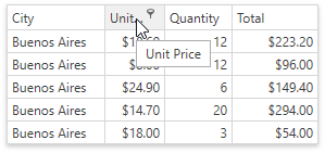
If the BaseColumn.HeaderToolTip property is not specified, a tooltip is displayed for a column (band) header if its caption is clipped. A tooltip contains the text displayed within a column or band header.
Custom Tooltip Text
To specify custom text for the tooltip of an individual column or band, use the BaseColumn.HeaderToolTip property. In this case, the tooltip displays automatically when an end-user hovers the mouse pointer over the column’s header.
<dxg:GridControl AutoGenerateColumns="None">
    <dxg:GridControl.Columns>
        <!-- A column with a custom header tooltip -->
        <dxg:GridColumn FieldName="Id" HeaderToolTip="Identification Number"/>
        <dxg:GridColumn FieldName="Name" />
        <dxg:GridColumn FieldName="Age" />
    </dxg:GridControl.Columns>
</dxg:GridControl>
Custom Tooltip Template
Use the BaseColumn.HeaderToolTipTemplate property to specify the tooltip presentation for an individual column. To specify a common tooltip template applied to all columns displayed within a view, use the DataViewBase.ColumnHeaderToolTipTemplate property.
Tooltips for Trimmed Text
The in-place editor trims the text when this text overflows the content area in display mode.
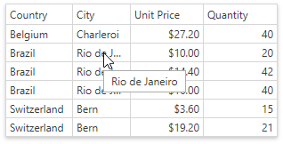
The text is trimmed only if the TextEditSettings.TextWrapping property is set to NoWrap.
Use the TextEditSettings.TrimmedTextToolTipContentTemplate property to specify a template that is used to present the tooltip content.
To hide tooltips for the trimmed text, set the TextEditSettings.ShowTooltipForTrimmedText property to false.
Cell Tooltips
You can define the cell tooltip template for cells:

To show a cell tooltip, follow the steps below:
Specify the BaseColumn.CellToolTipBinding property for columns that should display cell tooltips.
Use the BaseColumn.CellToolTipTemplate or DataViewBase.CellToolTipTemplate property to define a cell tooltip template.
<dxg:GridControl ItemsSource="{Binding Source}">
    <dxg:GridColumn FieldName="Id"/>
    <dxg:GridColumn FieldName="Name" CellToolTipBinding="{Binding}"/>
    <dxg:GridColumn FieldName="Age" CellToolTipBinding="{Binding}"/>

    <dxg:GridControl.View>
        <dxg:TableView>
            <dxg:TableView.CellToolTipTemplate>
                <DataTemplate>
                    <StackPanel Orientation="Vertical">
                        <StackPanel Orientation="Horizontal">
                            <TextBlock FontWeight="Bold" Text="Name: "/>
                            <TextBlock Text="{Binding Name}"/>
                        </StackPanel>
                        <StackPanel Orientation="Horizontal">
                            <TextBlock FontStyle="Italic" FontWeight="Bold" Text="Age: "/>
                            <TextBlock Text="{Binding Age}"/>
                        </StackPanel>
                    </StackPanel>
                </DataTemplate>
            </dxg:TableView.CellToolTipTemplate>
        </dxg:TableView>
    </dxg:GridControl.View>
</dxg:GridControl>
Note
The BaseColumn.CellToolTipTemplate property takes precedence over the DataViewBase.CellToolTipTemplate property.
You can also use the ColumnBase.CellStyle or ColumnBase.CellTemplate properties to display cell tooltips.
Card Tooltips
You can use the CardView.CardStyle property to specify card tooltips in the Card View. In this case, the tooltip’s data context is a CardData object.

<dxg:CardView.CardStyle>
    <Style TargetType="ContentControl">
        <Setter Property="ToolTip">
            <Setter.Value>
                <ToolTip>
                    <StackPanel>
                        <TextBlock>
                            <Run Text="Unit Price:" FontWeight="Bold"/>
                            <Run Text="{Binding Row.UnitPrice, StringFormat=c}"/>
                        </TextBlock>
                        <TextBlock>
                            <Run Text="Quantity:" FontWeight="Bold"/>
                            <Run Text="{Binding Row.Quantity}"/>
                        </TextBlock>
                        <TextBlock>
                            <Run Text="Total:" FontWeight="Bold"/>
                            <Run Text="{Binding DataContext.Total, StringFormat=c}"/>
                        </TextBlock>
                    </StackPanel>
                </ToolTip>
            </Setter.Value>
        </Setter>
    </Style>
</dxg:CardView.CardStyle>