v25.2 Release Notes
- 26 minutes to read
Tip
Visit our website to explore new features/capabilities available across the entire DevExpress product line: What’s New in our Latest Update.
.NET 10 Support
DevExpress Blazor UI components support new .NET 10 features.
Visual Studio 2026 Support
DevExpress Blazor UI components fully support Visual Studio 2026.
Content Security Policy (CSP) Enhancements
We improved Content Security Policy (CSP) support across our Blazor component suite. DevExpress Blazor components no longer require the style-src 'unsafe-inline' directive.
For additional information, refer to the following topic: Content Security Policy.
Project Templates
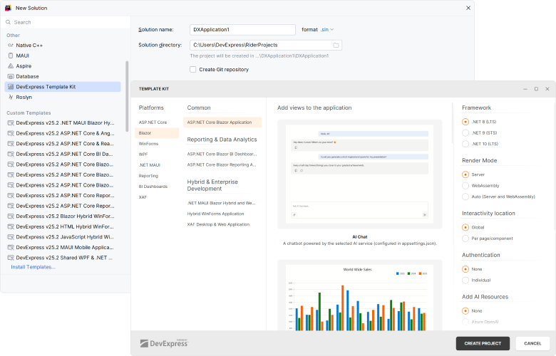
JetBrains Rider Support
With v25.2, DevExpress Template Kit is fully integrated into JetBrains Rider. You can create new projects using the same set of DevExpress templates available in Visual Studio and VS Code.
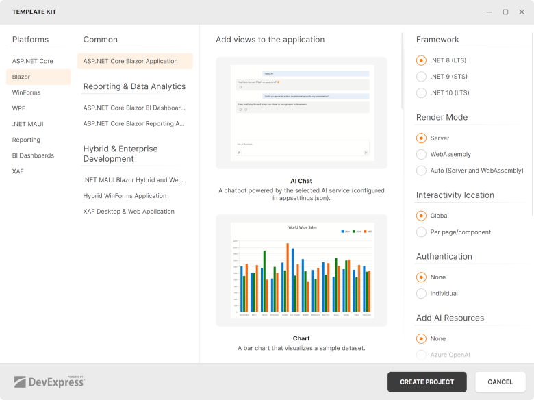
New Sample Views
To accelerate developer adoption, the DevExpress Template Kit adds sample Blazor component pages to the generated project. Each page includes minimal component configuration, resources, and sample data.
The following DevExpress components are supported:
- AI Chat
- Bar Chart
- PDF Viewer
- Pivot Table
- Rich Text Editor
- Report Designer
- Report Viewer
- Scheduler
- TreeList
Performance Enhancements
Blazor Grid, TreeList & Pivot — Improved Performance with Many Columns
With v25.2, we extended our rendering engine with horizontal virtualization support (in addition to existing vertical virtualization). Column virtualization is now available for DevExpress Blazor Grid, TreeList, and PivotTable UI components. Use it to efficiently handle data sources with hundreds or even thousands of columns.
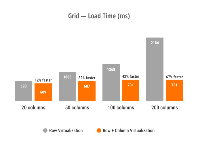
Blazor Grid — Load Time
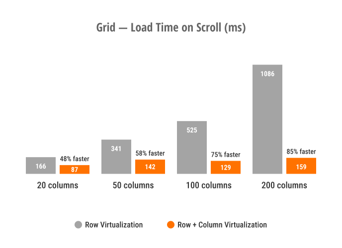
Blazor Grid — Load Time on Scroll
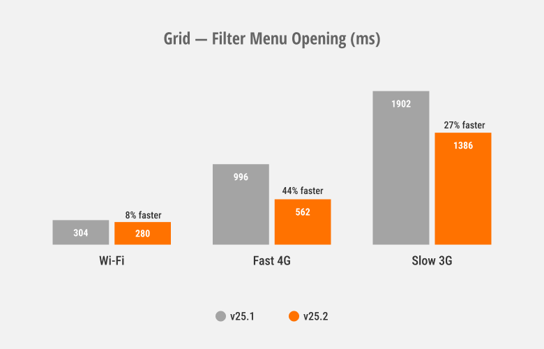
Blazor Grid & TreeList — Improved Filter Menu Responsiveness
We optimized rendering speed and improved responsiveness for column filter menus used within our Blazor Grid and TreeList components.
Blazor Ribbon & Toolbar — Faster Popup Opening
DevExpress Blazor Ribbon and Toolbar SubMenus now reuse a single popup instance that initializes on component load. This improves popup activation speed, especially over slower connections.
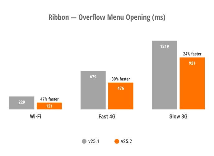
Blazor Ribbon — Overflow Menu Opening
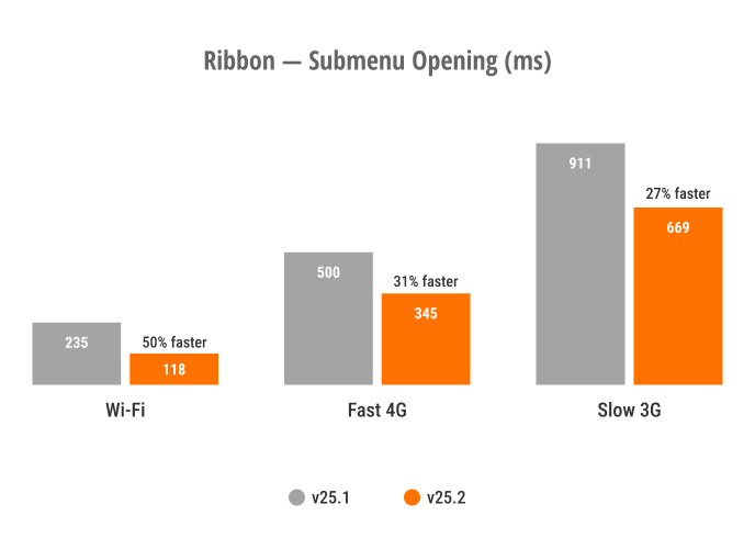
Blazor Ribbon — SubMenu Opening

Blazor Toolbar — SubMenu Opening
These optimizations also affect Blazor components that use the DevExpress Blazor Ribbon/Toolbar internally, including the DevExpress Rich Text Editor, HTML Editor, and Scheduler.
Blazor Scheduler — Resize and Drag & Drop Enhancements
To help improve responsiveness, we optimized our Scheduler’s resize/drag & drop engine.
The DevExpress Blazor Scheduler automatically switches to our new client-side mode unless server-side processing is required (when you use template-based appointments or handle server-side events). You can use the AppointmentDragMode property to specify appointment drag/resize operation processing (on client or server).
For client-side processing (AppointmentDragMode is Client), we added a hint that displays appointment start and end times. This change allows the Blazor Scheduler to re-render appointments on the client without server communication.
Blazor Filter Builder — Performance Optimizations
We optimized the DevExpress Blazor Filter Builder to handle large data models efficiently. It now supports up to 100,000 fields across multiple hierarchy levels with improved performance.
Accessibility Enhancements
- Added support for keyboard navigation in both our Pivot Table and Ribbon component. We also improved existing keyboard navigation in our Filter Builder and TagBox.
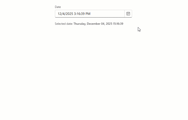
- Added an Alt + Del keyboard shortcut designed to clear values in the Date Edit, Date Range Picker, Memo, Search Box, Spin Edit, Text Box, and Time Edit.
- Supported relevant accessibility attributes in our Date Edit, Form Layout, Message Box, Time Edit, and Popup components.
- Improved screen reader support in our Calendar, Color Palette, Time Edit, TagBox, and Popup components.
- Introduced minimum size requirement for spin buttons used in our Spin Edit component.
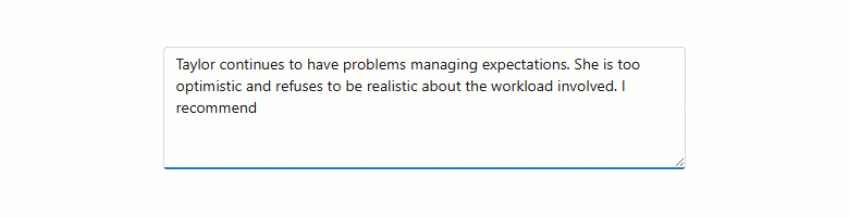
New Blazor Smart Autocomplete
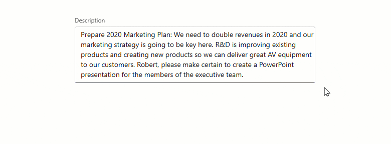
We added a Smart Autocomplete option - a new AI-powered Extension designed to accelerate text input. Smart Autocomplete connects to our Blazor Memo and displays gray inline suggestions based on current input. Suggestions appear within the Blazor Memo Editor without interrupting typing flow. Users can accept a suggestion or simply continue typing to dismiss it.
The Smart Autocomplete Extension provides the following API members to help you customize associated behaviors: InputDelay, SuggestionReceived.
<DxMemo @bind-Text=@TextValue>
    <Extensions>
        <MemoSmartAutoComplete InputDelay="1000"
                               SuggestionReceived="@OnSuggestionReceived" />
    </Extensions>
</DxMemo>

@code {
    string TextValue { get; set; } =
    "Taylor continues to have problems managing expectations. " +
    "She is too optimistic and refuses to be realistic about the workload involved. " +
    "I recommend";

    void OnSuggestionReceived(MemoSmartAutoCompleteSuggestionReceivedEventArgs e) {
        // Handle suggestions
    }
}
Blazor AI Chat
Tool Calling API
AI tool calling connects Blazor application logic with natural language input. DevExpress Blazor AI Chat can invoke methods annotated with metadata (called AI tools) to execute any action in the UI or business logic. The AI service automatically resolves a relevant function at runtime based on chat context.
We’ve added an AI tool calling layer that extends capabilities found in Microsoft.Extensions.AI:
- Target-aware tools
- Tools can operate on specific object instances (UI controls, pages, data services, business objects). The API automatically resolves target objects at runtime based on context and descriptions.
- Flexible tool contexts
- Tools can be grouped into contexts that can be enabled, disabled, or removed dynamically based on application state or user workflow.
- Seamless integration with the AI Chat Control
- The DevExpress Blazor AI Chat Control discovers and merges tools from all registered contexts and manages tool selection, target resolution, parameter binding, and invocation.
The following code snippet registers DevExpress AI services, defines a contextual AI tool, and integrates an AI tool calling pipeline into an application:
@using DevExpress.AIIntegration.Blazor.Chat
@using DevExpress.AIIntegration.Tools
@inject AIToolsContextContainer container

<DxAIChat />
<DxGrid @ref="grid">
    <!-- ... -->
</DxGrid>

@code {
    DxGrid grid;
    AIToolsContext context;

    protected override void OnAfterRender(bool firstRender) {
        if (firstRender) {
            context = new AIToolsContextBuilder()
                .WithToolMethods(ExpandGroups)
                .Build();
            container.Add(context);
        }
    }
}
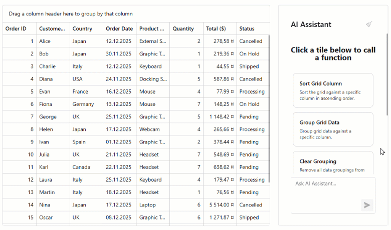
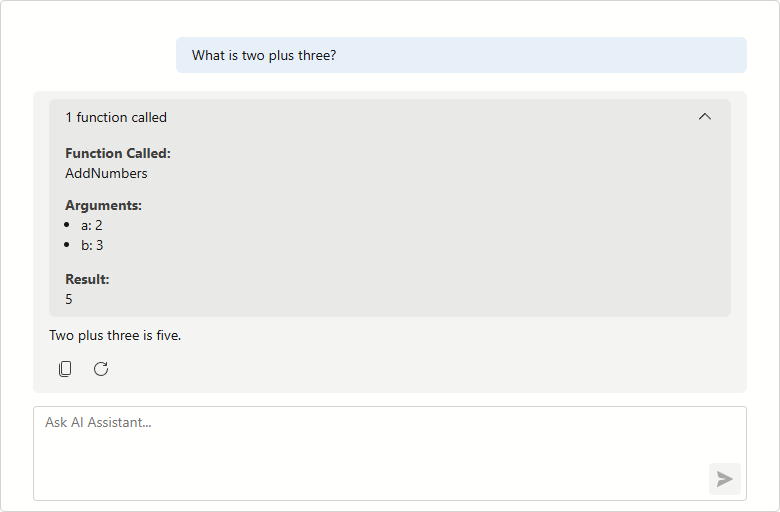
Tool Call Visualization
DevExpress Blazor AI Chat messages now include information about all AI functions invoked in response to a user’s message. Use this information to build custom message templates or use the predefined template to test/debug AI tool calling during development.
Resources
The DevExpress Blazor AI Chat component allows users to attach additional context to chat messages. Resources can include binary files (images, audio, PDFs, documents) and non-file artifacts such as database schemas, structured records, or logs. You can also supply external content retrieved from a Model Context Protocol (MCP) server as a resource.
Use the Resources collection to add or manage resources programmatically.
Resources help the AI model generate more precise answers without fine-tuning and reduce hallucinations.
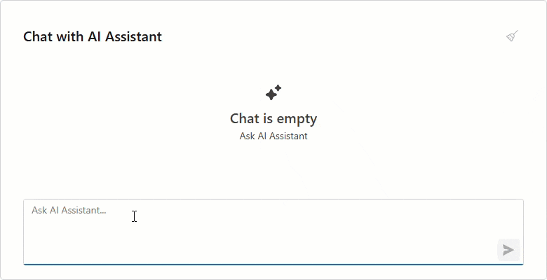
Clear Chat History
DevExpress Blazor AI Chat now displays a customizable chat header and a Clear Chat button (removes all messages from the conversation history, except for system messages).
<DxAIChat ShowHeader="true"
          HeaderText="Chat with AI Assistant" />
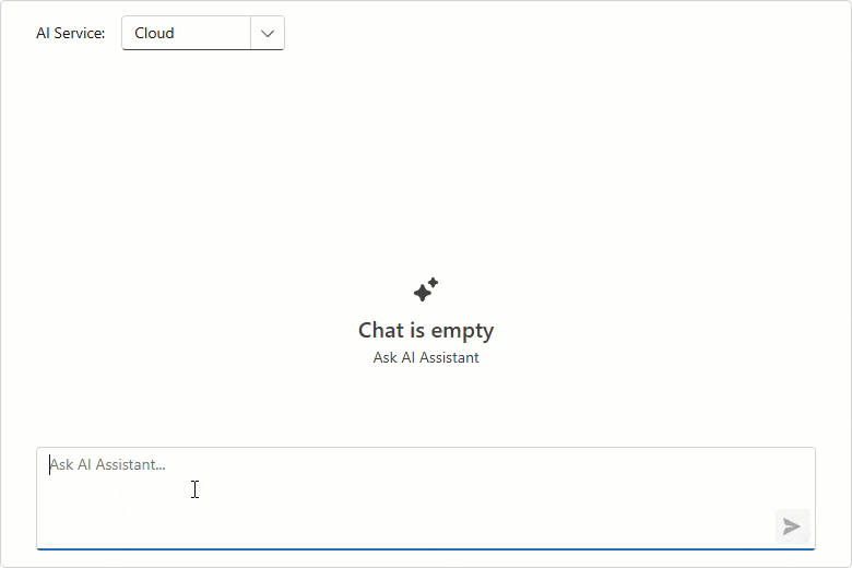
Multiple AI Chat Providers
The DevExpress Blazor AI Chat component can be bound to a specific AI service at runtime. You can allow users to select an AI model or programmatically specify the most suitable model for the current task. For instance, you can use a powerful “thinking” model for complex queries and a faster, more cost-effective model for simpler interactions.
To add multiple services, register each AI model with a unique string key:
// Azure OpenAI client
AzureOpenAIClient azureOpenAIClient = new(
        new Uri(azureOpenAiEndpoint),
        new ApiKeyCredential(azureOpenAiKey)
);
IChatClient azureOpenAIChatClient = azureOpenAIClient.GetChatClient(azureOpenAiModel)
                                                        .AsIChatClient();
// Ollama client
IChatClient ollamaChatClient = new OllamaApiClient("http://localhost:11434", aiModel);
// Register keyed AI services
builder.Services.AddKeyedChatClient("AzureOpenAI", azureOpenAIChatClient);
builder.Services.AddKeyedChatClient("Ollama", ollamaChatClient);
Once registered, use the ChatClientServiceKey property to bind a service to our Blazor AI Chat:
<DxComboBox Data="chatClients"
            TextFieldName="Value"
            ValueFieldName="Key"
            @bind-Value="chatClientServiceKey" />

<DxAIChat ChatClientServiceKey="@chatClientServiceKey" />

@code {
    Dictionary<string, string> chatClients = new()
    {
        { "AzureOpenAI", "Cloud" },
        { "Ollama", "Local" }
    };
    string chatClientServiceKey = "";
    protected override void OnInitialized()
    {
        chatClientServiceKey = chatClients.First().Key;
        base.OnInitialized();
    }
}
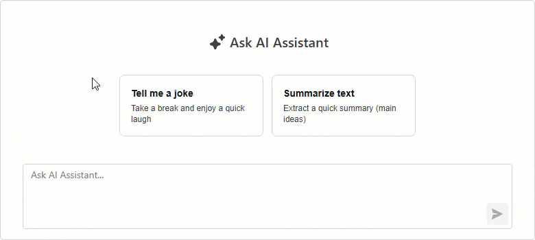
Send Prompt Suggestion on Click
DevExpress Blazor AI Chat automatically inserts a selected prompt suggestion into the chat prompt box so users can edit it before sending. Activate our new SendOnClick property to send prompt suggestions to the server immediately (once clicked) and accelerate conversation flow.
<DxAIChat>
    <PromptSuggestions>
        <DxAIChatPromptSuggestion Title="Tell me a joke"
                                  Text="Take a break and enjoy a quick laugh"
                                  PromptMessage="Tell me a joke about AI."
                                  SendOnClick="true" />
        <DxAIChatPromptSuggestion Title="Summarize text"
                                  Text="Extract a quick summary (main ideas)"
                                  PromptMessage="Summarize the following text:"
                                  SendOnClick="false" />
    </PromptSuggestions>
</DxAIChat>
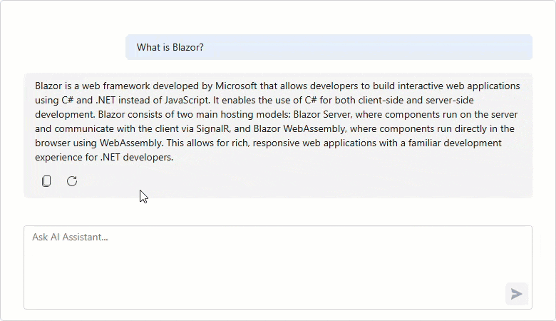
Resizable Input Box
The Blazor AI Chat input box automatically resizes itself as a user types.
Enable the new AllowResizeInput property to drag the topmost edge of the chat input box: up for additional space, down to display more chat history.
<style>
    .my-ai-chat {
        width: 100%;
        height: 400px;
    }
</style>

<DxAIChat
    CssClass="my-ai-chat"
    AllowResizeInput="true" />
Blazor AI Extensions
AI Toolbar Item Text
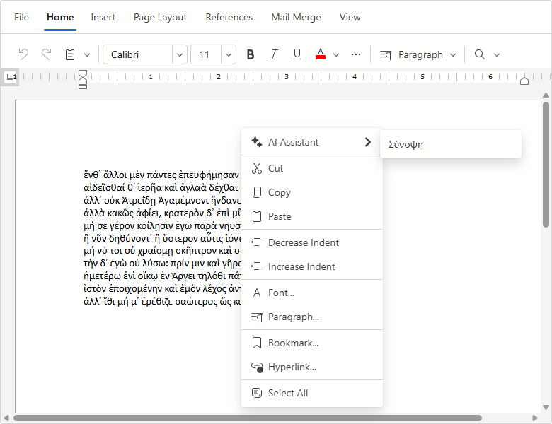
You can now rename Blazor Rich Text Editor and HTML Editor AI toolbar items:
<DxRichEdit>
    <Extensions>
        <SummarizeAIContextMenuItem Text="Σύνοψη" />
    </Extensions>
</DxRichEdit>
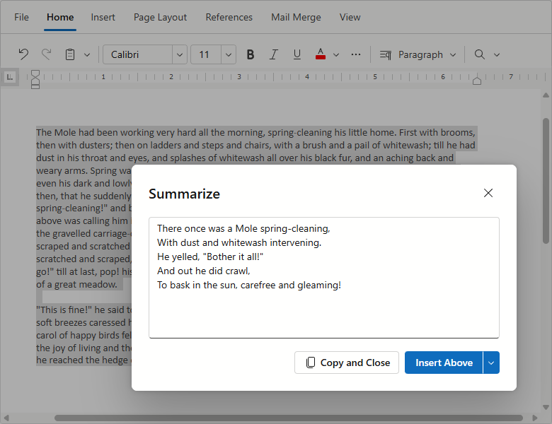
AI Toolbar Prompt Augmentation
DevExpress AI-powered extensions for the Blazor Rich Text Editor and HTML Editor includes pre-built prompts for selected text processing. Using the PromptAugmentation property, you can now add custom instructions to default prompts and enhance AI response relevance/accuracy.
<DxRichEdit>
    <Extensions>
        <SummarizeAIContextMenuItem
            PromptAugmentation="Summarize the text as a humorous limerick." />
    </Extensions>
</DxRichEdit>
Blazor Grid & TreeList
Column Virtualization
DevExpress Blazor Grid and TreeList UI components now support column virtualization. Once this feature enabled, the DevExpress Grid and TreeList only render columns within the current viewport. This reduces DOM size and improves component load time.
You can virtualize both rows and columns simultaneously to ensure fast rendering regardless of table size. Users can navigate through cells using horizontal/vertical scroll bars or keyboard shortcuts.
<DxGrid Data="LargeDataSource"
        VirtualScrollingEnabled="true"
        VirtualScrollingMode="GridVirtualScrollingMode.RowsAndColumns">
    ...
</DxGrid>
Context Menu
Both our Blazor Grid and TreeList include an integrated Context Menu. Users can right-click the following regions to access context-specific commands:
- Data Row
- Group Row
- Column Header
- Footer
- Group Panel
- Group Footer
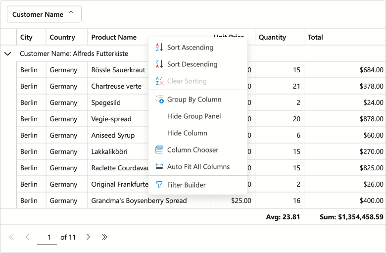
Use the ContextMenus property to enable Context Menu functionality for desired elements.
Predefined Commands
- Auto Fit Columns
- Expand/Collapse
- Group/Ungroup
- Hide Column
- Open Column Chooser Dialog
- Open Filter Builder Dialog
- Show/Hide Group Panel
- Sort Ascending/Sort Descending/Clear Sorting
Item Customization
Handle the CustomizeContextMenu event to customize the menu as requirements dictate:
- Modify predefined items: Change item state, visibility, and appearance.
- Add custom items: Introduce your own commands and actions.
- Customize context menu per element: Example - hide sort commands for a specific column.
The following code snippet hides built-in grouping commands for the Category column and adds custom Fix/Unfix commands for the selection column:
void CustomizeContextMenu(GridCustomizeContextMenuEventArgs args) {
    if (args.Context is GridHeaderCommandContext headerContext) {
        // Customizes context menu commands for the Category column header
        if (headerContext.Column is IGridDataColumn dataColumn && dataColumn.FieldName == "Category") {
            args.Items.Remove(GridContextMenuDefaultItemNames.GroupByColumn);
            args.Items.Remove(GridContextMenuDefaultItemNames.UngroupColumn);
        }
        // Customizes context menu commands for the selection column header
        if (headerContext.Column is IGridSelectionColumn selectionColumn) {
            var isFixed = selectionColumn.FixedPosition != GridColumnFixedPosition.None;
            string itemText = isFixed ? "Unfix Column" : "Fix Column to the Left";
            var newValue = isFixed ? GridColumnFixedPosition.None : GridColumnFixedPosition.Left;

            args.Items.AddCustomItem(itemText, () => {
                headerContext.Grid.BeginUpdate();
                headerContext.Column.FixedPosition = newValue;
                headerContext.Grid.EndUpdate();
            });
        }
    }
}
Integrated Filter Builder
Users can now create complex filter criteria for the DevExpress Blazor Grid and TreeList using a built-in Filter Builder dialog. Our Grid and TreeList components automatically generate Filter Builder fields based on data columns (no additional code is required). Call the ShowFilterBuilder method to open the Filter Builder dialog from code. Alternatively, users can activate this dialog via the Filter Panel.
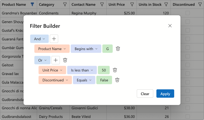
Use the FilterBuilderTemplate to customize the dialog. The template’s RenderDefaultFields method allows you to reuse auto-generated fields within your custom Filter Builder control. The following code snippet adds additional filter fields to the Filter Builder dialog:
<FilterBuilderTemplate>
    <DxFilterBuilder @bind-FilterCriteria="context.FilterCriteria">
        <Fields>
            @context.RenderDefaultFields() // adds auto-generated fields
            <DxFilterBuilderField FieldName="ShipCountry" Caption="Country">
                <EditSettings>
                    <DxComboBoxSettings Data="ShipCountries" />
                </EditSettings>
            </DxFilterBuilderField>
            <DxFilterBuilderField FieldName="ShipCity" Caption="City" />
        </Fields>
    </DxFilterBuilder>
</FilterBuilderTemplate>
Filter Panel
Both DevExpress Blazor Grid and TreeList ship with an integrated Filter Panel. This panel displays the current filter criteria and allows users to:
- Temporarily deactivate the filter
- Open the Filter Builder dialog
- Clear the current filter condition
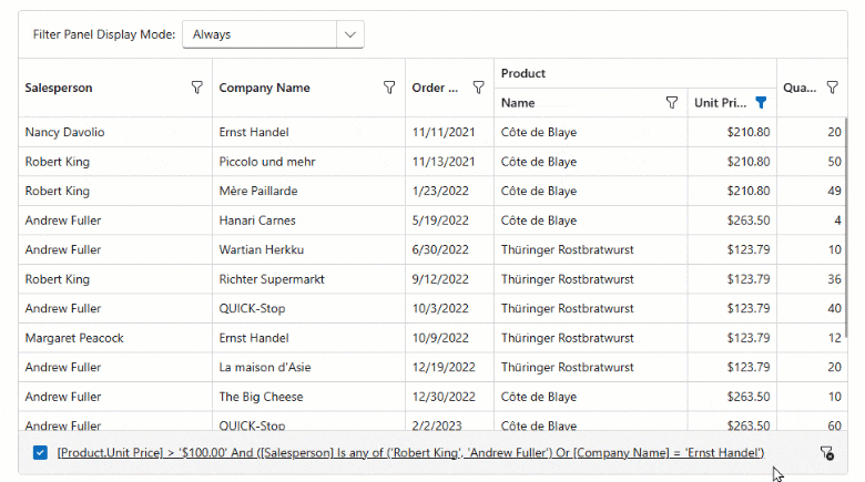
Use the FilterPanelDisplayMode property to add this panel to our Blazor Grid or TreeList component.
Command Column Icons
With v25.2, the DevExpress Blazor Grid and TreeList display built-in icons for command actions by default. This change reduces column width and produces a cleaner, more modern appearance.
To display captions for command buttons, set the command column’s new DisplayMode property to Text or IconsAndText.
Data Export — Preserve Hierarchy for Selected Rows
When exporting DevExpress Blazor Grid or TreeList data, you can activate the ExportSelectedRowsOnly option and export selected records as flat data. Use our new SelectedRowsExportMode option to preserve selected row hierarchy (export selected records along with parent rows).
The following code snippet exports selected Grid records and corresponding group rows to PDF:
await Grid.ExportToPdfAsync("ExportResult", new GridPdfExportOptions() {
    ExportSelectedRowsOnly = true,
    SelectedRowsExportMode = GridSelectedRowsExportMode.KeepGrouping
});
New Scrolling API
New MakeCellVisible and MakeCellVisibleAsync methods allow you to navigate to a specific cell when paging or scrolling is enabled.
Blazor Filter Builder
Official Release
Our Blazor Filter Builder is now ready for production use. We finalized APIs/behaviors and implemented the following new features and enhancements.
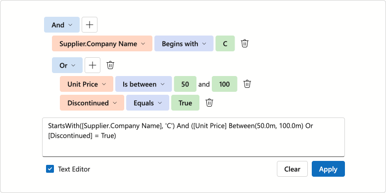
Text Mode for Filter Expressions
The DevExpress Blazor Filter Builder supports text mode for filter expressions. You can use this mode to:
- Copy and paste filter criteria.
- Create flexible conditions incompatible with a tree structure.
- Validate filter syntax and troubleshoot expression errors in real time.
Set the ViewMode property to VisualAndText to activate text mode.
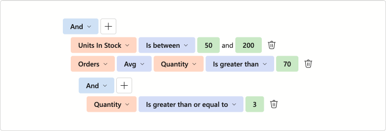
Collection Field and Aggregate Function Support
The DevExpress Blazor Filter Builder supports aggregate operators for fields that store object collections. Available functions include:
ExistsCountAvgSumMin/Max
These functions calculate collection summaries and allow users to create filter conditions based on aggregated results. For instance, users can filter invoices with fewer than 5 items in the Products field. Set the DxFilterBuilderField.IsCollection property to true to create a collection field.
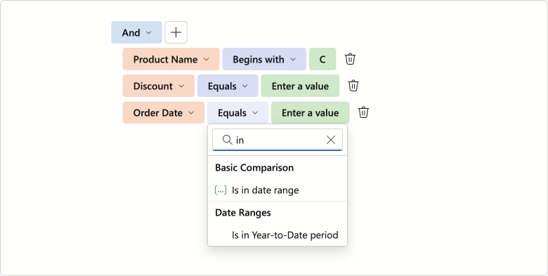
Filter Operator UI Enhancements
We finalized available filter operators (for each data type) and implemented the following operator list enhancements:
- A separate Date Ranges operator group for
DateTimeandDateOnlyfield types - Case-insensitive search option
- Icon support
Keyboard Navigation and Accessibility Support
We added full keyboard navigation support to the DevExpress Blazor Filter Builder UI component. You can navigate between condition rows and individual items, access drop-down lists/value editors without using a mouse. This enhancement improves accessibility and streamlines user workflows, especially for keyboard-centric business solutions.
Operator Customization
v25.2 ships with customization options for operators in the DevExpress Blazor Filter Builder. You can now limit available logical operators using the GroupOperatorTypes property.
<DxFilterBuilder GroupOperatorTypes=@(FilterBuilderGroupOperatorType.And |
                                      FilterBuilderGroupOperatorType.Or)>
    @* ...*@
</DxFilterBuilder>
Our implementation allows you to customize filter operators. Handle the CustomizeOperators event to:
- Manage built-in operator collections
- Add custom criteria functions
- Arrange operators into groups
- Change default operators
- Customize operator captions and icons
<DxFilterBuilder CustomizeOperators="CustomizeOperators" >
    <Fields>
        <DxFilterBuilderField FieldName="Subject" Caption="Name" Type="@typeof(string)" />
        <DxFilterBuilderField FieldName="CreatedDate" Caption="Created Date" Type="@typeof(DateTime)" />
        <DxFilterBuilderField FieldName="Amount" Caption="Amount" Type="@typeof(int)" />
        <DxFilterBuilderField FieldName="Discontinued" Type="@typeof(bool)" />
    </Fields>
</DxFilterBuilder>


@code {
    void CustomizeOperators(FilterBuilderCustomizeOperatorsEventArgs args) {
        if(args.FieldName == "Amount") {
            args.Operators.Clear();
            args.Operators.Add(new FilterBuilderOperatorItem(FilterBuilderOperatorType.Equals));
            args.Operators.Add(new FilterBuilderOperatorItem(FilterBuilderOperatorType.Greater));
            args.Operators.Add(new FilterBuilderOperatorItem(FilterBuilderOperatorType.Less));
            args.DefaultOperator = args.Operators[FilterBuilderOperatorType.Less];
            args.ShowGroups = true;
        }
        if(args.FieldType == typeof(DateTime)) {
            FilterBuilderOperatorItem thisMonthOperator = args.Operators[FilterBuilderOperatorType.IsThisMonth];
            thisMonthOperator.Caption = "Falls in this month";

            var customItem = new FilterBuilderOperatorItem(IsEarlierThisMonth.Instance.Name) {
                GroupName = "Custom functions"
            };
            args.Operators.Add(customItem);
        }
    }
}
Value Templates
The DevExpress Blazor Filter Builder allows you to specify templates used for field values:
- ValueDisplayTemplate — Customizes content and appearance of field value captions.
- ValueEditTemplate — Allows you to replace an autogenerated value editor with custom content.
Templates implement a context parameter that includes DisplayText and Value properties.
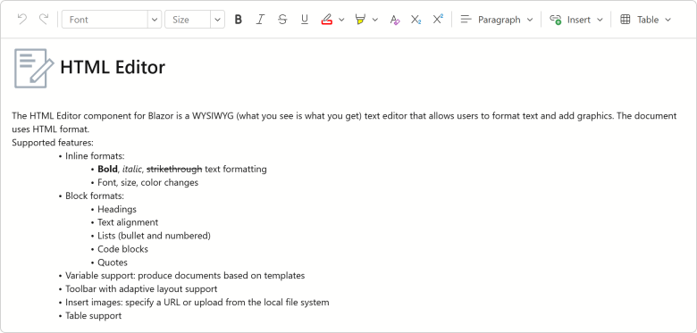
Blazor HTML Editor
Updated Toolbar UI
The DevExpress Blazor HTML Editor now uses our Ribbon component for its built-in toolbar. While existing toolbar customization APIs remain unchanged, the Ribbon delivers improved visuals, a more compact layout, and new adaptive priority settings. In addition, the HTML Editor toolbar now displays colored icons when using Fluent themes.
Blazor Data Editors
Value Changing Events
We added new *Changing events for the following DevExpress Blazor Data Editors.
| Data Editor | New Events |
|---|---|
| ComboBox | TextChanging, ValueChanging |
| DateEdit | DateChanging |
| Drop-Down Box | ValueChanging |
| List Box | ValuesChanging |
| Masked Input | ValueChanging |
| Memo | TextChanging |
| Search Box | TextChanging |
| SpinEdit | TextChanging |
| TagBox | TagsChanging, ValuesChanging |
| Text Box | TextChanging |
These events allow you to validate/cancel user changes before they are applied to editor values.
The following code handles the DateChanging event to prevent weekend day selection in the DateEdit component. If a user tries to select Saturday or Sunday, the Date Edit’s value remains unchanged.
<DxDateEdit @bind-Date="@CurrentDate"
            DateChanging="@OnDateChanging" />

@code {
    DateTime CurrentDate { get; set; } = DateTime.Today;

    void OnDateChanging(ParameterValueChangingEventArgs<DateTime> e) {
        if (e.NewValue.DayOfWeek == DayOfWeek.Saturday ||
            e.NewValue.DayOfWeek == DayOfWeek.Sunday) {
            e.NewValue = e.OldValue;
        }
    }
}
Memo — Adaptive Height Support
The DevExpress Blazor Memo can now automatically adjust height based on content:
- In Auto mode, Memo height changes dynamically to match content.
- The MaxRows property allows you to specify maximum component height (applies in
Auto,Vertical, andVerticalAndHorizontalresize modes). When content exceeds this limit, a vertical scrollbar appears on-screen.
<DxMemo @bind-Text="@TextValue"
        ResizeMode="MemoResizeMode.Auto"
        MaxRows="8">
</DxMemo>
Spin Editor — Spin Button Orientation
You can now switch between horizontal and vertical orientations for DevExpress Blazor Spin Editor increment/decrement buttons. Horizontal orientation places spin buttons side by side (improves accessibility), while vertical orientation stacks them on top of each other (more compact).
<DxSpinEdit Value="15" ShowSpinButtons="false">
    <Buttons>
        <DxSpinButtons Orientation="Orientation.Horizontal"/>
    </Buttons>
</DxSpinEdit>

If the Orientation property is not specified, the Spin Edit automatically arranges buttons based on device type: horizontally on mobile and tablet devices, and vertically on other devices.
TagBox — Keyboard Navigation Enhancements
The DevExpress Blazor TagBox now supports keyboard navigation for tags. Users can use Arrow keys to navigate through tags, and Backspace/Delete to remove them.
Date Edit & Time Edit — Time Selection UI Redesign
We reworked the drop-down menu used for DevExpress Blazor Date Edit and Time Edit components as follows:
- Restyled and repositioned Accept and Cancel buttons (to make them more noticeable).
- Removed the Clear button from the drop down. To clear editor values, use our new Alt+Del shortcut or click the corresponding button in the input element.
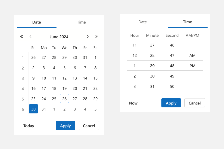
You can enable the ApplyValueOnOutsideClick option to remove Accept and Cancel buttons from the drop down. Date Edit and Time Edit components will update bound values once a user clicks outside a component’s boundaries.
Blazor Navigation
Maximum Dropdown Height
You can specify maximum dropdown height for DevExpress Blazor Context Menu, Menu, and Toolbar components. When menu/drop-down content exceeds DropDownMaxHeight, a scrollbar appears to ensure all items remain accessible. If total height is less than the DropDownMaxHeight, this property will not have a visible effect.
<DxMenu DropDownMaxHeight="100px">
    <Items>
        <DxMenuItem Text="Products" Expanded="true">
            <Items>
                <DxMenuItem Text="JS / TS" />
                <DxMenuItem Text="Blazor" />
                <DxMenuItem Text="ASP.NET Core" />
                <DxMenuItem Text="ASP.NET Web Forms" />
                <DxMenuItem Text="ASP.NET MVC" />
                <DxMenuItem Text="Bootstrap Web Forms" />
                <DxMenuItem Text="Web Reporting" />
            </Items>
        </DxMenuItem>
    </Items>
</DxMenu>
Blazor Pivot Table
Official Release
The DevExpress Blazor Pivot Table is now ready for production use. Our Pivot Table includes the following key features and capabilities:
- High-performance data engine for efficient data processing.
- Data sorting and grouping support.
- Configurable totals and grand totals with flexible positioning.
- Built-in horizontal/vertical scroll bars with sticky Column Field Headers and Row Field Headers areas.
- Virtual scrolling support for both rows and columns.
- Value formatting with integrated templates.
- Full keyboard navigation support.
- Customizable field values and data cell appearance.
Pivot Table RTM version release also means that our previously-available Pivot Grid component is now in maintenance mode. We do not work on new Pivot Grid functionality and plan to remove this component from our distribution in v26.2. We recommend that you migrate to the new Pivot Table. Refer to our Migration Guide for guidance.
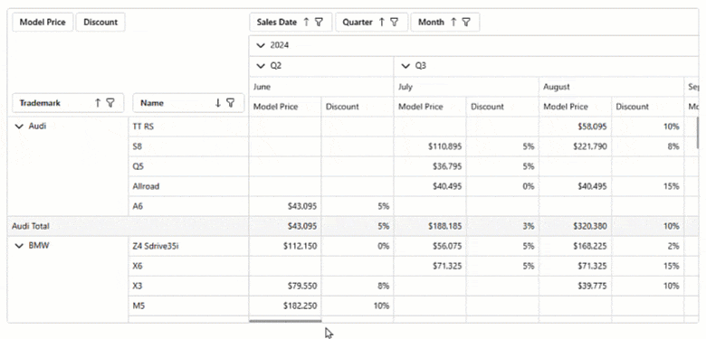
Column Virtualization
Our Blazor Pivot Table supports both row and column virtualization. The new column virtualization feature improves performance when the Pivot Table displays a large number of columns (for instance, when displaying one column per day across an entire year). The component now renders only visible columns, reducing DOM size and improving responsiveness. We also performed extensive internal testing to verify performance and stability in high-density scenarios.
The new VirtualScrollingMode property allows you to specify whether to use row virtualization, column virtualization, or both.
<DxPivotTable Data="SalesData"
              VirtualScrollingEnabled="true"
              VirtualScrollingMode="PivotTableVirtualScrollingMode.Horizontal">
    <Fields>
        @*...*@
    </Fields>
</DxPivotTable>
Keyboard Navigation
The DevExpress Blazor Pivot Table allows users to access UI elements within the following UI regions using the keyboard:
- Filter Area
- Data Field Headers
- Column Headers
- Row Headers
- Column Field Values
- Row Field Values, Data Area, Column Totals, Grand Column Totals, Row Totals
- Row Grand Totals
Supported shortcuts:
- Ctrl+Arrow Up/Arrow Down - Move between navigation areas.
- Arrow keys or Tab/Shift+Tab - Navigate between elements and cells.
- Home/End - Move to the first/last cell in a row or navigation area.
- Alt + Arrow keys, Enter - Expand/collapse groups.
- Shift + scroll wheel - Scroll horizontally.
- Space - Toggle sort order for a focused field header.
- Alt + Arrow Down - Open the filter drop-down menu for a focused field header.
- Enter - Expand/Collapse a focused group.
Blazor Ribbon
Official Release
The DevExpress Blazor Ribbon component is now ready for production use. Version 25.2 ships with expanded APIs, improved UI/UX, adaptive layout, and enhanced accessibility.
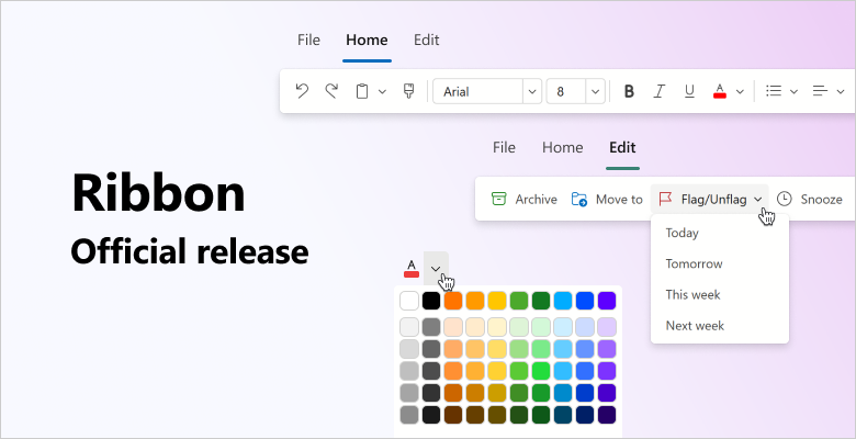
Improved UI/UX
Our Blazor Ribbon was redesigned for cleaner visuals, higher contrast, and faster command discovery. New APIs allow you to customize Ribbon appearance as requirements dictate:
- Visually emphasize Ribbon buttons using the
IsPrimaryattribute. - Apply custom CSS classes to the Ribbon application tab, buttons, and drop-down menus.
- Limit the maximum height of Ribbon drop-down menus. A scrollbar appears if menu content exceeds the specified value.
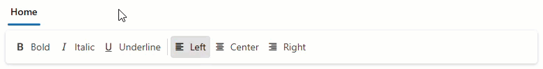
Toggle Buttons
The new DevExpress Blazor Ribbon DxRibbonToggleItem component adds a button with a persistent selection state. Use it for option buttons that remain active until deactivated.
Combine multiple Toggle Buttons into a Toggle Group and ensure only one button is selected at any one point in time.
<DxRibbon>
    <DxRibbonTab Text="Home">
        <DxRibbonGroup>
            <DxRibbonToggleItem Text="Bold"
                                IconCssClass="dx-icon-bold" />
            <DxRibbonToggleItem Text="Italic"
                                IconCssClass="dx-icon-italic" />
            <DxRibbonToggleItem Text="Underline"
                                IconCssClass="dx-icon-underline" />
        </DxRibbonGroup>
        <DxRibbonGroup>
            <DxRibbonToggleGroup>
                <DxRibbonToggleItem Text="Left"
                                    IconCssClass="dx-icon-alignleft" />
                <DxRibbonToggleItem Text="Center"
                                    IconCssClass="dx-icon-aligncenter" />
                <DxRibbonToggleItem Text="Right"
                                    IconCssClass="dx-icon-alignright" />
            </DxRibbonToggleGroup>
        </DxRibbonGroup>
    </DxRibbonTab>
</DxRibbon>
Adaptive Layout
DevExpress Blazor Ribbon automatically adapts to available screen space:
- Hides lower-priority details (such as button captions).
- Collapses groups into drop-down menus.
- Moves excess items into structured overflow menus.
The Ribbon offers two adaptivity modes: single overflow menu (collapses all items and groups into one structured menu) and per-group overflow menus (each group uses its own menu). Select a mode using AdaptivityAutoCollapseItemsToGroups.
You can also configure item relative priority so that essential commands remain visible even on narrow screens.
Accessibility & Keyboard Navigation
DevExpress Blazor Ribbon offers full keyboard navigation across tabs, groups, and items. Keyboard shortcuts allow users who cannot use a mouse or rely on assistive technologies (like screen readers or switch devices) to interact with application content:
- Tab moves focus to the next/previous Ribbon element.
- Arrow keys move focus between Ribbon elements and open/close drop-down menus.
- Enter or Space clicks the focused Ribbon item.
- Home / End focuses the first/last item.
- Esc closes drop-down menus.
You can also assign HTML and ARIA attributes (roles, states, labels) to Ribbon controls to improve screen reader output and strengthen accessibility compliance.
API Enhancements
- ActiveTabIndex | ActiveTabIndexChanged — Switch tabs programmatically and obtain the active tab index.
- ApplicationTabClick | ApplicationTabItemClick | ItemClick | NodeEvent — Allow you to handle events at the Ribbon level (instead of attaching listeners to each item).
- ShowTabs — Hides tab captions for a compact, toolbar-style layout.
- DxRibbonApplicationTab.Enabled | DxRibbonApplicationTabItem.Enabled | Visible — Disable or hide the application tab or specific controls within it.
- AutomaticColor | AutomaticColorCaption — Display an automatic color swatch above a color picker palette.
- EditText | EditTextChanged — Allow users to enter custom values into ComboBoxes.
- NavigateUrl | Target — Navigate to the specified URL once an item is clicked.
- IconUrl | IconCssClass — Assign icons to tabs.
Rich Text Editor and HTML Editor Integration
The DevExpress Rich Text Editor and HTML Editor now use our new Ribbon to unify APIs, simplify configuration, and deliver a consistent appearance.
Blazor Rich Text Editor
Scroll API
The DevExpress Blazor Rich Text Editor allows you to scroll documents programmatically using the following methods:
- ScrollToPageAsync — Scrolls the document to the specified page.
- ScrollToPositionAsync — Scrolls the view to the specified position in the main sub-document or in headers/footers (using optional parameters).
<DxRichEdit @bind-DocumentContent="@documentContent" @ref="richEdit" />

<DxButton Text="First page" Click="@ScrollToFirstPage" />
<DxButton Text="Footer" Click="@ScrollToFooter" />

@code {
    DxRichEdit richEdit;
    byte[] documentContent;
    string filePath = "C:\\Users\\Public\\example.docx";

    protected override async Task OnInitializedAsync() {
        documentContent = await File.ReadAllBytesAsync(filePath);
        await base.OnInitializedAsync();
    }

    async Task ScrollToFirstPage() {
        await richEdit.ScrollToPageAsync(0);
    }
    async Task ScrollToFooter() {
        Section section = await richEdit.DocumentAPI.Sections.GetAsync(0);
        SubDocument footer = await section.GetFooterAsync();
        if(footer != null)
            await richEdit.ScrollToPositionAsync(0, footer);
    }
}
Updated Ribbon UI
The DevExpress Blazor Rich Text Editor now uses our Ribbon component to display built-in commands. While existing customization APIs remain unchanged, the new Ribbon delivers improved visuals, a more compact layout, and adaptive priority settings for items and groups. In addition, the Rich Text Editor Ribbon now displays colored icons when using Fluent themes.
Blazor Scheduler
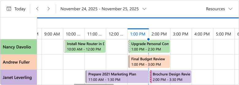
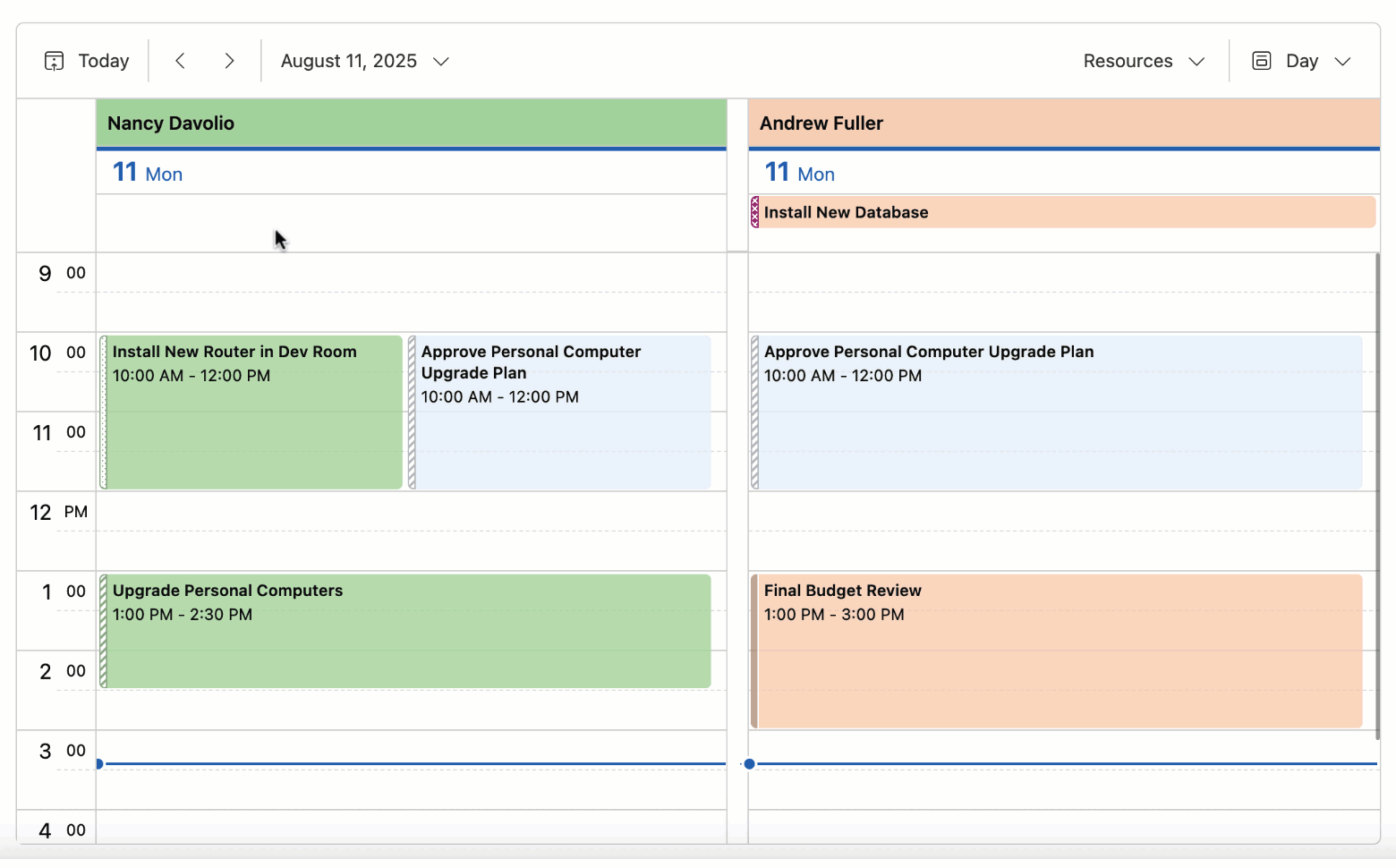
Timeline & Month Views — Compact Cell Size
Our Blazor Scheduler calculates cell height based on the number of appointments and associated size. We also removed the minimum height requirement (160px in Fluent; 150px in classic themes). This change allows you to create more compact interfaces and maximize on-screen information display.
You can use the following properties to modify cell size based on design requirements:
CellMinHeight- Specifies minimum cell height.
LastAppointmentIndent- Specifies indent from the last appointment to the cell border.
ResourceCaptionOrientation- Specifies resource caption arrangement (vertically or horizontally) when appointments are grouped.
VerticalResourceCellWidth- Specifies resource cell width for horizontally aligned resource captions.
<DxScheduler @bind-StartDate="@StartDate"
             DataStorage="@DataStorage"
             GroupType="SchedulerGroupType.Date">
    <DxSchedulerTimelineView Duration="@TimeSpan.FromHours(48)"
                             CellMinHeight="50"
                             LastAppointmentIndent="3"
                             ResourceCaptionOrientation="Orientation.Horizontal"
                             VerticalResourceCellWidth="120">
        <Scales>
            <DxSchedulerTimeScale Unit="@SchedulerTimeScaleUnit.Day" UnitCount="1" />
        </Scales>
    </DxSchedulerTimelineView>
</DxScheduler>
Time Cells & Appointment Hover Effect
We added a new effect indicating that a hovered cell is interactive:
- For an empty area, the hover effect suggests to create a new appointment.
- For existing appointments, the hover effect signals that the item can be edited or resized.
If you disable appointment generation or editing, hover will not appear on-screen.
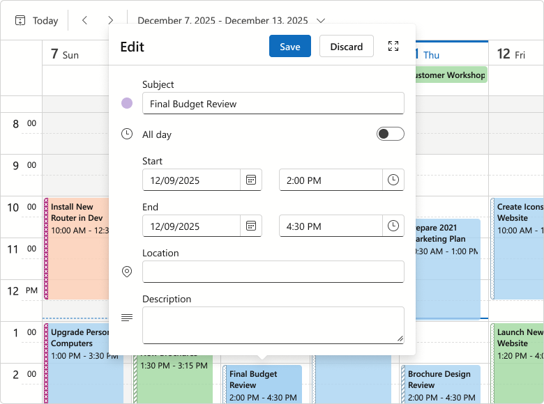
Appointment Tooltip & Edit Form Layout Changes
We reworked the design of Blazor Scheduler popup elements (tooltip and compact/extended edit form) as follows:
- Introduced dedicated captions for tooltips and creating/editing appointments.
- Replaced solid fill in element headers with less colorful alternatives.
- Redesigned Save, Discard, and Expand buttons in edit forms.
- Removed the Close button tooltip.
- Removed the Resource field placeholder from the edit form.
These changes improve visual structure, reduce unnecessary spacing, and contribute to a cleaner, more consistent UI.
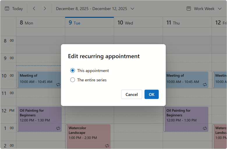
Recurring Appointment Dialogs — Option Button Redesign
We replaced buttons with a radio group for our Blazor Edit/Delete Recurring Appointment dialogs (improved user experience/design).
Blazor Themes
Design System Documentation
We documented DevExpress Design System foundations in our v25.2 release cycle. Design System documentation covers key styling principles behind our Fluent themes, including design tokens, their semantic roles, and how they map to UI elements. Blazor Fluent themes implement these tokens (via CSS variables) to apply color, typography, and spacing styles.
Fluent — Public CSS Variables
We finalized CSS variables available in Fluent. You can now use --dxds-* variables to customize Fluent themes or simply reference these variables in your own stylesheets.
.my-card {
    position: relative;
    display: flex;
    flex-direction: column;
    min-width: 0;
    overflow-wrap: break-word;
    background-color: var(--dxds-color-surface-neutral-default-rest);
    background-clip: border-box;
    border: var(--dxds-border-width-10) solid var(--dxds-color-border-neutral-default-rest);
    border-radius: var(--dxds-border-radius-40);
}
Fluent — Bootstrap Styles
Fluent themes now ship with optional Bootstrap styles for the default color accent (blue) in both light and dark modes. You can include Bootstrap styles as follows:
@DxResourceManager.RegisterTheme(Themes.Fluent.Clone(properties => {
    properties.UseBootstrapStyles = true;
}))
For styles dependent on Fluent accent colors, we recommend using DevExpress CSS variables instead. Due to Bootstrap’s CSS architecture, Bootstrap styles will not reflect your accent colors, so use them for non-color customizations.
Blazor Upload & File Input
File Type Validation Enhancement
The DevExpress Blazor Upload and File Input components include new DxUpload.ValidateByAcceptedFileTypes and DxFileInput.ValidateByAcceptedFileTypes properties designed to disable MIME type validation.
<DxUpload Name="myFile" UploadUrl="https://localhost:10000/api/Upload/Upload/"
          AcceptedFileTypes="@(new List<string> { "image/*"})"
          ValidateByAcceptedFileTypes="false">
</DxUpload>
Blazor Windows
DropDown & Flyout — Keyboard Navigation Support
DevExpress Blazor DropDown and Flyout components now offer the following accessible keyboard navigation options:
- When a window is open, focus moves to its first interactive element or the Close button.
- Tab / Shift+Tab move focus to the next/previous focusable element inside a window. In non-modal windows, focus can exit to surrounding page content or to the next/previous window when you move past the last/first element.
- Escape closes the active window.
Message Box HTML Attributes
The DevExpress Blazor Message Box allows you to add standard HTML attributes at runtime. Use the Attributes property to supply the Attributes collection, or specify individual attributes directly in Message Box markup. Semantic attributes improve screen reader support and strengthen accessibility compliance.
<DxMessageBox @bind-Visible="MessageBoxVisible"
              Title="Error"
              Text="Unable to process the request. Please try again later or contact support."
              OkButtonText="Contact Support"
              CancelButtonText="Try Later"
              RenderStyle="MessageBoxRenderStyle.Danger"
              Type="MessageBoxType.Confirmation"
              data-priority="1" />

@code {
    bool MessageBoxVisible { get; set; } = false;

    protected override void OnInitialized()
    {
        base.OnInitialized();
        MessageBoxVisible = true;
    }
}