Scrolling in Blazor Grid
- 6 minutes to read
The DevExpress Blazor Grid component supports regular and virtual scrolling modes. You can specify these modes separately for rows or columns. You can also combine scrolling with paging. For instance, you can use regular horizontal scrolling with virtual vertical scrolling, or combine paging with column virtualization.
Regular Scrolling
The Grid automatically displays vertical/horizontal scrollbars if content does not fit the component container.
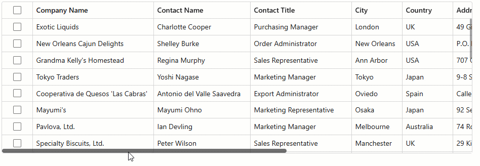
You can specify a column’s FixedPosition property to freeze the column and keep it visible on screen while a user scrolls content horizontally. The following code sample fixes two columns to the left and limits Grid dimensions to activate scrolling:
@inject NwindDataService NwindDataService

<DxGrid Data="@Data"
        CssClass="my-grid"
        ShowAllRows="true">
    <Columns>
        <DxGridSelectionColumn FixedPosition="GridColumnFixedPosition.Left" Width="60px" />
        <DxGridDataColumn FieldName="ContactName" Width="190px" />
        <DxGridDataColumn FieldName="ContactTitle" Width="200px" />
        <DxGridDataColumn FieldName="CompanyName" FixedPosition="GridColumnFixedPosition.Left" Width="240px"/>
        <DxGridDataColumn FieldName="City" Width="100px" />
        <DxGridDataColumn FieldName="Country" Width="100px" />
        <DxGridDataColumn FieldName="Address" Width="270px" />
        <DxGridDataColumn FieldName="Fax" Width="120px" />
        <DxGridDataColumn FieldName="PostalCode" Width="100px" />
        <DxGridDataColumn FieldName="Phone" Width="150px" />
    </Columns>
</DxGrid>
@code {
    object Data { get; set; }
    protected override async Task OnInitializedAsync() {
        Data = await NwindDataService.GetSuppliersAsync();
    }
}
Virtual Scrolling
Column/row virtualization allows you to optimize DevExpress Blazor Grid performance when working with large datasets. Set the VirtualScrollingEnabled property to true to activate virtual scrolling. Use the VirtualScrollingMode property to specify whether to virtualize rows, columns, or both.
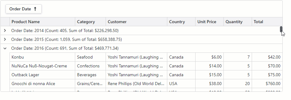
The following example activates virtualization for both rows and columns:
@inject NwindDataService NwindDataService
<DxGrid Data="GridData"
CssClass="my-grid"
TextWrapEnabled="false"
ShowGroupPanel="true"
VirtualScrollingMode="GridVirtualScrollingMode.RowsAndColumns"
VirtualScrollingEnabled="true"
SkeletonRowsEnabled="true">
<Columns>
<DxGridBandColumn Caption="Product">
<Columns>
<DxGridDataColumn FieldName="ProductId" Caption="ID" Width="100px" />
<DxGridDataColumn FieldName="ProductName" Caption="Name" MinWidth="180" />
<DxGridDataColumn FieldName="UnitPrice" DisplayFormat="c" Width="120px" />
<DxGridDataColumn FieldName="Quantity" Width="80px" />
<DxGridDataColumn FieldName="Discount" DisplayFormat="p0" Width="100px" />
<DxGridDataColumn FieldName="ExtendedPrice" Caption="Total" DisplayFormat="c" Width="120px" />
</Columns>
</DxGridBandColumn>
<DxGridBandColumn Caption="Customer">
<Columns>
<DxGridDataColumn FieldName="CustomerId" Caption="Full Name" MinWidth="200" Width="20%">
<EditSettings>
<DxComboBoxSettings Data="Customers" ValueFieldName="CustomerId"
TextFieldName="DisplayText" />
</EditSettings>
</DxGridDataColumn>
<DxGridDataColumn FieldName="CompanyName" Caption="Company" MinWidth="140" />
<DxGridDataColumn FieldName="ContactName" MinWidth="140" />
<DxGridDataColumn FieldName="ContactTitle" Caption="Title" MinWidth="140" />
<DxGridDataColumn FieldName="Phone" MinWidth="140" />
<DxGridDataColumn FieldName="Fax" MinWidth="140" />
<DxGridDataColumn FieldName="Address" MinWidth="200" />
<DxGridDataColumn FieldName="City" Width="120px" />
<DxGridDataColumn FieldName="Region" Width="120px" />
<DxGridDataColumn FieldName="PostalCode" Width="120px" />
<DxGridDataColumn FieldName="Country" Width="140px" />
</Columns>
</DxGridBandColumn>
<DxGridBandColumn Caption="Shipping">
<Columns>
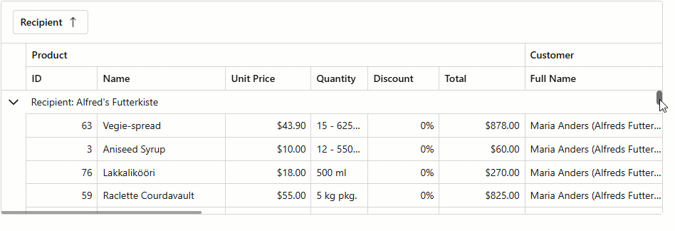
<DxGridDataColumn FieldName="ShipName" Caption="Recipient" GroupIndex="0" />
<DxGridDataColumn FieldName="ShipAddress" Caption="Address" MinWidth="200" />
<DxGridDataColumn FieldName="ShipCity" Caption="City" Width="120px" />
<DxGridDataColumn FieldName="ShipRegion" Caption="Region" Width="120px" />
<DxGridDataColumn FieldName="ShipPostalCode" Caption="Postal Code" Width="140px" />
<DxGridDataColumn FieldName="ShipCountry" Caption="Country" Width="140px" />
</Columns>
</DxGridBandColumn>
</Columns>
</DxGrid>
@code {
// ...
}
Row Virtualization (Vertical)
The Grid virtualizes only rows when the VirtualScrollingMode is set to Rows (default). Switch to the RowsAndColumns mode to activate both vertical and horizontal virtualization.
When virtualized vertically, the Grid renders all rows that are in the viewport and several rows above and below that viewport. The additional row count depends on the bound data source and Grid layout.
Specifics and Limitations
Note the following specifics and limitations when using row virtualization:
- Grid Height
- For optimal performance, define a CSS constraint for the Grid height. Without it, the Grid automatically adjusts its height (up to a maximum of 10,000 pixels) to fit all rows.
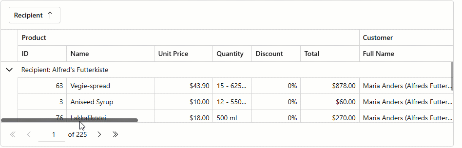
- Paging
- The PageSize property has no effect and all data rows are on one page. The Grid hides the pager and displays the vertical scrollbar that allows users to navigate through data.
- Remote Data Sources
- When bound to a remote data source (Server Mode or Queryable), the Grid initially loads only records to render and requests additional data in small chunks as the user scrolls. This approach minimizes initial load time and improves performance for large datasets.
- Row Height
- To optimize scrolling performance, you can set the Grid’s TextWrapEnabled property to
false. This option disables word wrap in Grid cells and ensures all rows have the same height. Identical row height allows faster layout calculation. - Select All Checkbox
- Vertical virtual scrolling mode affects Select All checkbox appearance and behavior. Refer to the following topic for additional information: SelectAllCheckboxMode.
- Skeleton Rows
- The Grid component renders skeleton rows when it retrieves data from a remote data source. When the component retrieves data from an in-memory data source, skeletons are disabled (since response times are shorter). Use the SkeletonRowsEnabled property to alter skeleton behavior.
Column Virtualization (Horizontal)
Set the VirtualScrollingMode to Columns to virtualize only Grid columns. Switch to the RowsAndColumns mode to activate both horizontal and vertical virtualization.
When virtualized horizontally, the Grid renders only columns that are in the viewport and dynamically renders additional cells as users scroll right or left.
Specifics and Limitations
Note the following specifics and limitations when using column virtualization:
- Auto Fit
- The AutoFitColumnWidths() method has no effect. The Auto Fit All Columns context menu command is disabled.
- Fixed Columns
- Specify a column’s FixedPosition property to freeze (anchor) the column and keep it visible on screen while a user scrolls content horizontally.
- Header Rendering
- To additionally improve performance, the Grid component does not render column filter menus and sort glyphs for virtualized data columns. Use the following template context properties to display a specific caption when a column is virtualized:
- Max Allowed Column Count
- A Grid containing more than 1,000 columns cannot be virtualized horizontally due to CSS limitations.
- Skeleton Columns
- The Grid component renders skeleton columns when it retrieves data from a remote data source. When the component retrieves data from an in-memory data source, skeletons are disabled (since response times are shorter). Use the SkeletonRowsEnabled property to alter skeleton behavior.
- Keyboard Navigation
- When you navigate Grid cells horizontally using keyboard, the row height may change based on cell content size. To ensure all cells have the same height, set the Grid’s TextWrapEnabled property to
falseor set a fixed row height using the CustomizeElement event.
Scrolling API
In both regular and virtual scrolling modes, call the following methods to scroll the Grid to the target record/cell:
- MakeCellVisible
- Navigates to the cell displayed at the intersection of the specified row and data column.
- MakeCellVisibleAsync
- Navigates to the cell bound to the specified data item’s field.
- MakeRowVisible
- Makes the row with the specified visible index visible on screen.
- MakeDataItemVisibleAsync
- Makes the row bound to the specified data item visible on screen.