RepositoryItemGridLookUpEditBase.PopupViewType Property
Gets or sets the type of View used to represent data in the dropdown.
Namespace: DevExpress.XtraEditors.Repository
Assembly: DevExpress.XtraGrid.v25.2.dll
NuGet Packages: DevExpress.Win.Grid, DevExpress.Win.Navigation
Declaration
[DefaultValue(GridLookUpViewType.Default)]
[DXCategory("View")]
public GridLookUpViewType PopupViewType { get; set; }Property Value
| Type | Default | Description |
|---|---|---|
| GridLookUpViewType | Default | A GridLookUpViewType value that specifies the type of the current View. |
Available values:
| Name | Description |
|---|---|
| Default | The default View is used. Currently this option is the same as the GridView option |
| GridView | Corresponds to a GridView View. |
| BandedView | Corresponds to a BandedGridView View. |
| AdvBandedView | Corresponds to an AdvBandedGridView View. |
| TileView | Corresponds to a TileView. |
Remarks
Use this property to change the type of View used to represent data within the embedded grid control. Assigning a new value to the PopupViewType property creates a new View object and assigns it to the RepositoryItemGridLookUpEditBase.PopupView property (the previously assigned View is disposed of).
You may need to perform additional customizations of the created View. For instance, after you activate the BandedView or AdvBandedView format, you need to manually create bands and add columns to the bands. Otherwise, these Views cannot display data.
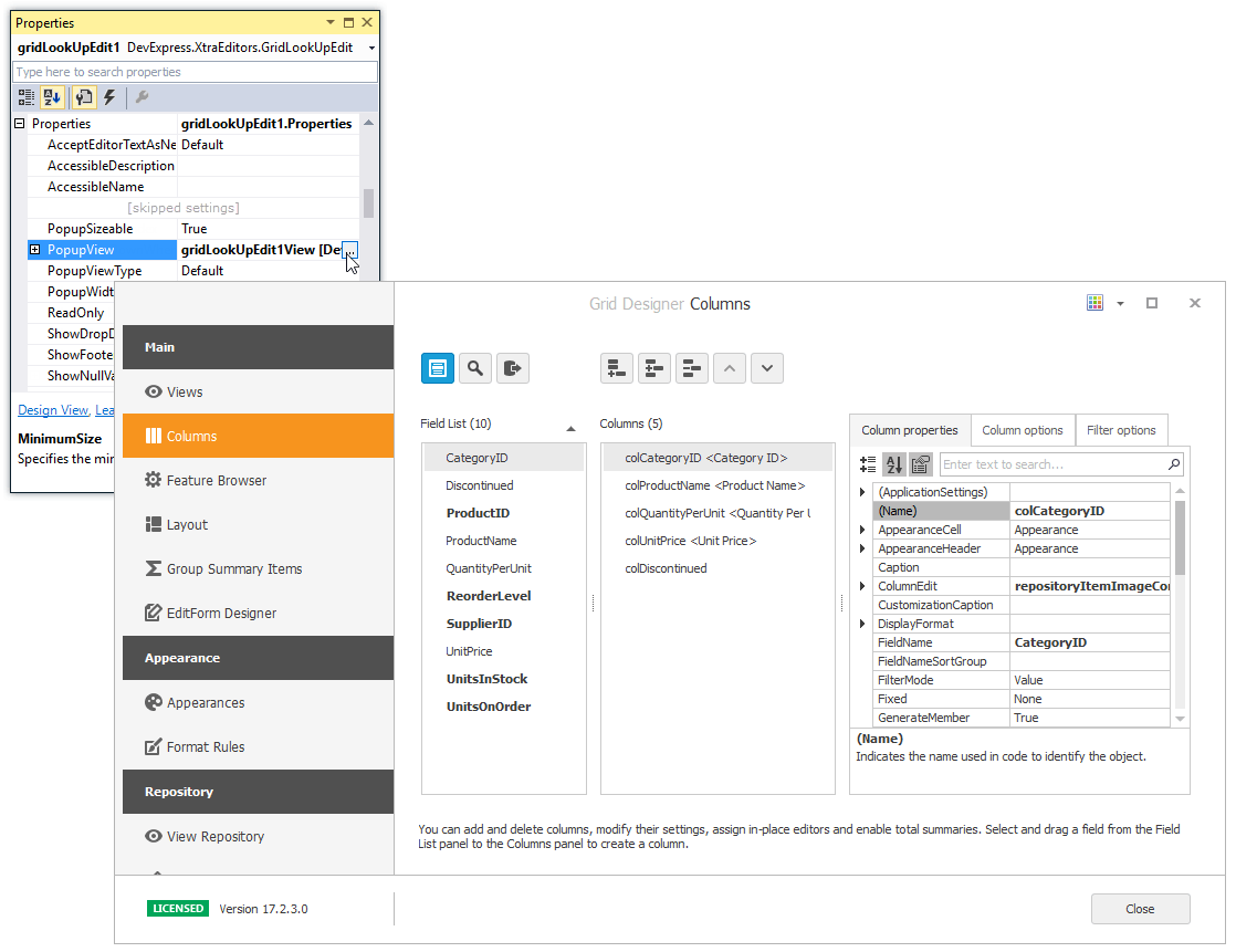
At design time, you can customize the View with the Data Grid Designer. To open the designer, do one of the following:
- click the ellipsis button for the PopupView property in Properties grid.
- invoke the Designer View command from the Properties window or the control’s smart tag.
