RibbonControl Class
Allows you to create a Ribbon toolbar with commands grouped into categories, pages and page groups.
Namespace: DevExpress.XtraBars.Ribbon
Assembly: DevExpress.XtraBars.v25.1.dll
NuGet Package: DevExpress.Win.Navigation
Declaration
[DXLicenseWinForms]
public class RibbonControl :
    ControlBase,
    IBarObject,
    IXtraSerializable,
    IXtraSerializableLayout,
    ICustomBarControl,
    IExtenderProvider,
    IDXMenuManager,
    IDXDropDownMenuManager,
    ISupportXtraAnimation,
    IToolTipControlClientEx,
    IToolTipControlClient,
    IEditorBackgroundProvider,
    IBackstageViewOwner,
    ISupportInitialize,
    ISupportGlassRegions,
    IGestureClient,
    ISupportAdornerUIRibbon,
    ISupportAdornerUIManager,
    IWin32Window,
    IUpdateAdornerUI,
    IPopupControlOwner,
    ICommandOwnerControl,
    ISupportDXSkinColors,
    ISupportImageDragDrop,
    IXtraSupportForceInitialize,
    IScaleDpiProvider,
    ISupportSingleTapToShowKeyboard,
    ITransparentBackgroundManagerEx,
IKeyboardSelectionClientRemarks
The Ribbon Control displays various commands, generally represented as buttons, by categorizing them into pages and page groups. The following screenshot shows a sample Ribbon Control which consists of two pages (“Home” and “View”). The first page contains three groups (“New”, “Actions”, and “Quick Letter”), and each group contains specific commands.

Structurally, a Ribbon Control contains one or more pages which are displayed as tabs. The control’s pages, which are represented by RibbonPage objects, can be accessed with the RibbonControl.Pages collection. You can use the RibbonControl.Pages property to add, remove and access specific pages and customize their settings.
A Ribbon page is divided into groups which display specific commands. Page groups (RibbonPageGroup class objects) can be accessed from the RibbonPage.Groups property.
Each page group can display various elements: buttons, static text, submenus, editors, etc. To add a specific element to the group, create a corresponding bar item and add it to the RibbonPageGroup.ItemLinks collection. For information on bar items and bar item links, refer to Items and Item Links.
Note
If you create bar items in code, ensure the following:
- All bar items are added to the RibbonControl.Items collection. Otherwise, bar items may not function properly (for instance, a submenu may not be displayed).
The following list shows the correct ways to create bar items while adding them to the RibbonControl.Items collection.
- Using the BarItems.CreateButton, BarItems.CreateCheckItem, BarItems.CreateMenu, BarItems.CreateSplitButton and RibbonBarItems.CreateButtonGroup methods of the RibbonControl.Items object.
- Using the BarItem descendant constructor with the manager parameter. Pass the object specified by the RibbonControl.Manager property as this parameter.
- Using the BarItem descendant default constructor and then manually adding the created bar item to the RibbonControl.Items collection.
- All bar items have their BarItem.Id properties initialized to unique values. This ensures correct functioning of the bar item (de)serialization mechanism.
The BarItem.Id properties can be initialized with the BarManager.GetNewItemId method accessible from the RibbonControl.Manager object.
The Quick Access Toolbar displayed by default at the top of the Ribbon Control allows you to display the most used commands. Use the RibbonControl.ToolbarLocation property to control the toolbar’s position and visibility. The RibbonControl.Toolbar property permits you to access the toolbar and customize its contents.
For more information on Ribbon elements, see Ribbon Control.
Popup Menus for External Controls
When you place a RibbonControl on a form at design time, all controls publish the PopupContextMenu extender property (its caption in the Properties window looks like ‘PopupContextMenu on ribbonControl1’). You can use this property to assign a PopupMenu or RadialMenu menu for this control. This menu will be displayed when right-clicking the control at runtime.

To assign a popup menu for a control in code, use the RibbonControl.SetPopupContextMenu method.
Note
Specific complex controls such as Grid Control and Tree List do not publish the PopupContextMenu property, as these controls support different context menus for different visual elements. See the help documentation on these products to learn how to work with context menus in these controls.
Notes
Note
Using regular bars (a BarManager component) and a RibbonControl within the same form/user control is not recommended, as the Bar Manager and Ribbon Control components may conflict with each other. Use either a Bar Manager or a Ribbon Control within a single form/user control.
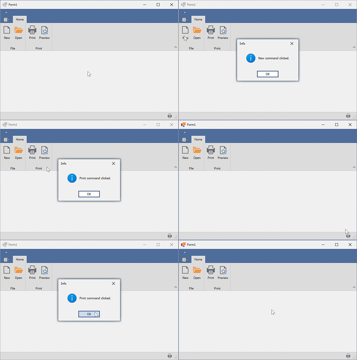
Example
This example creates DevExpress WinForms RibbonControl and
RibbonStatusBar:
- The
RibbonControlcontains the “Home” page, “File” and “Print” groups, and four commands (bar items). - The
RibbonStatusBardisplays the “Print” command. The “Print” command is aligned to the right.
The following animation shows the result:

Prerequisites
In this example, the SvgImageCollection was created and populated with SVG images at design-time.
Note
When creating the Ribbon UI in code, ensure that the following requirements are met:
- All bar items are added to the RibbonControl.Items collection.
- All bar items have unique identifiers (the BarItem.Id property should be set to a unique value).
using System.Windows.Forms;
using DevExpress.XtraBars.Ribbon;
using DevExpress.XtraBars;
using DevExpress.XtraEditors;

namespace DXApplication
{
    public partial class Form1 : XtraForm
    {
        public Form1()
        {
            InitializeComponent();
            // Create the DevExpress RibbonControl
            RibbonControl ribbon = new RibbonControl();
            this.Controls.Add(ribbon);
            /* Assign the SVG image collection to display images/icons within bar items.
             * In this example, the svgImageCollection1 was created and populated with SVG images at design-time.
             */
            ribbon.Images = svgImageCollection1;

            // Create a Ribbon page.
            RibbonPage pageHome = new RibbonPage("Home");
            ribbon.Pages.Add(pageHome);
            // Create a Ribbon page group.
            RibbonPageGroup groupFile = new RibbonPageGroup("File");
            pageHome.Groups.Add(groupFile);
            // Create another Ribbon page group.
            RibbonPageGroup groupPrint = new RibbonPageGroup("Print");
            pageHome.Groups.Add(groupPrint);

            // Create button items and add them to the 'File' group.
            BarButtonItem itemNew = ribbon.Items.CreateButton("New");
            // Ensures correct runtime layout (de)serialization.
            itemNew.Id = ribbon.Manager.GetNewItemId();
            // Specifies the image.
            itemNew.ImageOptions.SvgImage = svgImageCollection1["new"];
            itemNew.RibbonStyle = RibbonItemStyles.Large;
            itemNew.ItemClick += ItemClick;

            BarButtonItem itemOpen = ribbon.Items.CreateButton("Open");
            itemOpen.Id = ribbon.Manager.GetNewItemId();
            itemOpen.RibbonStyle = RibbonItemStyles.Large;
            itemOpen.ImageOptions.SvgImage = svgImageCollection1["open"];
            itemOpen.ItemClick += ItemClick;

            groupFile.ItemLinks.AddRange(new BarItem[] { itemNew, itemOpen });

            /* Create a button item using its constructor and add the button item to the 'Print' group.
             * The constructor automatically adds the new item to the RibbonControl's Items collection.
             */
            BarButtonItem itemPrint = new BarButtonItem(ribbon.Manager, "Print")
            {
                Id = ribbon.Manager.GetNewItemId(),
                RibbonStyle = RibbonItemStyles.Large
            };
            itemPrint.ImageOptions.SvgImage = svgImageCollection1["print"];
            itemPrint.ItemClick += ItemClick;

            // Create a button item using the default constructor.
            BarButtonItem itemPreview = new BarButtonItem()
            {
                Caption = "Preview",
                RibbonStyle = RibbonItemStyles.Large,
                Id = ribbon.Manager.GetNewItemId(),
            };
            itemPreview.ImageOptions.SvgImage = svgImageCollection1["preview"];
            itemPreview.ItemClick += ItemClick;
            // Add the 'Preview' item to the RibbonControl's Items collection.
            ribbon.Items.Add(itemPreview);

            groupPrint.ItemLinks.AddRange(new BarItem[] { itemPrint, itemPreview });

            // Create a status bar with the 'Print' command.
            RibbonStatusBar ribbonStatusBar = new RibbonStatusBar(ribbon)
            {
                Parent = this
            };
            BarItemLink linkPrint = ribbonStatusBar.ItemLinks.Add(itemPrint);
            linkPrint.UserRibbonStyle = RibbonItemStyles.SmallWithoutText;
            linkPrint.UserAlignment = BarItemLinkAlignment.Right;
        }

        void ItemClick(object sender, ItemClickEventArgs e)
        {
            XtraMessageBox.Show(string.Format("{0} command clicked.", e.Item.Caption), "Info", MessageBoxButtons.OK, MessageBoxIcon.Information);
        }
    }
}