ToolTipItem Class
Represents a region in a super tooltip.
Namespace: DevExpress.Utils
Assembly: DevExpress.Utils.v26.1.dll
Declaration
Remarks
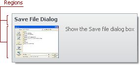
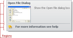
A super tooltip consists of multiple regions (items): title, content, separator, and footer. Items are arranged one under another, each item can display an image and text. A tooltip can contain any combination of items.
Note
See the Tooltip Controller demo that illustrates super tooltips.
Tooltip Items
The following types specify the tooltip items:
ToolTipItem— the main region in a super tooltip that displays text and/or image.- ToolTipTitleItem — a region displayed at the top of a tooltip.
- ToolTipSeparatorItem — a horizontal line in a tooltip.
Use the properties below to specify an item’s text, image, layout, and appearance.
Text
Use the ToolTipItem object’s following properties to specify the text:
- Text — a string value that specifies the item’s text.
- AllowHtmlText — whether to parse HTML tags in the text. HTML tags allow you to format the text: size, style, hyperlinks, etc.
Image
The ToolTipItem.ImageOptions provides access to the following properties that allow you to specify the image displayed in the item:
- Image — a raster image.
- ImageIndex — an index of the image in the Images collection.
- ImageUri — a value that specifies the image’s universal resource identifier.
- SvgImage — a vector image.
- ImageToTextDistance — the indentation of the text from the image.
- Alignment — whether the image is aligned at the left or right.
You can also use the ToolTipItem.Icon to specify the item’s icon. The Icon property has priority over ImageOptions.
Layout
The ToolTipItem.LeftIndent property specifies the indentation of the content from the tooltip’s left edge.
Appearance
The item’s Appearance property provides access to appearance settings that specify the font, border and foreground colors. The default settings depend on the current skin. This property allows you to change the skin’s appearance settings.
See the Hints and Super Tooltips topic learn how to create SuperToolTip objects at design time and runtime.