How to: Create a Financial Chart
- 12 minutes to read
This tutorial explains how to create a financial chart at runtime.
Add a Chart to a Project
Create a new WinForms project or open an existing project.
Add a ChartControl component to the form as shown in Lesson 1.
Set the form’s skin to “Office 2019 Black”.
Specify the Chart’s Data Source and Bind a Series to Data
Define the ChartControl.DataSource property.
Create a Series object and add it to the ChartControl.Series collection.
Use the SeriesBase.SetFinancialDataMembers method to specify the data source fields that provide data for the series’s arguments and “Open-High-Low-Close” values.
// Specify the Chart's data source.
DataSet chartSource = LoadDataFromXml(@"..\..\Data\StockData.xml");
chartControl1.DataSource = chartSource.Tables[0];

// Create a series and bind it to data.
Series series = new Series("Stocks", ViewType.CandleStick);
series.SetFinancialDataMembers("Date", "Low", "High", "Open", "Close");
chartControl1.Series.Add(series);
The data structure looks as follows:
<?xml version="1.0" standalone="yes"?>
<StockPrices>
  <xs:schema xmlns:xs="http://www.w3.org/2001/XMLSchema">
    <xs:element name="StockPrice">
      <xs:complexType>
        <xs:sequence>
          <xs:element name="Date" type="xs:dateTime"/>
          <xs:element name="Open" type="xs:double"/>
          <xs:element name="High" type="xs:double"/>
          <xs:element name="Low" type="xs:double"/>
          <xs:element name="Close" type="xs:double"/>
        </xs:sequence>
      </xs:complexType>
    </xs:element>
  </xs:schema>
  <StockPrice>
    <Date>2015-11-16</Date>
    <Open>111.38</Open>
    <High>114.24</High>
    <Low>111</Low>
    <Close>114.18</Close>
  </StockPrice>
  <StockPrice>
    <Date>2015-11-17</Date>
    <Open>114.92</Open>
    <High>115.05</High>
    <Low>113.32</Low>
    <Close>113.69</Close>
  </StockPrice>
  <!--. . .-->
</StockPrices>
Refer to Providing Data for more information about how to populate a chart with data.
Enable Navigation
To allow users to scroll and zoom a chart, enable the following options:
// Enable scrolling and zooming for the primary x-axis.
XYDiagram xyDiagram = (XYDiagram)chartControl1.Diagram;
xyDiagram.EnableAxisXZooming = true;
xyDiagram.EnableAxisXScrolling = true;
Note
Use the XYDiagram2D.EnableAxisYZooming and XYDiagram2D.EnableAxisYScrolling properties to enable navigation for y-axes.
Customize Series View
A view defines series appearance settings. This tutorial uses the CandleStickSeriesView that visualizes financial data points as candlesticks:
// Customize the series view.
CandleStickSeriesView view = series.View as CandleStickSeriesView;
view.ReductionOptions.ColorMode = ReductionColorMode.OpenToCloseValue;
view.ReductionOptions.FillMode = CandleStickFillMode.FilledOnReduction;
view.ReductionOptions.Color = Color.Red;
view.Color = Color.Green;
Related API
| Member | Description |
|---|---|
| CandleStickSeriesView | Represents a series view of the Candle Stick type. |
| ReductionStockOptions.ColorMode | Gets or sets the mode used to color the financial series points. |
| FillMode | Gets or sets a value specifying how the Candle Stick Series View points will be filled. |
| ReductionStockOptions.Color | Gets or sets the color of the price reduction. |
| SeriesViewBase.Color | Gets or sets the color of the series. |
Apply Technical Indicators
Indicators are calculated based on series data and allow you to predict changes in stock prices. This section describes how to draw a Trend Line through the data set’s first and last points. You also plot the Rate of Change indicator used to display how the closing price changes in relation to its previous value as a percentage.
Create the TrendLine and RateOfChange objects.
Add the objects to the series’s Indicators collection.
// Add indicators.
TrendLine trendLine = new TrendLine {
    CrosshairEnabled = DefaultBoolean.False
};

view.Indicators.Add(trendLine);
RateOfChange rateOfChange = new RateOfChange {
    ValueLevel = ValueLevel.Close,
    CrosshairEnabled = DefaultBoolean.True,
    CrosshairLabelPattern = "{V:f3}",
    LegendText = "Rate of Change",
    ShowInLegend = true
};
view.Indicators.Add(rateOfChange);
Related API
| Member | Description |
|---|---|
| TrendLine | Represents an individual Trend Line. |
| RateOfChange | A Rate of Change indicator. |
| XYDiagram2DSeriesViewBase.Indicators | Provides access to the collection of indicators that belong to the current series. |
| RateOfChange.ValueLevel | Gets or sets the value specifying which series point value should be used to calculate the indicator. |
| Indicator.CrosshairEnabled | Gets or sets the value that specifies whether to enable the Crosshair Cursor for the indicator. |
| Indicator.CrosshairContentShowMode | Gets or sets the element that displays the indicator’s Crosshair content. |
| Indicator.CrosshairLabelPattern | Gets or sets the pattern to format the text that the Crosshair Cursor shows for the specified indicator’s point. |
| Indicator.LegendText | Gets or set the text that identifies an indicator within the chart legend. |
| Indicator.ShowInLegend | Specifies whether the indicator is represented in the chart’s legend. |
Specify Pane Options
This section explains how to add a separate pane for the Rate of Change indicator and change panes’ sizes.
// Define the default pane options.
xyDiagram.DefaultPane.LayoutOptions.RowSpan = 3;
xyDiagram.DefaultPane.ScrollBarOptions.XAxisScrollBarVisible = false;

// Add a separate pane and configure its layout options.
XYDiagramPane rocPane = new XYDiagramPane();
rocPane.LayoutOptions.RowSpan = 2;
xyDiagram.Panes.Add(rocPane);

// Assign the pane to the indicator.
rateOfChange.Pane = rocPane;
Related API
| Member | Description |
|---|---|
| XYDiagramPane | Represents an XY-diagram’s additional pane. |
| GridLayoutOptions.RowSpan | Gets or sets the number of grid layout rows that the pane occupies. |
| XYDiagramPaneBase.ScrollBarOptions | Gets the specific settings of scroll bars displayed within the pane when the chart is being zoomed or scrolled. |
| XYDiagram2D.Panes | Provides access to the diagram‘s collection of panes. |
| SeparatePaneIndicator.Pane | Gets or sets the pane, used to plot the separate pane indicator on an XYDiagram. |
Configure Axis Options
This section shows how to:
- bind the Rate of Change indicator to a separate axis.
- make y-axis visual range show values only for visible arguments.
- specify an on-screen x-axis data range.
- show the working day data.
- configure the axis label format.
// Add a secondary y-axis and configure its options.
SecondaryAxisY rocAxisY = new SecondaryAxisY();
rocAxisY.WholeRange.AlwaysShowZeroLevel = false;
rocAxisY.Alignment = AxisAlignment.Far;
rocAxisY.GridLines.Visible = true;
xyDiagram.SecondaryAxesY.Add(rocAxisY);

// Assign the axis to the indicator.
rateOfChange.AxisY = rocAxisY;

// Define the primary axis options.
xyDiagram.DependentAxesYRange = DefaultBoolean.True;
xyDiagram.AxisX.VisualRange.SetMinMaxValues(new DateTime(2016, 06, 10), new DateTime(2016, 10, 25));
xyDiagram.AxisX.WholeRange.SideMarginsValue = 0;
xyDiagram.AxisX.SetVisibilityInPane(false, xyDiagram.DefaultPane);
xyDiagram.AxisX.DateTimeScaleOptions.WorkdaysOnly = true;
xyDiagram.AxisX.Label.ResolveOverlappingOptions.AllowStagger = true;
xyDiagram.AxisX.GridLines.Visible = true;
xyDiagram.AxisX.Interlaced = true;
xyDiagram.AxisX.Label.TextPattern = "{A:MMM d}";
xyDiagram.AxisY.WholeRange.AlwaysShowZeroLevel = false;
xyDiagram.AxisY.Alignment = AxisAlignment.Far;
Related API
| Member | Description |
|---|---|
| SecondaryAxisY | Represents the secondary Y-axis within a chart control in 2D series, except for the Swift Plot and Swift Point. |
| WholeRange.AlwaysShowZeroLevel | Gets or sets the value that indicates whether to show an axis zero level. |
| Axis2D.Alignment | Specifies the position of an axis relative to another primary axis. |
| GridLines.Visible | Specifies whether the grid lines are visible. |
| XYDiagram.SecondaryAxesY | Provides access to a collection of secondary Y-axes for a given XYDiagram. |
| SeparatePaneIndicator.AxisY | Gets or sets the Y-axis that is used to plot the current indicator on a XYDiagram. |
| XYDiagram2D.DependentAxesYRange | Gets or sets whether the visual range of all Y-axes (axes of values) should be calculated only by values of points contained in the visual range of the X-axis (axis of arguments). |
| AxisBase.Interlaced | Gets or sets whether interlacing is applied to the axis. |
| XYDiagram.AxisX | Gets the X-axis. |
| Range.SetMinMaxValues | Sets both minimum and maximum values of an axis range. |
| Axis2D.SetVisibilityInPane | Specifies panes in which an axis should be visible. |
| DateTimeScaleOptions.WorkdaysOnly | Specifies whether holidays and non-working days should be excluded from the axis scale. |
| AxisLabel.TextPattern | Gets or sets a string that formats text for the auto-generated x- or y-axis labels. |
Customize Crosshair Options
The Crosshair Cursor allows you to track series and indicator series point values. The CrosshairOptions stores settings that define the Crosshair Cursor’s appearance and behavior.
// Configure the crosshair options.
chartControl1.CrosshairOptions.ShowOnlyInFocusedPane = false;
chartControl1.CrosshairOptions.ShowValueLine = true;
chartControl1.CrosshairOptions.ContentShowMode = CrosshairContentShowMode.Legend;
Related API
| Member | Description |
|---|---|
| CrosshairOptions.ShowOnlyInFocusedPane | Gets or sets a value that specifies whether to show a crosshair cursor in a focused pane only. |
| CrosshairOptions.ShowValueLine | Specifies whether to show a value line of a series point indicated by a crosshair cursor on a diagram. |
| CrosshairOptions.ContentShowMode | Gets or sets the element that displays the Crosshair’s content. |
Configure Legend Options
This step shows how to add a second legend, assign it to an indicator, and adjust the legend’s position.
// Specify the default legend's options.
chartControl1.Legend.AlignmentHorizontal = LegendAlignmentHorizontal.Left;
chartControl1.Legend.AlignmentVertical = LegendAlignmentVertical.Top;
chartControl1.Legend.DockTarget = xyDiagram.DefaultPane;
chartControl1.Legend.MaxCrosshairContentWidth = 250;

// Add a separate legend for an indicator.
Legend rocLegend = new Legend { AlignmentHorizontal = LegendAlignmentHorizontal.Left };
rocLegend.DockTarget = rocPane;
rocLegend.AlignmentVertical = LegendAlignmentVertical.Top;
chartControl1.Legends.Add(rocLegend);
rateOfChange.Legend = rocLegend;
Related API
| Member | Description |
|---|---|
| ChartControl.Legend | Provides access to the chart control’s legend. |
| Legend | Represents a chart’s legend. |
| LegendBase.AlignmentHorizontal | Gets or sets the legend’s horizontal alignment within the chart control. |
| LegendBase.AlignmentVertical | Gets or sets the legend’s vertical alignment within the chart control. |
| Legend.DockTarget | Specifies the element (chart or pane) to which the legend is docked. |
| Legend.MaxCrosshairContentWidth | Gets or sets the maximum width for the Crosshair’s content in the legend. |
| ChartControl.Legends | Provides access to the chart control’s legend. |
| Indicator.Legend | Gets or sets a legend displaying an indicator legend item. |
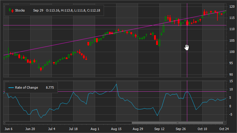
Results
The resulting code is listed below:
using System;
using System.Data;
using System.Drawing;
using DevExpress.Utils;
using DevExpress.XtraCharts;

namespace FinancialChart {
    public partial class Form1 : DevExpress.XtraEditors.XtraForm {
        public Form1() {
            InitializeComponent();
        }

        private void Form1_Load(object sender, EventArgs e) {

            // Specify the Chart's data source.
            DataSet chartSource = LoadDataFromXml(@"..\..\Data\StockData.xml");
            chartControl1.DataSource = chartSource.Tables[0];

            // Create a series and bind it to data.
            Series series = new Series("Stocks", ViewType.CandleStick);
            series.SetFinancialDataMembers("Date", "Low", "High", "Open", "Close");
            series.CrosshairLabelPattern = "{A:MMM d}   O:{OV}, H:{HV}, L:{LV}, C:{CV}";
            chartControl1.Series.Add(series);

            // Enable scrolling and zooming for the primary x-axis.
            XYDiagram xyDiagram = (XYDiagram)chartControl1.Diagram;
            xyDiagram.EnableAxisXZooming = true;
            xyDiagram.EnableAxisXScrolling = true;

            // Customize the series view.
            CandleStickSeriesView view = series.View as CandleStickSeriesView;
            view.ReductionOptions.ColorMode = ReductionColorMode.OpenToCloseValue;
            view.ReductionOptions.FillMode = CandleStickFillMode.FilledOnReduction;
            view.ReductionOptions.Color = Color.Red;
            view.Color = Color.Green;


            // Add indicators.
            TrendLine trendLine = new TrendLine {
                CrosshairEnabled = DefaultBoolean.False
            };

            view.Indicators.Add(trendLine);
            RateOfChange rateOfChange = new RateOfChange {
                ValueLevel = ValueLevel.Close,
                CrosshairEnabled = DefaultBoolean.True,
                CrosshairLabelPattern = "{V:f3}",
                LegendText = "Rate of Change",
                ShowInLegend = true
            };
            view.Indicators.Add(rateOfChange);

            // Define the default pane options.
            xyDiagram.DefaultPane.LayoutOptions.RowSpan = 3;
            xyDiagram.DefaultPane.ScrollBarOptions.XAxisScrollBarVisible = false;

            // Add a separate pane and configure its layout options.
            XYDiagramPane rocPane = new XYDiagramPane();
            rocPane.LayoutOptions.RowSpan = 2;
            xyDiagram.Panes.Add(rocPane);

            // Assign the pane to the indicator.
            rateOfChange.Pane = rocPane;

            // Add a secondary y-axis and configure its options.
            SecondaryAxisY rocAxisY = new SecondaryAxisY();
            rocAxisY.WholeRange.AlwaysShowZeroLevel = false;
            rocAxisY.Alignment = AxisAlignment.Far;
            rocAxisY.GridLines.Visible = true;
            xyDiagram.SecondaryAxesY.Add(rocAxisY);

            // Assign the axis to the indicator.
            rateOfChange.AxisY = rocAxisY;

            // Define the primary axis options.
            xyDiagram.DependentAxesYRange = DefaultBoolean.True;
            xyDiagram.AxisX.VisualRange.SetMinMaxValues(new DateTime(2016, 06, 10), new DateTime(2016, 10, 25));
            xyDiagram.AxisX.WholeRange.SideMarginsValue = 0;
            xyDiagram.AxisX.SetVisibilityInPane(false, xyDiagram.DefaultPane);
            xyDiagram.AxisX.DateTimeScaleOptions.WorkdaysOnly = true;
            xyDiagram.AxisX.Label.ResolveOverlappingOptions.AllowStagger = true;
            xyDiagram.AxisX.GridLines.Visible = true;
            xyDiagram.AxisX.Interlaced = true;
            xyDiagram.AxisX.Label.TextPattern = "{A:MMM d}";
            xyDiagram.AxisY.WholeRange.AlwaysShowZeroLevel = false;
            xyDiagram.AxisY.Alignment = AxisAlignment.Far;

            // Configure the crosshair options.
            chartControl1.CrosshairOptions.ShowOnlyInFocusedPane = false;
            chartControl1.CrosshairOptions.ShowValueLine = true;
            chartControl1.CrosshairOptions.ContentShowMode = CrosshairContentShowMode.Legend;

            // Specify the default legend's options.
            chartControl1.Legend.AlignmentHorizontal = LegendAlignmentHorizontal.Left;
            chartControl1.Legend.AlignmentVertical = LegendAlignmentVertical.Top;
            chartControl1.Legend.DockTarget = xyDiagram.DefaultPane;
            chartControl1.Legend.MaxCrosshairContentWidth = 250;

            // Add a separate legend for an indicator.
            Legend rocLegend = new Legend { AlignmentHorizontal = LegendAlignmentHorizontal.Left };
            rocLegend.DockTarget = rocPane;
            rocLegend.AlignmentVertical = LegendAlignmentVertical.Top;
            chartControl1.Legends.Add(rocLegend);
            rateOfChange.Legend = rocLegend;
        }
        public DataSet LoadDataFromXml(string filepath) {
            DataSet xmlDataSet = new DataSet();
            xmlDataSet.ReadXml(filepath);
            return xmlDataSet;
        }
    }
}