Format Text Chart Elements
- 9 minutes to read
This topic describes how to format and customize chart elements’ text.
This article consists of the following sections:
- Use Pattern Properties
- Available Placeholders
- Examples
- Use Custom Placeholders
- Use HTML-Inspired Tags
- Change Text Based on a Specific Condition
Use Pattern Properties
You can apply format strings to customize the text of chart elements with the ~Pattern property. Patterns can contain regular text (displayed as is) and value placeholders in braces. You can use placeholders listed in the Available Placeholders section. To format numeric and date/time values, you can apply Format Specifiers. Use a colon to separate a placeholder and its format specifier.
See the Examples section for code samples that show how to create patterns.
Available Placeholders
Basic Placeholders
This section describes placeholders for all diagram types.
Placeholder | Description | Use in Properties |
|---|---|---|
{S} | Displays the series name. This value is obtained from Series.Name. | SeriesBase.CrosshairLabelPattern |
{A} | Displays a series point argument. | SeriesBase.CrosshairLabelPattern |
{V} | Displays a series point value. | SeriesBase.CrosshairLabelPattern |
Pie Series Placeholders
This section describes placeholders specific to Pie, Donut, and Nested Donut series.
Placeholder | Description | Use in Properties |
|---|---|---|
{VP} | Displays series point values as percentages. | SeriesLabelBase.TextPattern |
{TV} | Displays a total group value. |
Stacked Series Placeholders
This section describes placeholders specific to stacked series (Side-by-Side Stacked Bar, Full-Stacked Area, and so on).
Placeholder | Description | Use in Properties |
|---|---|---|
{VP} | Displays series point values as percentages. |
SeriesBase.LegendTextPattern (if a legend displays series points) SeriesBase.CrosshairLabelPattern SeriesBase.ToolTipPointPattern SeriesLabelBase.TextPattern (for y-axes) |
{G} | Displays a stacked series point group name. | CrosshairOptions.GroupHeaderPattern |
{TV} | Displays a total group value. | TotalLabel.TextPattern (for stacked bar series) |
Bubble Series Placeholders
This section describes placeholders specific to Bubble series.
Placeholder | Description | Use in Properties |
|---|---|---|
{W} | Displays the series point weight. | SeriesBase.CrosshairLabelPattern SeriesBase.LegendTextPattern (if a legend displays series points) |
Range Series Placeholders
This section describes placeholders specific to Side-by-Side Gantt and Overlapped Gantt series.
Placeholder | Description | Use in Properties |
|---|---|---|
{V1} | Displays the first point value. | SeriesBase.CrosshairLabelPattern |
{V2} | Displays the second point value. | SeriesBase.CrosshairLabelPattern |
{VD} | Displays the duration between the first and second data point values | SeriesBase.CrosshairLabelPattern |
{VDTD} | Displays the duration between the first and second date-time data point values in days. | SeriesBase.CrosshairLabelPattern |
{VDTH} | Displays the duration between the first and second date-time data point values in hours. | SeriesBase.CrosshairLabelPattern |
{VDTM} | Displays the duration between the first and second date-time data point values in minutes. | SeriesBase.CrosshairLabelPattern |
{VDTS} | Displays the duration between the first and second date-time data point values in seconds. | SeriesBase.CrosshairLabelPattern |
{VDTMS} | Displays the duration between the first and second date-time data point values in milliseconds. | SeriesBase.CrosshairLabelPattern |
Financial Series Placeholders
This section describes placeholders specific to Stock and Candle Stick series.
Placeholder | Description | Use in Properties |
|---|---|---|
{OV} | Displays a series point’s open value. | SeriesBase.CrosshairLabelPattern |
{HV} | Displays a series point’s high value. | SeriesBase.CrosshairLabelPattern |
{LV} | Displays a series point’s low value. | SeriesBase.CrosshairLabelPattern |
{CV} | Displays a series point’s close value. | SeriesBase.CrosshairLabelPattern |
Box Plot Series Placeholders
This section describes placeholders specific to Box Plot series.
Placeholder | Description | Use in Properties |
|---|---|---|
{BP_MIN} | Displays the Box Plot point’s Minimum value. | |
{BP_Q1} | Displays the Box Plot point’s First Quartile value. | |
{BP_MDN} | Displays the Box Plot point’s Median value. | |
{BP_AVG} | Displays the Box Plot point’s Mean value. | |
{BP_Q3} | Displays the Box Plot point’s Third Quartile value. | |
{BP_MAX} | Displays the Box Plot point’s Maximum value. |
Waterfall Series Placeholders
This section describes placeholders specific to Waterfall series.
Placeholder | Description | Use in Properties |
|---|---|---|
{V} | Displays a value change for a rising and falling bar in relation to the previous bar value. | |
{VABS} | Displays an absolute point value. |
Indicator Placeholders
This section describes placeholders you can use for indicators.
Placeholder | Description | Use in Properties |
|---|---|---|
{I} | Displays the indicator name. | |
{S} | Displays the series name to which the indicator belongs. | |
{A} | Displays an indicator point’s argument. | |
{V} | Displays an indicator point’s value. | |
{AV} | Displays the Moving Average indicator average line’s point value. | |
{UV} | Displays the Moving Average upper envelope line’s point value. | |
{LV} | Displays the Moving Average lower envelope line’s value. | |
{T} | Displays an Error Bar point’s highest value. | |
{B} | Displays an Error Bar point’s lowest value. | |
{SV} | Displays the MovingAverageConvergenceDivergence indicator signal line’s point value. |
Placeholders for Histograms
This section describes placeholders you can use to format a histogram chart’s x-axis labels.
Placeholder | Description | Use in Properties |
|---|---|---|
{OB} | Displays an opening bracket. | |
{CB} | Displays a closing bracket. | |
{A1} | Displays the interval start value. | |
{A2} | Displays the interval end value. | |
{OS} | Displays the greater than sign. | |
{US} | Displays the less than or less than or equal to sign. |
Colorizer Placeholders
Placeholders in this group are used to format legend items for range colorizers. Refer to Point Range Colorizer and Segment Range Colorizer for more information.
Placeholder | Description | Use in Properties |
|---|---|---|
{V1} | Displays the first value that defines a color range boundary. | |
{V2} | Displays the second value that defines a color range boundary. |
Examples
The following examples show how to form patterns for axis labels and legend items. You can use the same syntax to create patterns for other chart elements.
Specify Axis Label Format
The following images show charts with formatted axis labels:
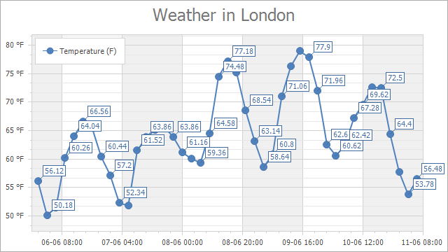
axisXLabel.TextPattern = “{A:dd-MM HH:mm}”, axisYLabel.TextPattern = “{V} °F”
axisYLabel.TextPattern = “{VP:P0}”
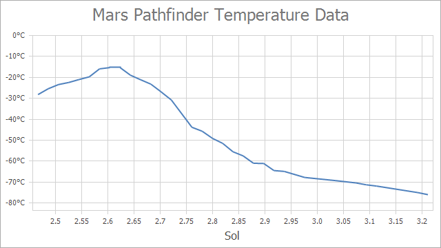
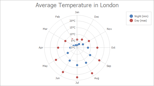
axisXLabel.TextPattern = “{A:0.0#}”, axisYLabel.TextPattern = “{V}°C”
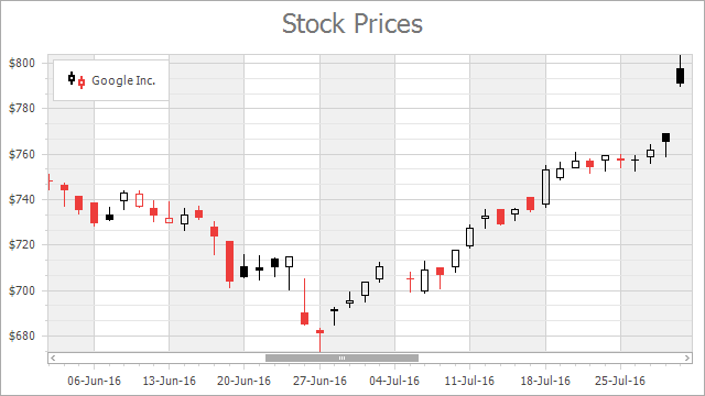
axisXLabel.TextPattern = “{A:dd-MMM-yy}”, axisYLabel.TextPattern = “${V}”
axisXLabel.TextPattern = “{A:MMM}”, axisYLabel.TextPattern = “{V}°C”
The charts above use the AxisLabel.TextPattern property to format auto-generated axis labels.
AxisLabel axisXLabel = ((XYDiagram)chartControl.Diagram).AxisX.Label;
AxisLabel axisYLabel = ((XYDiagram)chartControl.Diagram).AxisY.Label;

axisXLabel.TextPattern = "{A:dd-MM HH:mm}";
axisYLabel.TextPattern = "{V} °F";
Specify Legend Item Format
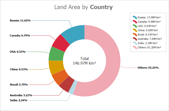
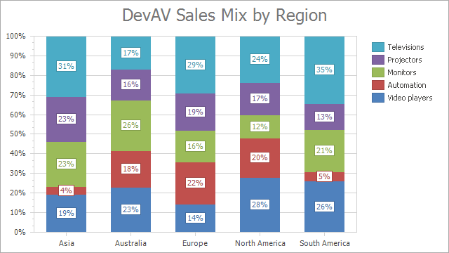
The following images show charts with formatted legend items:
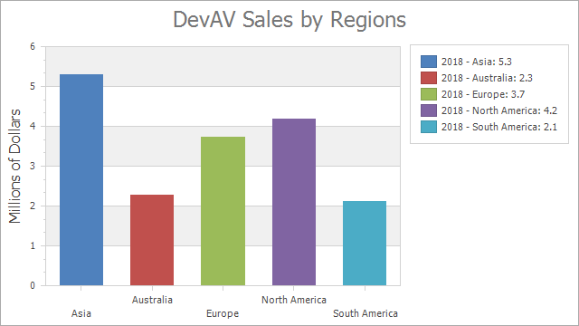
LegendTextPattern = “{S} - {A}: {V:F1}”
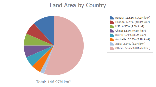
LegendTextPattern = “{A}: {VP:P2} ({V:F1}M km²)”
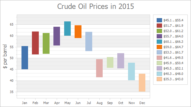
LegendTextPattern = “{V1:c1} .. {V2:c1}”
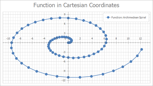
LegendTextPattern = “Function: {S}”
The charts above use the SeriesBase.LegendTextPattern property to format legend items.
private void OnFormLoad(object sender, EventArgs e) {
    ((SideBySideBarSeriesView)chartControl1.Series[0].View).ColorEach = true;
    chartControl1.Series[0].LegendTextPattern = "{S} - {A}: {V:F1}";
}
Tip
Alternatively, you can use the Pattern Editor to form patterns for series labels, axis labels, and legend items at design time.
Use Custom Placeholders
When the Chart Control or a series is bound to data, the text pattern may contain data field values in addition to default placeholders. For example, the data source contains the Discount field and the text pattern may look like: {S}: {V:F2} (Discount: {Discount:P0}).
When the chart control is unbound, you can initialize a series point’s Tag property with an object that stores information associated with a point. Then, use the object’s property names as placeholders in patterns ({Info} in the example below).
series1.Points.Add(new SeriesPoint(new DateTime(2019, 11, 10), 20) { Tag = new { Info = "Accepted" }});
// ...
series1.CrosshairLabelPattern = "Status: {Info}";
Use HTML-Inspired Tags
You can use HTML tags to specify text for the following elements:
- Chart titles, series titles, pane titles, axis titles, legend titles, and constant line titles. Use the title Text property.
- Text annotations. Use the TextAnnotation.Text and TextAnnotation.Lines properties.
- Crosshair labels. Use the SeriesBase.CrosshairLabelPattern and Indicator.CrosshairLabelPattern properties.
// Adds a title and formats its text with HTML tags.
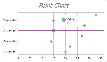
chartControl1.Titles.Add(new ChartTitle { Text = "<i>Point Chart</i>" });
// Formats croshair label content.
series1.CrosshairLabelPattern = "Value:<br><color=#FF7200><b>{V}</b></color>";
The following image shows the results:
See the HTML-inspired Text Formatting document for a list of supported tags.
Change Text Based on a Specific Condition
Customize Crosshair Label Text
Use the ChartControl.CustomDrawCrosshair event to customize the crosshair label’s text. You can define any condition that allows you to specify the text’s format and appearance. If you customize the crosshair elements’ text in the event handler, patterns specified for these elements are not in effect.
chartControl1.CustomDrawCrosshair += OnCustomDrawCrosshair;
//...
private void OnCustomDrawCrosshair(object sender, CustomDrawCrosshairEventArgs e) {
    foreach (CrosshairElementGroup group in e.CrosshairElementGroups) {
        foreach (CrosshairElement element in group.CrosshairElements) {
            element.LabelElement.Text = (element.SeriesPoint.Values[0] > 20)
                ? $"<b>{element.SeriesPoint.DateTimeArgument:MMMM dd}: </b><color=green><i>{element.SeriesPoint.Values[0]}</i></color>"
                : $"<b>{element.SeriesPoint.DateTimeArgument:MMMM dd}: </b><color=red><i>{element.SeriesPoint.Values[0]}</i></color>";
        }
    }
}
Customize Axis Label Text
Use the ChartControl.CustomDrawAxisLabel event to customize axis labels. For example, you can apply a specific color to labels if they display values greater than a specified threshold.
You can also use the AxisLabel.Formatter property to pass a custom format provider for axis labels.
Customize Total Labels
The Chart Control provides the CustomizeStackedBarTotalLabel and ChartControl.CustomizePieTotalLabel events that allow you to configure a total label‘s text format and appearance.