Smart Tags
- 3 minutes to read
This topic describes actions available in Smart Tags.
Access a Smart Tag
To access the Smart Tag panel, select a control and click the Smart Tag icon  at the top-right corner of the control.

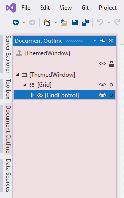
You can also use the Document Outline Window to select an element.

Attach MVVM Behaviors and Services
To add behavior, open the Smart Tag menu for the element and press Add Behavior.

Tip
The list of available behaviors and services can differ depending on which element is selected.
Select the newly added element in the list of behaviors. Set the required properties.

Bind Property to a Source
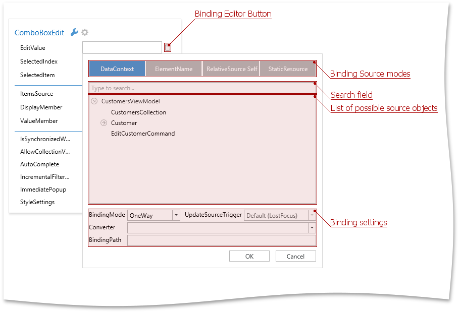
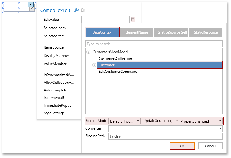
Each property can be either set manually or bound to a source. To bind a property to a source, click the  button that opens the Binding Editor Dialog.

If a property is already bound to a source, the binding button is marked in yellow and the binding text is shown in the corresponding property line.

Choose a Binding Source Mode
Use the Binding Editor Dialog to specify a binding source mode: DataContext, ElementName, RelativeSource Self, StaticResource. These modes set different sources for target properties.
In the DataContext source mode, the Binding Editor Dialog displays properties defined in the data context object.
Tip
Set the DataContext or d:DataContext property in XAML to display the list of available data context properties in the Binding Editor Dialog.
Use the ElementName mode to bind to a property of any XAML element within the same namescope.

Use the RelativeSource Self mode to bind to another property of the same element.

- If your source object is placed inside a static resource, use the StaticResource mode.
Specify Binding Settings
In the Binding Editor Dialog, you can specify the binding expression’s settings like BindingMode, UpdateSourceTrigger, and Converter.

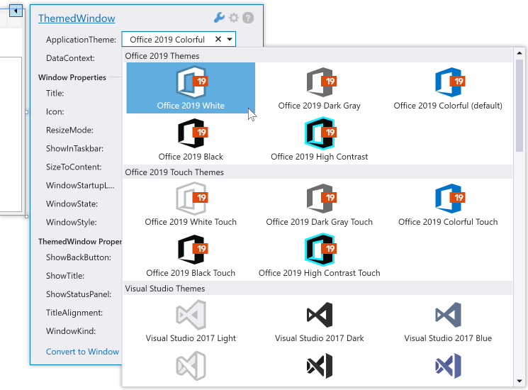
Select the Application Theme
The Application Theme menu item allows you to apply the selected theme to the entire application or a UserControl. The selected theme is applied at design time.

Refer to the WPF Application Themes for more information about DevExpress themes.
Define the Data Context
When you use the DataContext property line, the Smart Tag menu analyzes the object that is set. If Smart Tag considers that this is a POCO object, the DataContext property is set through the ViewModelSource class.
DataContext="{dxmvvm:ViewModelSource ViewModel:MainViewModel}"
Use the Image Picker to Get Image Paths
The DevExpress Image Picker dialog integrated into Visual Studio allows you to configure images for WPF controls. The dialog shows images found in the application’s solution or from the DevExpress.Images.v25.2.dll assembly. The library contains common images that are referenced by multiple DevExpress controls. Refer to the DevExpress Image Picker topic for more information.
Convert to ThemedWindow
You can click the Convert to ThemedWindow element (available when a window is selected) to convert the current window to a ThemedWindow.
