Badge Class
The Badge control displays a text in a badge over a visual element.
Namespace: DevExpress.Xpf.Core
Assembly: DevExpress.Xpf.Core.v24.2.dll
NuGet Package: DevExpress.Wpf.Core
#Declaration
#Related API Members
The following members return Badge objects:
#Remarks
Set the Badge.Badge attached property on a visual element to display a Badge control over the element:

<Window x:Class="WPFApp.MainWindow"
  ....
  xmlns:dx="http://schemas.devexpress.com/winfx/2008/xaml/core">
  <Button Content="Inbox">
    <dx:Badge.Badge>
        <dx:Badge Content="10"/>
    </dx:Badge.Badge>
  </Button>
</Window>
#Custom Content Formats
The Badge.ContentStringFormat and Badge.ContentFormatProvider properties allow you to format the Badge‘s content. For example, you can display ‘99+’ instead of numbers equal to or greater than 100:

Refer to the Badge.ContentStringFormat or Badge.ContentFormatProvider property descriptions for a code sample.
#Customize the Appearance
#Size
You can change a Badge size with the following properties:
- Badge.Height, Badge.MinHeight, and Badge.MaxHeight.
- Badge.Width, Badge.MinWidth, and Badge.MaxWidth.
#Position
You can use the following members to specify the Badge control’s position:
- Badge.HorizontalAlignment and Badge.HorizontalAnchor properties
- Badge.VerticalAlignment and Badge.VerticalAnchor properties
- Badge.CustomPlacement event
- Margin standard property
#Shapes
#Predefined Shapes
Use the Badge.BadgeShape property to choose one of a Badge control’s shapes:
| Value Name | Figure |
|---|---|
| Badge |
 |
| Badge |
 |
| Badge |
 |
#Custom Shapes
You can specify the Badge.CornerRadius property. When its value is not Null, the Badge control ignores the Badge.BadgeShape property.
The following code sample sets the radius of the Badge control’s top-left/top-right/bottom-right corners to 5 and the bottom-left corner to 0:

<dx:SimpleButton ...>
  <dx:Badge.Badge>
    <dx:Badge Content="10" CornerRadius="5,5,5,0" />
  </dx:Badge.Badge>
</dx:SimpleButton>
#Colors
#Predefined Colors
Use the Badge.BadgeKind property to choose one of a predefined Badge colors:
| Value Name | Figure |
|---|---|
| Badge |
 |
| Badge |
|
| Badge |
 |
| Badge |
 |
| Badge |
 |
Note
The Badge control’s predefined colors depend on the application theme.
#Custom Colors
You can change a Badge color with the following properties:
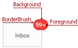
The following code sample shows how to get the Badge control’s colors as on the figure above:
<Button ...>
  <dx:Badge.Badge>
    <dx:Badge Content="99+" BorderThickness="1"
    BorderBrush="White" Foreground="#fff" Background="#f5222d"/>
  </dx:Badge.Badge>
</Button>
#Fonts
Use the following properties to change the Badge fonts:
The following code sample sets the Badge.FontFamily property to Tahoma, Badge.FontSize property to 12, and Badge.FontWeight property to Thin:

<dx:SimpleButton ...>
  <dx:Badge.Badge>
    <dx:Badge Content="10" FontFamily="Tahoma"
    FontSize="12" FontWeight="Thin" />
  </dx:Badge.Badge>
</dx:SimpleButton>
#Animations
The Badge control has fade-in and fade-out animations. Use the Badge.AnimationDuration property to specify the animation duration. The following code sample sets the animation duration to 500ms:
<dx:SimpleButton ...>
  <dx:Badge.Badge>
    <dx:Badge Content="10" AnimationDuration="500" />
  </dx:Badge.Badge>
</dx:SimpleButton>