WPF Application Themes
- 9 minutes to read
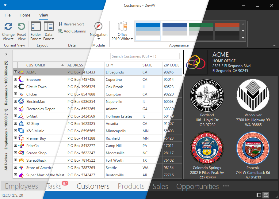
The DevExpress WPF Subscription ships with over 30 custom-designed application themes. You can use each of these themes without modification or customize them in our free WPF Theme Designer application.
Refer to the Theme List topic to get the available theme list. You can apply each theme to the DevExpress WPF Controls and the supported Standard WPF Controls.
The Lightweight Themes topic contains a list of available lightweight themes. These themes visually replicate regular themes, but offer quicker startup times and consume less memory.
Note
When you reference a DevExpress WPF library in an application, the application applies the Office2019Colorful theme. This theme affects all the DevExpress WPF Controls and the supported Standard WPF Controls. You can reset the DevExpress Theme applied to Standard WPF Controls.
List of Supported Standard Controls
The following Standard WPF Controls are supported only in the Office2016SE, VS2017, Office2019, VS2019, Win10, and Win11 DevExpress WPF Themes:
- System.Windows.Button
- System.Windows.CheckBox
- System.Windows.ComboBox
- System.Windows.ComboBoxItem
- System.Windows.ContextMenu *
- System.Windows.Expander
- System.Windows.GridSplitter
- System.Windows.GroupBox
- System.Windows.Label
- System.Windows.ListBox
- System.Windows.ListBoxItem
- System.Windows.Menu*
- System.Windows.Page
- System.Windows.PasswordBox*
- System.Windows.ProgressBar
- System.Windows.RadioButton
- System.Windows.Controls.Primitives.ScrollBar
- System.Windows.ScrollViewer
- System.Windows.Separator
- System.Windows.Slider
- System.Windows.TabControl
- System.Windows.TabItem
- System.Windows.TextBox
- System.Windows.ToolTip
- System.Windows.TreeView
- System.Windows.TreeViewItem
Apply a DevExpress Theme
To apply a theme, it is necessary to reference the theme assembly or the theme NuGet package in your project.
Apply a DevExpress Theme to an Application
Approach 1
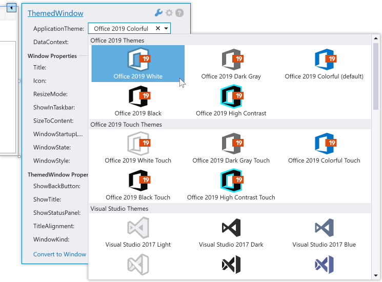
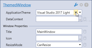
Open the Window’s or the User Control’s Quick Action or Smart Tag, expand the ApplicationTheme drop-down list, and select a theme. The list only shows the themes that are referenced in your project.
The resulting App.config file appears as follows:
.NET
...
<configuration>
    <configSections>
        <section name="DXThemeManager"
        type="System.Configuration.ClientSettingsSection, System, Version=4.0.0.0, Culture=neutral, PublicKeyToken=b77a5c561934e089"
        allowExeDefinition="MachineToLocalUser" requirePermission="false" />
    </configSections>
    <DXThemeManager>
        <setting name="ApplicationThemeName" serializeAs="String">
            <value>Office2019Colorful</value>
        </setting>
    </DXThemeManager>
</configuration>
...
.NET Framework
<configuration>
    <configSections>
        <sectionGroup name="userSettings"
        type="System.Configuration.UserSettingsGroup, System, Version=4.0.0.0, Culture=neutral, PublicKeyToken=b77a5c561934e089" >
        <section name="DXThemeManager"
        type="System.Configuration.ClientSettingsSection, System, Version=4.0.0.0, Culture=neutral, PublicKeyToken=b77a5c561934e089"
        allowExeDefinition="MachineToLocalUser" requirePermission="false" />
        </sectionGroup>
    </configSections>
    <startup>
        <supportedRuntime version="v4.0" sku=".NETFramework,Version=v4.7.2" />
    </startup>
    <userSettings>
        <DXThemeManager>
        <setting name="ApplicationThemeName" serializeAs="String">
            <value>Office2019Colorful</value>
        </setting>
        </DXThemeManager>
    </userSettings>
</configuration>
Approach 2
This approach overrides changes to the App.config file made with Approach 1.
- Reference the DevExpress.Data.Desktop.v26.1 assembly.
- Set the ApplicationThemeHelper.ApplicationThemeName property to a theme name at application startup.
public partial class App : Application {
    protected override void OnStartup(StartupEventArgs e) {
        ApplicationThemeHelper.ApplicationThemeName = Theme.MetropolisLightName;
        base.OnStartup(e);
    }
}
Tip
You can add the Ribbon Gallery Theme Selector to your application.
Apply a DevExpress Theme to a Container
Specify the attached ThemeManager.ThemeName property. You can apply the property to the DevExpress WPF Controls and the Supported WPF Standard Controls. The following code sample applies the Office2016SEWhite theme to the ThemedWindow and the Office2019Black theme to the GridControl:
<ThemedWindow ...
    xmlns:dx="http://schemas.devexpress.com/winfx/2008/xaml/core"
    xmlns:dxg="http://schemas.devexpress.com/winfx/2008/xaml/grid"
    dx:ThemeManager.ThemeName="Office2016SEWhite"
    x:Name="mainWindow">
    <dxg:GridControl dx:ThemeManager.ThemeName="Office2019Black">
        ...
    </dxg:GridControl>
</ThemedWindow>
In code, you can call the ThemeManager.SetThemeName method to apply a theme to a container:
using DevExpress.Xpf.Core;
//...
        public MainWindow() {
            //...
            ThemeManager.SetThemeName(mainWindow, "Office2019Black");
        }
Reset the Applied DevExpress Theme
When you reset a theme, DevExpress WPF Themes no longer affect Standard WPF Controls. DevExpress WPF Controls get their appearance from the DeepBlue theme built into control assemblies.
Reset the Applied DevExpress Theme to an application
Approach 1
Click the “X” button ( ) in the Window’s Smart Tag:
The resulting App.config file appears as follows:
...
<DXThemeManager>
    <setting name="ApplicationThemeName" serializeAs="String">
        <value>None</value>
    </setting>
</DXThemeManager>
...
If you use Quick Actions, you need to edit the App.config file manually.
Approach 2
Set the ApplicationThemeHelper.ApplicationThemeName property to Theme.NoneName at application startup. This approach overrides changes to the App.config file made with Approach 1.
using DevExpress.Xpf.Core;
...
    public partial class App : Application {
        protected override void OnStartup(StartupEventArgs e) {
            ApplicationThemeHelper.ApplicationThemeName = Theme.NoneName;
            base.OnStartup(e);
        }
    }
Reset a DevExpress Theme Applied to a Container
Set the attached ThemeManager.ThemeName property to None:
<ThemedWindow ...
    xmlns:dx="http://schemas.devexpress.com/winfx/2008/xaml/core"
    xmlns:dxg="http://schemas.devexpress.com/winfx/2008/xaml/grid">
    <dxg:GridControl dx:ThemeManager.ThemeName="None">
        ...
    </dxg:GridControl>
</ThemedWindow>
Reset a DevExpress Theme Only For the Standard WPF Controls
To reset a DevExpress Theme only for a container with Standard WPF Controls:
...
<DXThemeManager>
    <setting name="ApplicationThemeName" serializeAs="String">
        <value>None</value>
    </setting>
</DXThemeManager>
...
<ThemedWindow ...
    xmlns:dx="http://schemas.devexpress.com/winfx/2008/xaml/core"
    xmlns:dxg="http://schemas.devexpress.com/winfx/2008/xaml/grid">
    <dxg:GridControl dx:ThemeManager.ThemeName="Office2019White">
        ...
    </dxg:GridControl>
    <ComboBox>
    ...
    </ComboBox>
</ThemedWindow>
Save the Theme Applied at Runtime
The application applies a theme specified in the application’s configuration file at startup. Call the ApplicationThemeHelper.SaveApplicationThemeName method to save the current theme to the application’s configuration file:
ApplicationThemeHelper.ApplicationThemeName = Theme.MetropolisLightName;
ApplicationThemeHelper.SaveApplicationThemeName();
Add a Theme Selector to your App
DevExpress WPF Controls include the following MVVM behaviors that allow you to implement theme selectors in your application:
Use Legacy Default Themes
You can use the CompatibilitySettings.LegacyDefaultTheme property to specify the legacy default theme that the application should use:
using DevExpress.Xpf.Core;
...
    public partial class App : Application {
        protected override void OnStartup(StartupEventArgs e) {
            CompatibilitySettings.LegacyDefaultTheme = LegacyDefaultTheme.Office2016White;
            base.OnStartup(e);
        }
    }
Use Windows App Mode
Latest DevExpress WPF Theme families include the *System theme. This theme does not introduce its own new look and feel options. Instead, it reads Windows settings and applies one of the existing themes to match the current OS appearance. Your application then looks consistent with other software that a user runs on their machine.
The following table lists *System theme names and the corresponding themes that take effect in dark or light OS modes:
You should reference assemblies/NuGet packages of both (Dark and Light) theme versions. For example, to allow the Win11System theme to switch between Win11Light and Win11Dark themes, you should choose any of the following options:
- Reference the
DevExpress.Xpf.Themes.Win11Dark.v22.2.dllandDevExpress.Xpf.Themes.Win11Light.v22.2.dllassemblies. - Reference the
DevExpress.Wpf.Themes.Win11DarkandDevExpress.Wpf.Themes.Win11LightNuGet packages. - Reference the
DevExpress.Wpf.Themes.AllNuGet package.
The following code sample applies the VS2019System theme to the application:
public partial class App : Application {
    protected override void OnStartup(StartupEventArgs e) {
        ApplicationThemeHelper.ApplicationThemeName = Theme.VS2019SystemName;
        base.OnStartup(e);
    }
}
*System themes are available in the theme selector.
Note
Palettes cannot be applied to *System themes.
Apply a Touch Theme
DevExpress WPF Touch Themes affect only element appearance (size, paddings, margins, etc.). Refer to the following topic for more information on DevExpress WPF Controls Touch Support: Touch Support.
Append ;Touch to a theme name to apply the touch-friendly theme version:
Note
The TouchlineDark theme is touch-friendly (the default setting). You do not need to append ;Touch to its theme name.
<ThemedWindow ...
    xmlns:dx="http://schemas.devexpress.com/winfx/2008/xaml/core"
    dx:ThemeManager.ThemeName="Office2013;Touch">
    ...
</ThemedWindow>
| Name | ThemeManager.ThemeName |
|---|---|
| Office 2019 Black | Office2019Black;Touch |
| Office 2019 Colorful | Office2019Colorful;Touch |
| Office 2019 DarkGray | Office2019DarkGray;Touch |
| Office 2019 HighContrast | Office2019HighContrast;Touch |
| Office 2019 White | Office2019White;Touch |
| Office 2016 Black SE | Office2016BlackSE;Touch |
| Office 2016 Colorful SE | Office2016ColorfulSE;Touch |
| Office 2016 DarkGray SE | Office2016DarkGraySE;Touch |
| Office 2016 White SE | Office2016WhiteSE;Touch |
| Office 2016 Black | Office2016Black;Touch |
| Office 2016 Colorful | Office2016Colorful;Touch |
| Office 2016 White | Office2016White;Touch |
| Office 2013 | Office2013;Touch |
| Office 2013 DarkGray | Office2013DarkGray;Touch |
| Office 2013 LightGray | Office2013LightGray;Touch |
| TouchlineDark | TouchlineDark |
Preload Themes
Controls load theme resources when you run the application. Use the PreloadThemeResourceAsync method to load and cache all the theme resources asynchronously at application startup. The method reduces application freezes. You can set the runTypeInitializers method parameter to true to invoke static constructors and speed up control initialization.
See the following help topic for additional information: Preload Theme Resources.
Lightweight Templates
Lightweight Templates contain fewer visual elements and reduce the time it takes to load DevExpress WPF Controls. The following themes support Lightweight Templates:
| Theme Family | Themes |
|---|---|
| Windows 11 | Dark, Light |
| Windows 10 | Dark, Light |
| Office 2019 | Black, Colorful, Dark Gray, White, HighContrast |
| Visual Studio 2019 | Blue, Dark, Light |
| Office 2016 SE | Black, Colorful, Dark Gray, White |
| Visual Studio 2017 | Blue, Dark, Light |
The following table lists DevExpress WPF Controls that support Lightweight Templates and the properties you should use to enable/disable Lightweight Templates:
Tip
Refer to the following topics for more information on Lightweight Templates: GridControl Optimized Mode, Ribbon Lightweight Templates.
Standard WPF Control Properties
You can specify the Background, BorderBrush, and BorderThickness property values to change the appearance of Standard WPF Controls when an application uses one of the following DevExpress WPF Themes:
| Theme Family | Themes |
|---|---|
| Windows 11 | Dark, Light |
| Windows 10 | Dark, Light |
| Office 2019 | Black, Colorful, Dark Gray, White, HighContrast |
| Visual Studio 2019 | Blue, Dark, Light |
| Office 2016 SE | Black, Colorful, Dark Gray, White |
| Visual Studio 2017 | Blue, Dark, Light |
The following code sample sets the Standard WPF Button‘s Background property to Red when the Office2016WhiteSE theme is applied:
<dx:ThemedWindow
    ...
    xmlns:dx="http://schemas.devexpress.com/winfx/2008/xaml/core"
    dx:ThemeManager.Theme="Office2016WhiteSE">
    <Grid>
        <Button Content="Button" Background="Red" />
    </Grid>
</dx:ThemedWindow>
-
The theme that is applied when the Windows app mode is set to Light.
-
The theme that is applied when the Windows app mode is set to Dark.
-
These themes can adjust their colors based on the Windows accent color setting. Refer to the following link for more information: Windows Accent Color and App Mode Support.