RibbonControl.PageHeaderItems Property
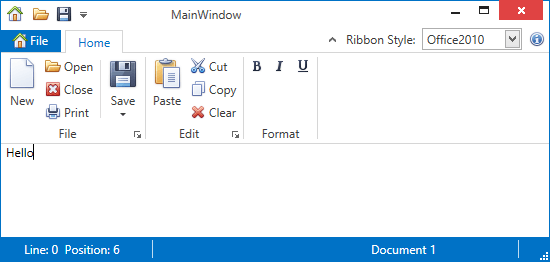
Provides access to the collection of bar items and bar item links displayed at the right edge of the Ribbon Control, in the same row with tab headers.
Namespace: DevExpress.Xpf.Ribbon
Assembly: DevExpress.Xpf.Ribbon.v25.2.dll
NuGet Package: DevExpress.Wpf.Ribbon
Declaration
Property Value
| Type | Description |
|---|---|
| DevExpress.Xpf.Bars.CommonBarItemCollection | A DevExpress.Xpf.Bars.CommonBarItemCollection collection that stores elements displayed at the right edge of the Ribbon Control, in the same row with tab headers. |
Remarks
You can add BarItem and BarItemLink descendants to the PageHeaderItems collection.
Example
This example shows how to display items on the right edge of the RibbonControl. The items are added via the RibbonControl.PageHeaderItems collection.
The following image shows the result:

<dxr:RibbonControl.PageHeaderItems>
    <dxb:BarEditItem x:Name="eRibbonStyle" Content="Ribbon Style:"
        EditWidth="100"
        ClosePopupOnChangingEditValue="True"
        EditValue="{Binding RibbonStyle, ElementName=RibbonControl}">
        <dxb:BarEditItem.EditSettings>
            <dxe:ComboBoxEditSettings IsTextEditable="False" PopupMaxHeight="250"
                                      ItemsSource="{dxe:EnumItemsSource EnumType={x:Type dxr:RibbonStyle}}"/>
        </dxb:BarEditItem.EditSettings>
    </dxb:BarEditItem>
    <dxb:BarButtonItem Name="bAbout" Content="About"
                   Glyph="{dxc:DXImage Image=Info_16x16.png}"
                   LargeGlyph="{dxc:DXImage Image=Info_32x32.png}"
                   ItemClick="bAbout_ItemClick" />
</dxr:RibbonControl.PageHeaderItems>
Related GitHub Examples
The following code snippets (auto-collected from DevExpress Examples) contain references to the PageHeaderItems property.
Note
The algorithm used to collect these code examples remains a work in progress. Accordingly, the links and snippets below may produce inaccurate results. If you encounter an issue with code examples below, please use the feedback form on this page to report the issue.