Tooltip
- 6 minutes to read
This document defines a tooltip, explains how to use it and lists its main features. Note that the tooltip is available for all diagram types.
If you wish to use an alternative tool to interact with chart data, you can use a crosshair cursor. See the Crosshair Cursor topic to learn more.
This topic consists of the following sections.
Overview
A tooltip is a small pop-up rectangle that shows information for hovered series and series points.

As you can see in the image, a tooltip also contains a beak that points to a series point, drawing your attention to this hovered element.
By default, this tooltip displays series point arguments and values, but it is possible to specify custom content as well.
See the Formatting Tooltip Text section to learn more.
Using Tooltips
Enable tooltips
To start using tooltips, set the ChartControl.ToolTipEnabled property to true.
Note
For a series that supports series point markers, a tooltip appears for a series point when these markers are visible. Thus, make sure the MarkerVisible property is set to true for the corresponding series (e.g.,LineSeries2D.MarkerVisible).
It is also possible to enable/disable tooltips for a particular series from the Series.ToolTipEnabled property.
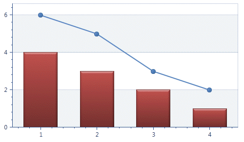
For instance, the following image shows a chart with tooltips disabled for the line series.
Note
Because a crosshair cursor is enabled by default, you can see it on a chart together with a tooltip.
To hide the default crosshair cursor, set the ChartControlBase.CrosshairEnabled property to false.
Show tooltips for series
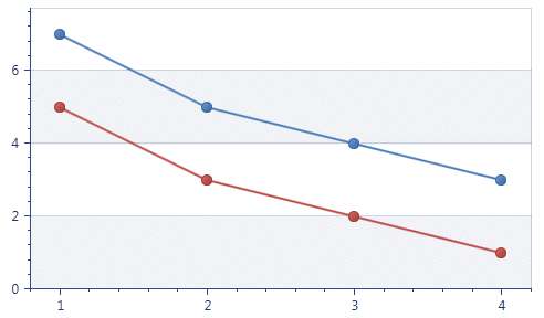
When you interact with a multiple series chart, it makes sense to get information about a particular series name. Tooltips provide this functionality.To accomplish this, you first need to specify the desired name for each series you would like to see on the tooltip via the Series.DisplayName property.
Then set the ToolTipOptions.ShowForSeries property to true.
In the following image, you can see how this can be done for a chart with two line series.
Tooltip Customization
A ToolTipOptions object contains properties allowing you to customize the tooltip’s behavior, as well as specify a tooltip position on a chart.
Use the ChartControl.ToolTipOptions property to gain access to tooltip options.
The following XAML demonstrates how this is done.
<Window x:Class="Tooltip.MainWindow"
        xmlns="http://schemas.microsoft.com/winfx/2006/xaml/presentation"
        xmlns:x="http://schemas.microsoft.com/winfx/2006/xaml"
        xmlns:dxc="http://schemas.devexpress.com/winfx/2008/xaml/charts"
        Title="MainWindow" Height="350" Width="525" >
    <Grid>
        <dxc:ChartControl ToolTipEnabled="True" >
            <dxc:ChartControl.ToolTipOptions>
                <dxc:ToolTipOptions ShowForSeries="True" ShowForPoints="False">
                    <dxc:ToolTipOptions.ToolTipPosition>
                        <dxc:ToolTipMousePosition Location="TopLeft" />
                    </dxc:ToolTipOptions.ToolTipPosition>
                </dxc:ToolTipOptions>
            </dxc:ChartControl.ToolTipOptions>
        </dxc:ChartControl>
    </Grid>
</Window>
Formatting Tooltip Text
A tooltip provides settings that allow you to change its displayed content.
Hide the tooltip’s beak and shadow
If you wish to hide a tooltip’s beak and shadow, set the ChartToolTipController.ShowBeak and ChartToolTipController.ShowShadow properties to false.
To gain access to the ChartToolTipController object, use the ChartControl.ToolTipController property.
The following image shows how these properties work.

A ChartToolTipController object also has properties that allow you to control tooltip behavior. See the Change Tooltip Behavior section for more information.
Specify a tooltip hint
A hint helps you understand the displayed values of a tooltip. You can place any object (e.g., text, a button or an image) inside a hint using the Series.ToolTipHint and SeriesPoint.ToolTipHint properties.
The following image shows a hint containing the Line series logo type for the first Line series point.

Use a tooltip pattern
By default, a tooltip displays an argument and value for each series point.
Use the Series.ToolTipPointPattern and Series.ToolTipSeriesPattern properties to change the default text displayed within a tooltip, as well as to format series point values.
A full list of available placeholders is detailed below.
Pattern Description {A} Displays a series point argument. {V} Displays series point values. {VP} Displays series point values as percentages (for a Pie series and Full-Stacked series). {S} Displays the name of the series. {G} Displays the name of a stacked group. {W} Displays the weight (for a Bubble series). {V1} Displays the first value (for range series). {V2} Displays the second value (for range series). {VD} Displays the duration between the first and second data point values (for range series). {HV} Displays the high value (for a Financial series). {LV} Displays the low value (for a Financial series). {OV} Displays the open value (for a Financial series). {CV} Displays the close value (for a Financial series). {HINT} Displays a hint for a series point. Note
The tooltip series pattern only allows you to specify a string in addition to the {S} default placeholder.
The Format Specifiers topic explains which standard and custom formats can be used together with placeholders to format a series point’s numeric and date-time values within a tooltip.
Use a tooltip template
There are many cases when it is necessary to build a custom tooltip. To solve this task, you can use the Series.ToolTipSeriesTemplate and Series.ToolTipPointTemplate properties.
For instance, you can show a chart within a tooltip when hovering over a series point.

Examples
The following examples demonstrate how to use this feature.
Specify Tooltip Position
A tooltip has three modes that define its position on a chart.
- ToolTipMousePosition - the tooltip is placed near the mouse pointer.
- ToolTipRelativePosition - the tooltip is placed near the invoked chart element (e.g., on the top of the bar).
- ToolTipFreePosition - the tooltip is placed unbound to any invoked chart element and its position is defined by the current offset, dock target and dock corner.
The image below shows the last tooltip mode with the CrosshairFreePosition.DockCorner property set to TopRight.

Note
A tooltip is automatically displayed without a beak in ToolTipFreePosition mode.
You can get access to the listed tooltip modes via the ToolTipOptions.ToolTipPosition property.
In the ToolTipMousePosition and ToolTipRelativePosition modes, you can specify tooltip position by utilizing the ToolTipPositionWithLocation.Location and ToolTipPosition.Offset properties.
Change Tooltip Behavior
A ChartToolTipController object provides properties that allow you to change tooltip behavior.
The main properties that control tooltip behavior are detailed in the following list.
| Member | Description |
|---|---|
| ChartToolTipController.OpenMode | Specifies the way a tooltip appears on a chart, on either a hover or a mouse click. |
| ChartToolTipController.CloseOnClick | A tooltip is closed when a particular chart element is clicked. |
| ChartToolTipController.AutoPopDelay | Specifies the auto pop up delay before the tooltip appears on a chart. |
| ChartToolTipController.InitialDelay | Specifies the initial delay triggered when a tooltip appears on a diagram. This is a dependency property. |
For additional information on chart interaction, refer to the End-User Capabilities section.