VCL Chart Control
- 5 minutes to read
The VCL Chart control (TdxChartControl) allows you to visualize data series in diagrams.
Getting Started
The following tutorials help you get acquainted with the Chart control, and its diagrams and series:
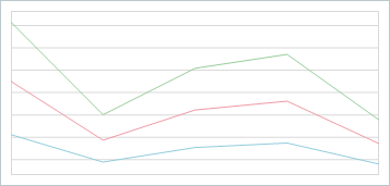
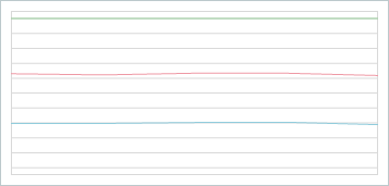
- Line View Tutorial
- This tutorial describes how to create line series, bind them to data, and customize XY diagram appearance at design time.
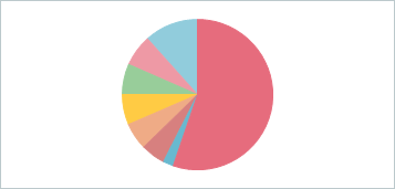
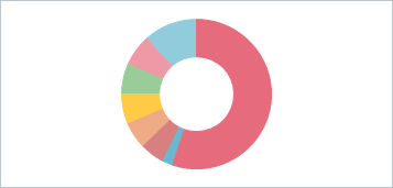
- Doughnut View Tutorial
- This tutorial describes how to create a doughnut series, bind it to data, and customize simple diagram appearance at design time.
Bind to Data
Chart series support the following data access modes:
- Bound
- A chart series loads and visualizes data from a bound dataset. The TDataSource component connects a series to a dataset.
- Unbound
- A chart series is not bound to a dataset. In this mode, you can manually populate series with data points in code.
Supported Render Modes
The VCL Chart control uses a universal rendering technique and supports all render modes available for DevExpress VCL products:
- DirectX Mode
A Chart control in DirectX render mode creates a Direct3D device context and uses a Direct2D-based canvas to draw content and UI elements. This mode is the most beneficial on a client machine with a discrete graphics card and high-DPI (4K+) displays, since calculation load shifts from CPU to GPU.
Note
The DirectX render mode imposes a number of requirements and limitations, such as the minimum operating system version. Refer to the mode description for details.
- GDI+ Mode
A Chart control in GDI+ render mode uses only GDI+ API-based canvases to draw content and UI elements of higher quality compared to the basic GDI render mode.
You can enable this mode instead of DirectX if you cannot use hardware acceleration due to its limitations.
- GDI Mode
Default. The basic render mode available for all VCL DevExpress controls. A Chart control in GDI mode uses a combination of GDI and GDI+ API-based canvases to draw content and UI elements.
A Chart control uses GDI as a fallback render mode if a device context-related error occurs in DirectX mode.
Supported Diagram and Series View Types
The Chart control supports XY and simple diagrams. Every diagram type is compatible with the corresponding set of series Views. You can use the ViewType or ViewClass property of a series to switch between compatible Views on-the-fly.
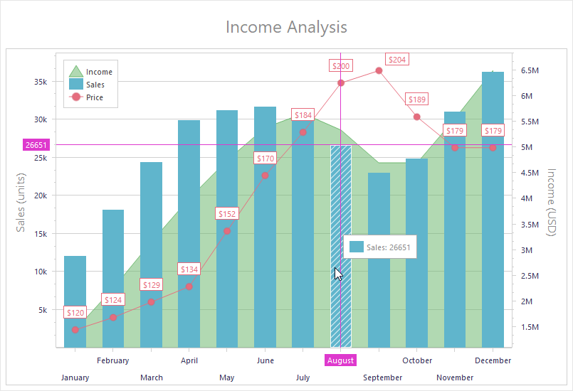
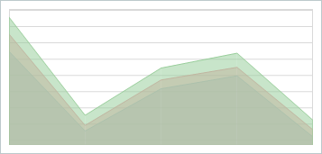
XY Diagrams
An XY diagram is compatible with XY series that support the following Views:
- Area
- Stacked Area
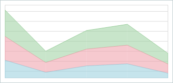
- Full-Stacked Area
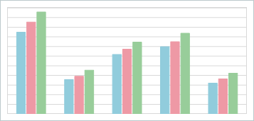
- Bar
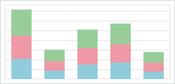
- Stacked Bar
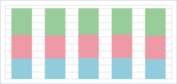
- Full-Stacked Bar
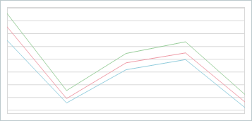
- Line
- Stacked Line
- Full-Stacked Line
Simple Diagrams
A simple diagram is compatible with simple series that support the following Views:
Visual Chart Elements
The Chart control can display the following visual elements:
- Diagrams
- A diagram is a pane designed to display and manage series.
- Series
- A series is a set of data points displayed in a diagram.
- Series Point Labels
- Series point labels can display values in different formats and include additional information.
- Legends
- A legend is a pane designed to display series captions (for XY diagrams) or series point information (for simple diagrams).
- Axes
The axis of arguments (X-Axis) and the axis of values (Y-Axis) form a two-dimensional Cartesian coordinate system in an XY diagram. You can customize appearance of axes, add axis captions, and display value labels. Axis settings also allow you to customize the diagram area.
The SecondaryAxes property of an XY diagram allows you to add and configure secondary axes of arguments and values. For example, secondary axes can be useful if you need to display multiple scales with different measurement units.
All XY diagram axes can switch between plain and logarithmic scales.
- Titles
- Titles display text not linked to any chart element. Use them to explain chart data.
Appearance Customization Options
In addition to general appearance settings available for individual visual elements at different levels, the Chart control has the following customization options:
- Palettes
The Palette property allows you to apply one of
49predefined palettes or a custom palette to all series in the Chart control. The control uses the active palette to apply different colors to different XY series in a diagram and different points in a simple series. If the active palette does not have enough explicitly defined colors for all target visual elements, the Chart control applies interpolated colors based on existing colors.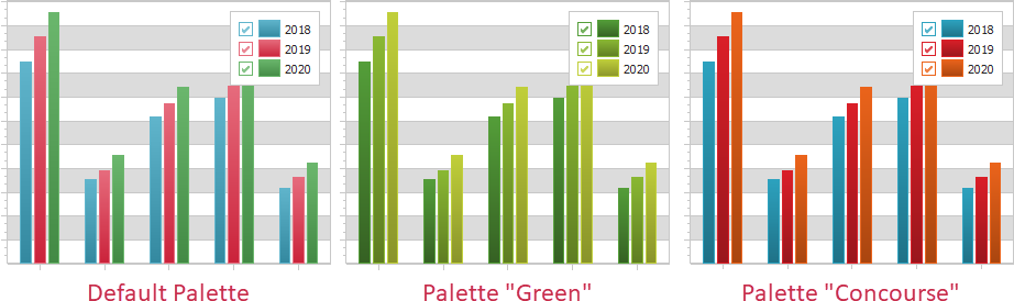
The TdxChartPaletteRepository component allows you to manage and use custom chart palettes. All stored custom palettes are available for selection in the same list as predefined palettes.
- Customization Events
Special customization events occur every time the Chart control is about to determine the appearance of a visual element. You can handle these events to override current appearance settings of visual elements based on certain conditions in your application. For example, you can fill all value markers in a linear XY series with unique colors:
Refer to the following topic for detailed information on all available options: Chart Appearance Customization.
User Interaction
The Chart control has the following user interaction functionality:
- Simple Tooltips
Simple tooltips display a series caption and/or a series point value when a user hovers the mouse pointer over a series point.
- Crosshair Cursor
Crosshair Cursor is an advanced tooltip that can target one or multiple series points in an XY diagram and display additional information on them in a label similar to a diagram legend pane.
Print and Export
The following documentation topics include information on content print and export functionality available for the Chart control:
- Data Export
- The Chart control has a number of built-in data export methods you can use to save content to a file or stream in a format of your choice: BMP, DOCX, EMF, GIF, JPEG, PNG, SVG, TIFF, WMF, and XLSX. This help topic contains an overview of all content export methods and explains how you can fit chart content into target dimensions.
- Print Functionality
- The Chart control relies on the TdxComponentPrinter component from the ExpressPrinting System to print content and export it to PDF. This topic contains detailed information on how to add chart print functionality to your application.