Image Item
- 2 minutes to read
The image item is the counterpart of standard and DevExpress image containers in the Layout Control.

The image item is resized according to the loaded image‘s dimensions and you do not need to embed it into a layout item.
Create the Layout Image Item
This item can be created at design time only. Double-click the Layout Control to invoke the customization form and follow the steps below:
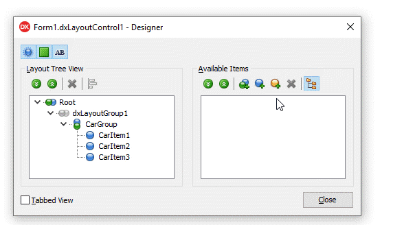
Click the “Add Auxiliary Item” button and select “Add Image Item” in the context menu.
Rename the image item.
Drag the item to the Layout Tree View pane.
Close the customization form.
Use the Object Inspector to customize the image item:
Clear the CaptionOptions.Text field.
Click the Image property’s ellipsis button to invoke the Image Picker dialog.
Load an image from a file system or the Icon Library.
The layout image item’s API:
Visibility | An item’s Visible property. |
Position | An item’s Index, VisibleIndex, AlignHorz, AlignVert, AlignmentConstraint, and Offsets properties. A parent group’s LayoutDirection and UseIndent properties. |
Appearance | An item’s LayoutLookAndFeel and CaptionOptions properties. A parent group’s LayoutLookAndFeelException property. The layout control’s LayoutLookAndFeel property. |
Contents | An item’s Image and CaptionOptions.VisibleElements properties. |
Behavior | An item’s CaptionOptions.Hint, SizeOptions.SizableHorz, SizeOptions.SizableVert, AllowRemove, and Enabled properties. A parent group’s Locked property. |
Size | An item’s SizeOptions.Height, SizeOptions.Width, SizeOptions.MaxHeight, and SizeOptions.MaxWidth properties. |
Contains commonly used customization options. | |
HitTest Information | The layout control’s GetHitTest function returns a TdxLayoutBasicItemHitTest object for all image items. |