Check Box Item
- 2 minutes to read
The layout check box item is the counterpart of standard and DevExpress check boxes in the Layout Control.

You do not need to embed the layout check box into a layout item.
Create the Layout Check Box Item
This item can be created at design time only. Double-click the control to invoke the Layout Control’s customization form and follow the steps below:
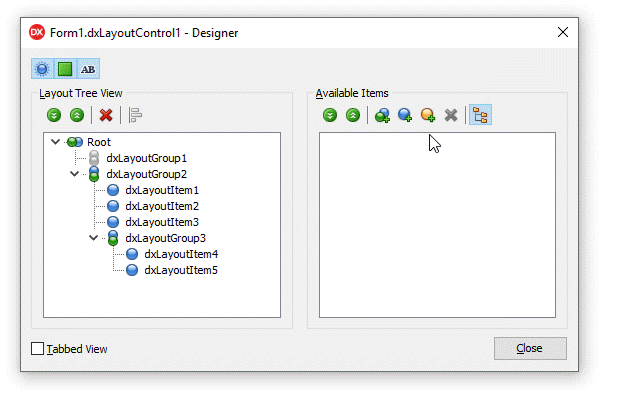
Click the “Add Auxiliary Item” button and select “Add Check Box Item” in the context menu.
Click the “Display Item Names/Captions” button.
Assign a new caption to the check box item.
Drag the item to the Layout Tree View pane.
The layout check box’s API:
Visibility | An item’s Visible property. |
Position | An item’s Index, VisibleIndex, AlignHorz, AlignVert, AlignmentConstraint, and Offsets properties. A parent group’s LayoutDirection and UseIndent properties. |
Appearance | An item’s LayoutLookAndFeel and CaptionOptions properties. A parent group’s LayoutLookAndFeelException property. The layout control’s LayoutLookAndFeel property. |
Behavior | An item’s CheckBoxOptions, SizeOptions.SizableHorz, SizeOptions.SizableVert, AllowRemove, and Enabled properties. A parent group’s Locked property. The layout control’s OptionsItem.SizableHorz and OptionsItem.SizableVert properties. |
Size | An item’s SizeOptions.Height, SizeOptions.Width, SizeOptions.MaxHeight, and SizeOptions.MaxWidth properties. |
Contains commonly used customization options. | |
HitTest Information | The layout control’s GetHitTest function returns a TdxLayoutBasicItemHitTest object for all check box items. |
Refer to the “How to Convert Embedded Controls to Layout Items“ topic for information on how to convert check boxes to layout check box items.