Separator Item
- 2 minutes to read
The separator item is a line that separates layout elements.

Separator Item Orientation
The orientation of a separator item depends on its height-to-width ratio on the screen.
Horizontal Separators
A separator is horizontally oriented when the separator’s width exceeds its visible height on the screen.

Vertical Separators
A separator is vertically oriented when the separator’s height exceeds its width on the screen.

Create a Layout Separator Item
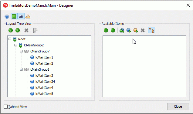
Double-click the Layout Control to invoke the customization form and follow the steps below:
- Click the “Add Auxiliary Item” button.
- Select “Add Separator Item” in the context menu.
- Click the “Display Item Names/Captions” button.
- Drag the item to the Layout Tree View pane.
- Drop the item between the layout elements you need to separate.
Layout Separator API
- Visibility
- A separator’s Visible property allows you to hide or display the separator.
- Position
A separator’s Index, VisibleIndex, AlignHorz, AlignVert, AlignmentConstraint, and Offsets properties allow you to position the separator precisely.
A parent group’s LayoutDirection and UseIndent properties also affect the separator’s position and orientation.
- Size
- Use a separator’s SizeOptions.Height, SizeOptions.Width, SizeOptions.MaxHeight, and SizeOptions.MaxWidth properties to adjust the separator dimensions.
- Content
- You can display a caption within a separator item in addition to a line. Use the item’s CaptionOptions.VisibleElements property to control the visibility of elements that make up the caption.
- Appearance
- A separator’s LayoutLookAndFeel and CaptionOptions properties define the separator’s appearance. Please note the following:
- The CaptionOptions.AlignHorz property has no effect on vertically oriented separators.
- The CaptionOptions.AlignVert property has no effect on horizontally oriented separators.
- Behavior
A separator’s SizeOptions.SizableHorz and SizeOptions.SizableVert properties specify if users can resize the separator horizontally and vertically.
The layout control’s OptionsItem.SizableHorz and OptionsItem.SizableVert properties define the common user permissions to perform layout element resize operations.
A separator’s AllowRemove property defines if users can remove the separator.
A parent group’s Locked property specifies if a user can move separators within the group.