TdxCustomLayoutItem.LayoutLookAndFeel Property
Associates the layout group or item with a dedicated look & feel storage component.
Declaration
property LayoutLookAndFeel: TdxCustomLayoutLookAndFeel read; write;Property Value
| Type | Description |
|---|---|
| TdxCustomLayoutLookAndFeel | The target layout look & feel component (a terminal TdxCustomLayoutLookAndFeel descendant instance). In addition to general appearance options (such as skins), layout look & feel components also include layout item and group-specific options (like paddings, offsets, and border appearance settings). |
Remarks
The Layout control (and its groups and items) can have individual look & feel settings or automatically synchronize (recommended) with the skin and palette defined using a TdxSkinController component or the Project Settings dialog.
If you need to apply different appearance settings to your Layout control, assign a layout look & feel component to the LayoutLookAndFeel property.
Note
If a vector skin is applied to the Layout control, the skin always uses the color palette defined at the global level (TdxSkinController.SkinPaletteName).
Group and Item Look & Feel Settings
The LayoutLookAndFeel property allows you to override Layout or global appearance settings at the level of individual groups and items. If a layout group’s LayoutLookAndFeelException property is set to True, you can use LayoutLookAndFeel properties of nested groups and items to override look & feel settings of the parent group.
How to Use Layout Look & Feel Components
- Use a TdxLayoutLookAndFeelList component to manage look & feel storage components.
- You can associate one TdxLayoutSkinLookAndFeel component with multiple Layout controls (LayoutLookAndFeel) and their groups/items (
LayoutLookAndFeel) to share settings.
Layout Look & Feel Component Manager
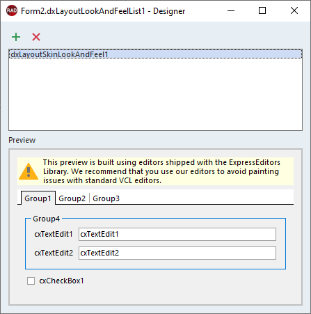
Use the TdxLayoutLookAndFeelList component to manage layout look & feel components. Call the TdxLayoutLookAndFeelList.CreateItem function or use the Designer dialog available at design time.
Design-Time Dialog
Double-click a TdxLayoutLookAndFeelList component to display a design-time dialog: