Label Item
- 2 minutes to read
The layout label item allows you to specify captions for layout elements.

You do not need to link this item to a control unlike standard and DevExpress labels.
Create the Layout Label Item
Double-click the Layout Control to invoke the customization form and follow the steps below:
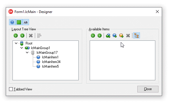
Click the “Add Auxiliary Item” button and select “Add Label Item” in the context menu.
Click the “Display Item Names/Captions” button.
Assign a new caption to the label item.
Drag the item to the Layout Tree View pane.
The layout label’s API:
Visibility | An item’s Visible property. |
Position | An item’s Index, VisibleIndex, AlignHorz, AlignVert, AlignmentConstraint, and Offsets properties. A parent group’s LayoutDirection and UseIndent properties. |
Appearance | An item’s LayoutLookAndFeel and CaptionOptions properties. A parent group’s LayoutLookAndFeelException property. The layout control’s LayoutLookAndFeel property. |
Contents | An item’s CaptionOptions.VisibleElements property. |
Behavior | An item’s CaptionOptions.Hint, SizeOptions.SizableHorz, SizeOptions.SizableVert, AllowRemove, and Enabled properties. A parent group’s Locked property. |
Size | An item’s SizeOptions.Height, SizeOptions.Width, SizeOptions.MaxHeight, and SizeOptions.MaxWidth properties. |
Contains commonly used customization options. | |
HitTest Information | The layout control’s GetHitTest function returns a TdxLayoutBasicItemHitTest object for all label items. |
Refer to the “How to Convert Embedded Controls to Layout Items“ topic for information on how to convert labels to layout label items.