Filter, Sort, and Group Data in Collection View for .NET MAUI
- 8 minutes to read
You can filter, sort, and group items in the DXCollectionView. Refer to the following section for information on how to populate a Collection View with items: Bind to Data.
Filter Collection View Items
The DevExpress suite for MAUI allows you to create filtering views that use a variety of built-in filter items.
The Collection View also ships with the FilterExpression and FilterString properties that allow you to filter collection view items. Note that the FilterString and FilterExpression properties are dependent. If you update one of them, the other changes as well.
Create Filtering UI
The DevExpress suite for MAUI allows you to use built-in filter items to create filtering views with ranges, check boxes, option lists, and much more.
The Collection View automatically collects applied filter rules from all filter items and saves the result to the FilterExpression (FilterString) property.
Implement and Invoke a Separate Filtering UI Page
Follow the steps below to configure a filter form and assign it to a CollectionView:
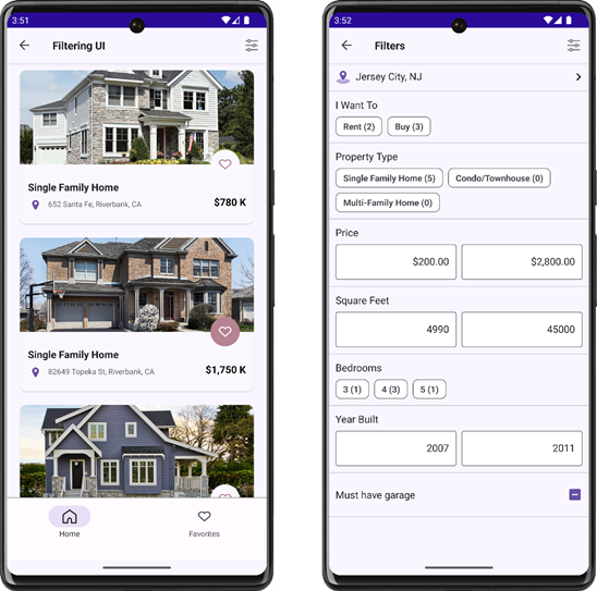
- Create a page and populate it with filter items.
- Assign the page to the FilteringUITemplate property. In this step, the CollectionView automatically binds the item
Contextproperty to CollectionView.FilteringContext. - Use the ShowFilteringUIForm command or call the ShowFilteringUIForm() method.
- To customize the filter form based on a condition, handle the FilteringUIFormShowing event. This example uses the event to specify the filter page title.
<demo:DemoPage ...>
    <ContentPage.Resources>
        <DataTemplate x:Key="filteringUIFormTemplate">
            <demo:ScrollViewFix BackgroundColor="{DynamicResource BackgroundThemeColor}">
                <demo:ScrollViewFix.Resources>
                   <!--...-->
                </demo:ScrollViewFix.Resources>
                <VerticalStackLayout>
                    <dxe:FilterRadioListPickerItem
                        FieldName="City"
                        ShowValuesOutOfFilter="true"
                        ShowValueCounts="false"
                        ShowRadioButtons="false"
                        ImageSource="filteringui_location"
                        ImageColor="{DynamicResource AccentColor}">
                        <dxe:FilterRadioListPickerItem.PickerTitleView>
                            <demo:TitleView Title="City" />
                        </dxe:FilterRadioListPickerItem.PickerTitleView>
                    </dxe:FilterRadioListPickerItem>
                    <dxe:FilterChipGroupItem Text="I Want To" FieldName="Status" AllowDeselect="True"/>
                    <dxe:FilterCheckedChipGroupItem Text="Property Type" FieldName="Type" CustomDisplayText="OnCustomDisplayText"/>
                    <dxe:FilterNumericRangeItem Text="Price" FieldName="Price" EditorDisplayFormat="C"/>
                    <dxe:FilterNumericRangeItem Text="Square Feet" FieldName="HouseSize"/>
                    <dxe:FilterCheckedChipGroupItem Text="Bedrooms" ShowValuesOutOfFilter="true" FieldName="Beds"/>
                    <dxe:FilterNumericRangeItem Text="Year Built" FieldName="YearBuilt"/>
                    <dxe:FilterCheckItem Text="Must have garage" FieldName="IsGarageExist"/>
                </VerticalStackLayout>
            </demo:ScrollViewFix>
        </DataTemplate>
    </ContentPage.Resources>
    <ContentPage.ToolbarItems>
        <ToolbarItem Command="{Binding Source={Reference collectionView}, Path=Commands.ShowFilteringUIForm}"
                     IconImageSource="filteringui_filter"/>
    </ContentPage.ToolbarItems>
    <ContentPage.Content>
        <Grid>
            <dxco:TabView ...>
                <dxco:TabViewItem>
                     <dxco:TabViewItem.Content>
                         <dxcv:DXCollectionView x:Name="collectionView"
                                   ItemsSource="{Binding ItemsSource}"
                                   ItemTemplate="{StaticResource houseCardTemplate}"
                                   FilteringUITemplate="{StaticResource filteringUIFormTemplate}"
                                   FilteringUIFormShowing="OnFilteringUIFormShowing">
                         </dxcv:DXCollectionView>
                     </dxco:TabViewItem.Content>
                 </dxco:TabViewItem>
                 <!--...-->
            </dxco:TabView>
        </Grid>
    </ContentPage.Content>
</demo:DemoPage>
Show CollectionView and Filter Items on the Same Page
To display filter items and a CollectionView on the same page, you should explicitly bind the filter item Context property to DXCollectionView.FilteringContext.
The following example allows users to configure CollectionView item filters in a bottom sheet:
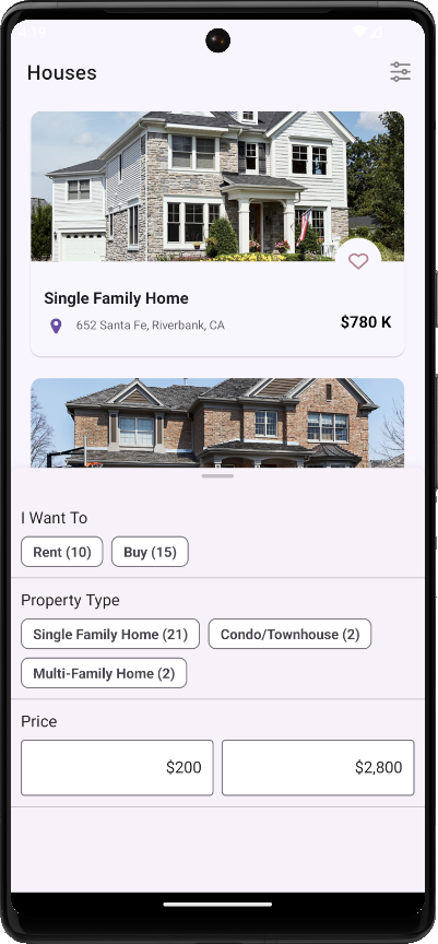
To do so, follow the steps below:
- Add a BottomSheet component to the page.
- Populate the bottom sheet with filter items.
- Set their
FieldNameproperties to data source fields that filter collection view items. - Bind their
Contextproperties to the Collection View’s FilteringContext.
<dxcv:DXCollectionView x:Name="collectionView" DoubleTap="collectionView_DoubleTap"
           ItemsSource="{Binding ItemsSource}" ...>
</dxcv:DXCollectionView>
<dxco:BottomSheet x:Name="bottomSheet">
    <VerticalStackLayout>
        <dxe:FilterChipGroupItem Context="{Binding Source={x:Reference collectionView}, Path=FilteringContext}" Text="I Want To" FieldName="Status" AllowDeselect="True"/>
        <dxe:FilterCheckedChipGroupItem Context="{Binding Source={x:Reference collectionView}, Path=FilteringContext}" Text="Property Type" FieldName="Type" CustomDisplayText="OnCustomDisplayText"/>
        <dxe:FilterNumericRangeItem Context="{Binding Source={x:Reference collectionView}, Path=FilteringContext}" Text="Price" FieldName="Price" EditorDisplayFormat="c0"/>
    </VerticalStackLayout>
</dxco:BottomSheet>
private void collectionView_DoubleTap(object sender, DevExpress.Maui.CollectionView.CollectionViewGestureEventArgs e) {
    bottomSheet.Show(state: DevExpress.Maui.Controls.BottomSheetState.HalfExpanded);
}
For more information, refer to the following topic: FilteringContext.
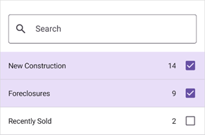
Filter Items
Filter items are separate controls within your application that automatically retrieve available values, format settings, and other information from the bound control – CollectionView. The following filter items are available:
Checkbox
FilterCheckItem – Allows users to use a checkbox to filter by Boolean values.

Switch
FilterSwitchItem – Allows users to use a switch to filter by Boolean values.

Chips with Single Selection
FilterChipGroupItem – Allows users to select a single option from a set.

Chips with Multiple Selection
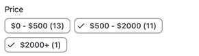
FilterCheckedChipGroupItem – Allows users to check multiple options from a set.

Predefined Chips with Multiple Selection
PredefinedFilterCheckedChipGroupItem – Allows users to check multiple predefined options from a set.
Date Range Editor
FilterDateRangeItem – Allows users to filter by date-time values.

Numeric Range Editor
FilterNumericRangeItem – Allows users to specify a value range to filter numeric values.

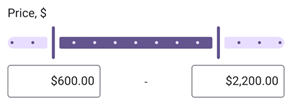
Numeric Range Slider
FilterNumericRangeSliderItem – Allows users to select a value range to filter numeric values.
List with Single Selection Using Radio Buttons
FilterRadioListItem – Allows users to select a single option from a radio-button list. Users can enter a search query in the search box to filter available options.

List with Multiple Selection Using Check Boxes
FilterCheckedListItem – Allows users to select multiple options from a checkbox list. Users can enter a search query in the search box to filter available options.
Dialog List with Single Selection Using Radio Buttons
FilterRadioListPickerItem – Allows users to select a single option from a list shown in a separate dialog. Users can enter a search query in the search box to filter available options.

Dialog List with Multiple Selection Using Check Boxes
FilterCheckedListPickerItem – Allows users to select multiple options from a list shown in a separate dialog. Users can enter a search query in the search box to filter available options.

Custom Filter Item
You can customize the value picker used in a built-in filter item. Depending on the filter item, use the following properties to implement a custom picker:
- FilterItemBase.FilterModelTemplate
- FilterFormItemBase.FilterModelTemplate
- FilterListPickerItemBase.PickerFilterModelTemplate
Use Filter Strings
The FilterString property allows you to specify a filter expression string written in Criteria Language Syntax.
The following example filters out persons whose name starts with the letter M:
<dxcv:DXCollectionView ItemsSource="{Binding Recents}"
                       FilterString="StartsWith([Name], 'M')">
    <!-- ... -->
</dxcv:DXCollectionView>
Use Filter Expressions
You can also use the FilterExpression property to filter Collection View items. To build expressions, use criteria operators described in the following topic: Criteria Operators.
The following example replicates the filtering rule from the previous section, but uses a filter expression instead of a filter string:
using DevExpress.Data.Filtering;
//...
    collectionView.FilterExpression = new FunctionOperator(FunctionOperatorType.StartsWith, new OperandProperty("Name"), new ConstantValue("M"));
To convert a filter string to its CriteriaOperator equivalent, call the CriteriaOperator.Parse method. For information on the Parse method limitations, refer to the following help topic: Limitations of CriteriaOperator.Parse.
Related Scenarios
Chip Filters for a CollectionView
Display Filtering UI Elements in a BottomSheet

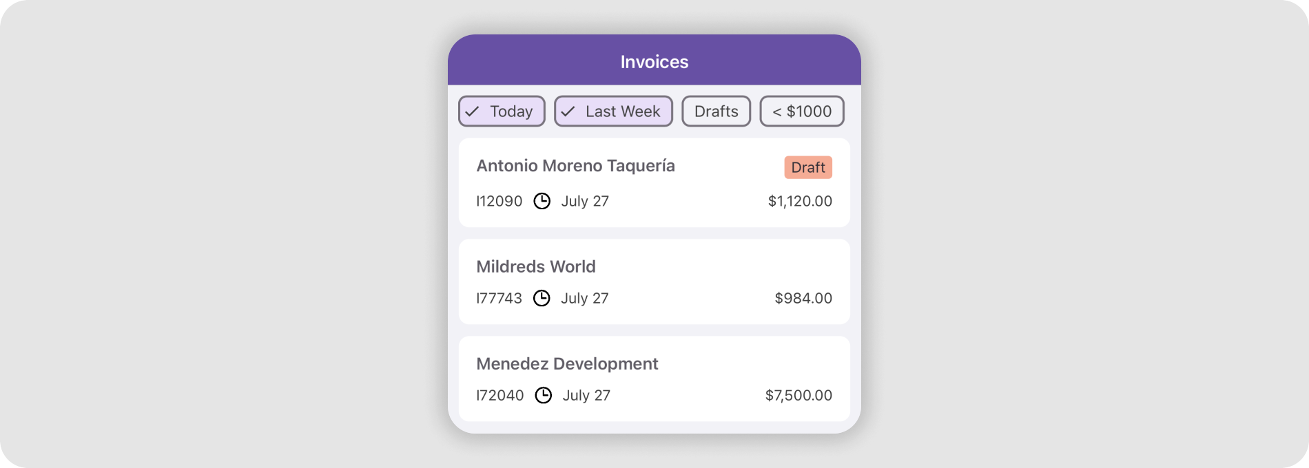
Sort Collection View Items
You can apply multiple sort rules to Collection View items and thereby sort items by multiple data fields. Follow the steps below to sort Collection View items:
Create a SortDescription object. Specify its properties:
Add the newly created sort description to the CollectionView.SortDescriptions collection.
Repeat steps 1-2 to add additional sort rules.
The following example sorts collection view items in descending order by the Name data field:

<dxcv:DXCollectionView ...>
    <dxcv:DXCollectionView.SortDescriptions>
        <dxcv:SortDescription FieldName="Name" SortOrder="Descending"/>
    </dxcv:DXCollectionView.SortDescriptions>
</dxcv:DXCollectionView>
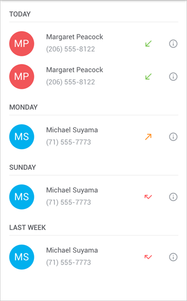
Group Collection View Items
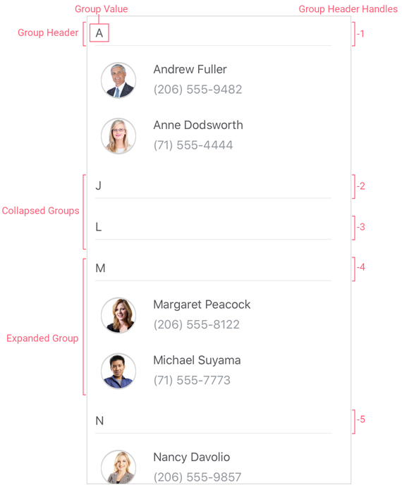
The DXCollectionView allows you to combine items into groups. To expand or collapse a group, a user should tap the group header. Enable the AllowFixedGroupHeaders property to fix group headers at the top of the Collection View when a user scrolls items up or down.
To group Collection View items, initialize the DXCollectionView.GroupDescription property with a GroupDescription object. Specify its options:
- FieldName
- Specifies the name of the field whose values are used to group collection view items.
- GroupInterval
- Specifies a range of values that form each group. For example, the
Alphabeticalgroup interval groups all rows that start with the same character. - SortOrder (Optional)
- Specifies whether items are sorted in ascending or descending order.
- DisplayFormat (Optional)
- Specifies the format for group captions.
The following markup groups a list of contacts alphabetically:
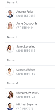
<dxcv:DXCollectionView x:Name="collectionView" ItemsSource="{Binding Data}">
    <dxcv:DXCollectionView.GroupDescription>
        <dxcv:GroupDescription FieldName="Name" GroupInterval="Alphabetical"/>
    </dxcv:DXCollectionView.GroupDescription>
    <!--...-->
</dxcv:DXCollectionView>
Collapse and Expand Groups
Users can tap the group header to collapse and expand the group. To prevent users from collapsing groups, set the AllowGroupCollapse property to False.
<dxcv:DXCollectionView AllowGroupCollapse="False"...>
    <!--...-->
</dxcv:DXCollectionView>
To check whether a group is collapsed, use the IsGroupCollapsed method and pass a group handle as a parameter. To get the handle of a specific Collection View item, call the DXCollectionView.GetItemHandle(Int32) method.
The DXCollectionView exposes an API that allows you to collapse/expand groups at runtime:
- CollapseGroup
- Collapses the specified group of items.
- CollapseAllGroups
- Collapses all groups of items.
- ExpandGroup
- Expands the specified group of items.
- ExpandAllGroups
- Expands all groups of items.
Respond to User Actions when Collapsing and Expanding Groups
The DXCollectionView ships with the following events that fire before/after a group is collapsed/expanded. You can handle these events to cancel collapse and expand operations, display a notification, and so on:
- GroupCollapsing
- Occurs before a group of items is collapsed.
- GroupCollapsed
- Occurs after a group of items has been collapsed.
- GroupExpanding
- Occurs before a group of items is expanded.
- GroupExpanded
- Occurs after a group of items has been expanded.
Customize Group Headers
The following API members allow you to configure the appearance for group items and headers:
- GroupHeaderTemplate
- Specifies a template that alters a collection view’s group headers.
- GroupItemAppearance
- Allows you to configure the appearance of collection view group items.
- GroupHeaderSize
- Gets or sets a group header’s height (for the vertical orientation of the view) or width (for the horizontal orientation). This is a bindable property.
- MinGroupHeaderSize
- Specifies a group header’s minimum height (for the vertical orientation of the view) or width (for the horizontal orientation). Use the Orientation property to manage the CollectionView orientation.
- GroupItemSeparatorColor
- Defines the color of group item separators.
- GroupItemSeparatorThickness
- Specifies the thickness of group item separators.
- GroupItemSeparatorCapMargin
- Specifies group item separator margins.
Use the IsGroupHeader method to check whether the passed handle belongs to a group header item.
Obtain Group Information
The following API members allow you to obtain information about groups and their child items:
- GroupCount
- Gets the number of data item groups in a CollectionView.
- GetGroupValue
- Returns the data value for which the group is created.
- GetGroupDisplayText
- Returns the text displayed in the specified group header.
- GetChildItemCount
- Returns the number of data items in the group.
- GetChildItemHandle
- Returns the handle of the item at the specified position within the specified group.