DXCollectionView.GroupHeaderTemplate Property
Gets or sets the template that defines the appearance of group headers. This is a bindable property.
Namespace: DevExpress.Maui.CollectionView
Assembly: DevExpress.Maui.CollectionView.dll
NuGet Package: DevExpress.Maui.CollectionView
Declaration
public DataTemplate GroupHeaderTemplate { get; set; }Property Value
| Type | Description |
|---|---|
| DataTemplate | A template that configures appearance settings for group headers. |
Remarks
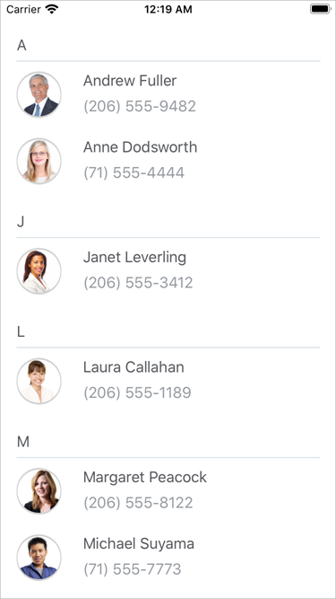
Use the GroupHeaderTemplate property to customize the headers of data item groups. A GroupInfo object specifies the binding context for a group header template. You can use GroupInfo properties in a custom template.
<dxcv:DXCollectionView ItemsSource="{Binding Data}"
                       GroupItemSeparatorThickness="1"
                       GroupItemSeparatorColor="#ebebeb"
                       GroupItemSeparatorCapMargin="4,20">
    <!-- Define ItemTemplate here.-->

    <!--Group items.-->
    <dxcv:DXCollectionView.GroupDescription>
        <dxcv:GroupDescription FieldName="Name" GroupInterval="Alphabetical"/>
    </dxcv:DXCollectionView.GroupDescription>

    <!--Define the group header template.-->
    <dxcv:DXCollectionView.GroupHeaderTemplate>
        <DataTemplate>
            <Label FontFamily="Roboto-Medium"
                   Margin="0,20,0,1"
                   TextColor="#55575c"
                   Text="{Binding GroupValueText}"/>
        </DataTemplate>
    </dxcv:DXCollectionView.GroupHeaderTemplate>
</dxcv:DXCollectionView>
Default | Custom |
|---|---|
|
|

You can also configure the appearance of group items, not only their headers. To do this, use the DXCollectionView.GroupItemAppearance property.
See Also