DXCollectionView.FilteringContext Property
Returns the data context that is used to bind filter items to the Collection View.
Namespace: DevExpress.Maui.CollectionView
Assembly: DevExpress.Maui.CollectionView.dll
NuGet Package: DevExpress.Maui.CollectionView
Declaration
public FilteringUIContext FilteringContext { get; }Property Value
| Type | Description |
|---|---|
| FilteringUIContext | A context that is used to connect the data control and filter items. |
Remarks
The DevExpress suite for MAUI allows you to use built-in filter items to design a functional and effective filtering UI. You can easily integrate such a UI with the CollectionView, because it publishes a dedicated FilteringContext property. When you populate a filter view with items, bind each item’s Context property to the CollectionView’s FilteringContext. Once users have interacted with the items, the resulting filter rule is available in the FilterExpression property.
Filter Items
Filter items are separate controls within your application that automatically retrieve available values, format settings, and other information from the bound control – CollectionView. The following filter items are available:
Checkbox
FilterCheckItem – Allows users to use a checkbox to filter by Boolean values.

Switch
FilterSwitchItem – Allows users to use a switch to filter by Boolean values.

Chips with Single Selection
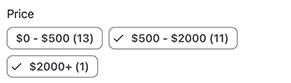
FilterChipGroupItem – Allows users to select a single option from a set.

Chips with Multiple Selection
FilterCheckedChipGroupItem – Allows users to check multiple options from a set.

Predefined Chips with Multiple Selection
PredefinedFilterCheckedChipGroupItem – Allows users to check multiple predefined options from a set.
Date Range Editor
FilterDateRangeItem – Allows users to filter by date-time values.

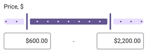
Numeric Range Editor
FilterNumericRangeItem – Allows users to specify a value range to filter numeric values.

Numeric Range Slider
FilterNumericRangeSliderItem – Allows users to select a value range to filter numeric values.
List with Single Selection Using Radio Buttons
FilterRadioListItem – Allows users to select a single option from a radio-button list. Users can enter a search query in the search box to filter available options.

List with Multiple Selection Using Check Boxes
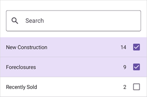
FilterCheckedListItem – Allows users to select multiple options from a checkbox list. Users can enter a search query in the search box to filter available options.
Dialog List with Single Selection Using Radio Buttons
FilterRadioListPickerItem – Allows users to select a single option from a list shown in a separate dialog. Users can enter a search query in the search box to filter available options.

Dialog List with Multiple Selection Using Check Boxes
FilterCheckedListPickerItem – Allows users to select multiple options from a list shown in a separate dialog. Users can enter a search query in the search box to filter available options.

Custom Filter Item
You can customize the value picker used in a built-in filter item. Depending on the filter item, use the following properties to implement a custom picker:
- FilterItemBase.FilterModelTemplate
- FilterFormItemBase.FilterModelTemplate
- FilterListPickerItemBase.PickerFilterModelTemplate
Example
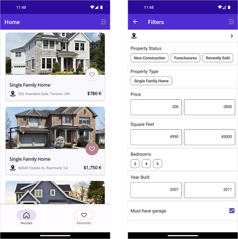
The following example shows how to design a filtering UI for a DXCollectionView. You need to populate a view with filter items and set their Context properties to the collection view’s FilteringContext. For each filter item, specify the FilterItemBase.FieldName property so that an item can obtain its values from the corresponding data field.
<VerticalStackLayout>
    <!-- The BindingContext contains the DXCollectionView.FilteringContext property value -->
    <dxe:FilterRadioListPickerItem Context="{Binding}" FieldName="City" ImageSource="filteringui_location" ImageColor="{DynamicResource AccentColor}"/>
    <dxe:FilterChipGroupItem Context="{Binding}" Text="Property Status" FieldName="Status" CustomDisplayText="OnCustomDisplayText"/>
    <dxe:FilterCheckedChipGroupItem Context="{Binding}" Text="Property Type" FieldName="Type" CustomDisplayText="OnCustomDisplayText"/>
    <dxe:FilterNumericRangeFormItem Context="{Binding}" Text="Price" FieldName="Price2"/>
    <dxe:FilterNumericRangeFormItem Context="{Binding}" Text="Square Feet" FieldName="HouseSize"/>
    <dxe:FilterCheckedChipGroupItem Context="{Binding}" Text="Bedrooms" FieldName="Beds"/>
    <dxe:FilterNumericRangeFormItem Context="{Binding}" Text="Year Built" FieldName="YearBuilt"/>
    <dxe:FilterCheckItem Context="{Binding}" Text="Must have garage" FieldName="IsGarageExist"/>
</VerticalStackLayout>