Customize Appearance of DevExpress CollectionView for .NET MAUI
- 3 minutes to read
This topic lists API members that allow you to customize the appearance of the DXCollectionView control.
Apply Themes
The DevExpress components for .NET MAUI including DXCollectionView control support the common theming mechanism. You can use more than 10 built-in color schemes in both light and dark modes.
For more information, refer to the following help topic: Color Themes for DevExpress .NET MAUI Controls.
Specify Background
Use the properties below to specify the CollectionView fill color:
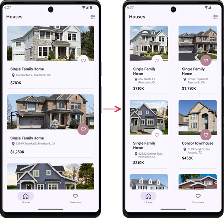
Specify Item Appearance and Layout
The properties below allow you to customize the appearance of CollectionView item text and appearance:
- DisplayFormat
- Specifies the format that is applied to CollectionView item text.
- ItemAppearance
- Allows you to specify the most common item appearance settings (including text color, padding, font options, and background).
- ItemTemplate
- Defines a data template that configures CollectionView item appearance.
- ItemSeparatorColor, ItemSeparatorShowBeforeGroup, ItemSeparatorThickness, ItemSeparatorCapMargin
- Specify item separator options.
- ItemSize, MinItemSize
- Allow you to define item height or width depending on the Orientation value.
- ItemSpanCount
Sets the number of columns or rows (depending on Orientation) that are used to arrange collection view items.
- ItemSpacing, ItemSpanSpacing
- Specify gaps between items in the DXCollectionView control.
Specify Group Header Appearance
The DXCollectionView control allows you to group its items. For information on how to specify group header appearance, refer to the following section: Customize Group Headers. The following properties configure header appearance options:
- GroupHeaderSize, MinGroupHeaderSize
- Specify the group header height or width depending on Orientation.
- GroupItemAppearance
- Allows you to specify the most common appearance settings for group headers (including text color, padding, margin, font options, and background).
- GroupHeaderTemplate
- Defines a data template that configures collection view group header appearance.
- GroupItemSeparatorCapMargin, GroupItemSeparatorColor, GroupItemSeparatorThickness
- Specify group header options.
Indicate Taps with Ripple Effects
Ripple animations allow you to visualize user taps on DXCollectionView items.

Use the following properties to configure ripple effects:
- UseRippleEffect
- Specifies whether to show ripple animations when a user taps collection view items.
- RippleColor
- Specifies the color used to display ripple effects.
- RippleEffectPosition
- Defines whether to show ripple effects in front of collection view items or behind them.
<dxcv:DXCollectionView ...
                       UseRippleEffect="True"
                       RippleColor="#502B0098"
                       RippleEffectPosition="Foreground">
Customize Selected Item Appearance
The following properties allow you to specify the appearance for selected DXCollectionView items:
For more information on selection in DXCollectionView, refer to the following help topic: Item Selection in Collection View for .NET MAUI.
Obtain Current Appearance Settings
Use the DXCollectionView.ActualAppearance property to obtain an object with the collection view’s current appearance settings.