Swipe Gestures in Collection View for .NET MAUI
- 6 minutes to read
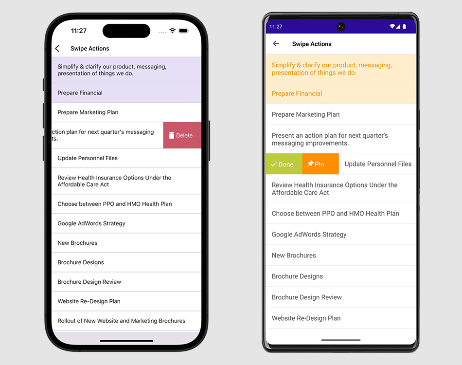
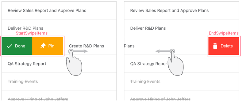
You can extend CollectionView’s UI with additional elements that appear when a user swipes an item from left to right or from right to left and perform custom actions on tap. For the Horizontal orientation, the CollectionView supports top-to-bottom and bottom-to-top swipe gestures for items.

To implement this functionality, set the DXCollectionView.ItemTemplate property to a data template that contains a SwipeContainer object and specify this container’s properties as follows:
- Assign a
Viewclass descendant to the ItemView property to define the appearance of CollectionView items. Populate StartSwipeItems and EndSwipeItems collections with swipe items. A swipe item is a visual element that appears on the left or right side of a data item when a user swipes the item, and performs a custom action on tap. If the CollectionView is horizontally oriented, it displays swipe items on the top or bottom of data items. You can use the Size property to specify a swipe item’s width (for vertical orientation of the collection view) or height (for horizontal orientation). Swipe items can be of the following types:
- SwipeContainerItem — displays a swipe item as a button for which you can specify an image, caption, and text settings.
- CustomSwipeItem — allows you to specify a custom view (a
Viewclass descendant) for a swipe item.
To assign an action to a swipe item, define a command in a view model and bind this command to the swipe item’s Command property, or handle the Tap event. Enable the RaiseSwipeItemTapImmediately property to raise the
Tapevent and execute theCommandbefore a swipe item animation starts.
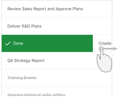
Use the FullSwipeMode property to specify whether the CollectionView should perform the first action from the StartSwipeItems collection and the last action from EndSwipeItems in response to a full swipe across a data item.

If you want to show or hide swipe items by a specified condition, handle the SwipeItemShowing event.
Example
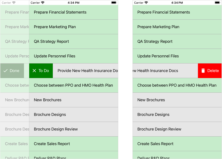
This example shows how to define the following two swipe actions for items of the vertical CollectionView bound to the list of tasks:
- Done/To Do
When a user swipes an item from left to right, this button appears on the left side of the item and changes the task state on tap (colors in-progress tasks green, and completed tasks gray). The button caption depends on the task state. - Delete
When a user swipes an item from right to left, this button appears on the right side of the item and removes the task on tap.

Create the ViewModel class with the Data property that returns a collection of tasks. This collection is a data source for the CollectionView.
An individual task is a Task object that has the following properties:
- Description – the task description.
IsTaskCompleted – the task state. It affects values of the following properties:
- ItemColor – a color that the CollectionView uses to fill the item that corresponds to the task.
- ActionText, ActionIcon – a caption and icon of the To Do/Done swipe button that changes the task state.
- ChangeStateCommand – a command that changes the task state.
using System.Collections.Generic;
using System.ComponentModel;
using System.Windows.Input;
using Microsoft.Maui.Controls;

namespace CollectionView_Swipe {
    public class ViewModel {
        public List<Task> Data { get; }

        public ViewModel() {
            Data = new List<Task>() {
                new Task("Prepare Financial"),
                new Task("Prepare Marketing Plan"),
                new Task("QA Strategy Report"),
                new Task("Update Personnel Files"),
                new Task("Provide New Health Insurance Docs"),
                new Task("Choose between PPO and HMO Health Plan"),
                new Task("New Brochures"),
                new Task("Brochure Designs"),
                new Task("Brochure Design Review"),
                new Task("Create Sales Report"),
                new Task("Deliver R&D Plans"),
            };
        }
    }

    public class Task : INotifyPropertyChanged {
        public string Description { get; private set; }

        bool isTaskCompleted;
        public bool IsTaskCompleted {
            get => isTaskCompleted;
            set {
                isTaskCompleted = value;
                PropertyChanged?.Invoke(this, new PropertyChangedEventArgs(nameof(IsTaskCompleted)));
                UpdateState();
            }
        }

        Color itemColor;
        public Color ItemColor {
            get => itemColor;
            private set {
                itemColor = value;
                PropertyChanged?.Invoke(this, new PropertyChangedEventArgs(nameof(ItemColor)));
            }
        }

        string actionText;
        public string ActionText {
            get => actionText;
            private set {
                actionText = value;
                PropertyChanged?.Invoke(this, new PropertyChangedEventArgs(nameof(ActionText)));
            }
        }

        string actionIcon;
        public string ActionIcon {
            get => actionIcon;
            private set {
                actionIcon = value;
                PropertyChanged?.Invoke(this, new PropertyChangedEventArgs(nameof(ActionIcon)));
            }
        }

        public ICommand ChangeStateCommand { get; }

        public event PropertyChangedEventHandler PropertyChanged;

        public Task(string description) {
            ChangeStateCommand = new Command(() => IsTaskCompleted = !IsTaskCompleted);
            Description = description;
            UpdateState();
        }

        void UpdateState() {
            ItemColor = IsTaskCompleted ? Color.FromArgb("#c6eccb") : Color.FromArgb("#e6e6e6");
            ActionText = IsTaskCompleted ? "To Do" : "Done";
            ActionIcon = IsTaskCompleted ? "uncompletetask" : "completetask";
        }
    }
}
Set the ContentPage’s BindingContext to a ViewModel object.
Add a DXCollectionView object to the page and bind its ItemsSource property to the view model’s Data property.
Define a template for CollectionView items:
- Create a
DataTemplatewith a SwipeContainer element. - Set the SwipeContainer.ItemView property to a view that specifies the appearance of items in the list. In this example, it is a
StackLayoutwith aLabelbound to the Task.Description property and a BoxView that defines a separator between items. - Assign the created data template to the DXCollectionView.ItemTemplate property.
- Create a
Specify swipe actions:
To Do/Done
Add a SwipeContainerItem object to the SwipeContainer.StartSwipeItems collection.Bind this object’s Caption, Image, and Command properties to properties of the view model to select the button text and icon depending on the task state and assign a custom action (change a task status) to the button. Use the BackgroundColor property to set the button color.
Delete
Add a SwipeContainerItem object to the SwipeContainer.EndSwipeItems collection.Use this object’s Caption, BackgroundColor, and Image properties to customize the button appearance.
Handle the Tap event to assign a custom action (remove an item) to the button.
<ContentPage xmlns="http://schemas.microsoft.com/dotnet/2021/maui" xmlns:x="http://schemas.microsoft.com/winfx/2009/xaml" xmlns:dxcv="clr-namespace:DevExpress.Maui.CollectionView;assembly=DevExpress.Maui.CollectionView" xmlns:local="clr-namespace:CollectionView_Swipe" x:Class="CollectionView_Swipe.MainPage"> <ContentPage.BindingContext> <local:ViewModel/> </ContentPage.BindingContext> <ContentPage.Resources> <Style TargetType="dxcv:SwipeItem"> <Setter Property="FontColor" Value="White"/> <Setter Property="FontSize" Value="Medium"/> </Style> <Style x:Key="SeparatorStyle" TargetType="BoxView"> <Setter Property="Color" Value="DarkGray"/> <Setter Property="HeightRequest" Value="1"/> </Style> </ContentPage.Resources> <dxcv:DXCollectionView x:Name="collectionView" ItemsSource="{Binding Data}"> <dxcv:DXCollectionView.ItemTemplate> <DataTemplate> <dxcv:SwipeContainer> <dxcv:SwipeContainer.ItemView> <StackLayout Margin="0" Spacing="0" BackgroundColor="{Binding ItemColor}"> <Label Margin="20" Text="{Binding Description}"/> <BoxView Style="{StaticResource SeparatorStyle}"/> </StackLayout> </dxcv:SwipeContainer.ItemView> <dxcv:SwipeContainer.StartSwipeItems> <dxcv:SwipeContainerItem Caption="{Binding ActionText}" BackgroundColor="Green" Image="{Binding ActionIcon}" Command="{Binding ChangeStateCommand}"/> </dxcv:SwipeContainer.StartSwipeItems> <dxcv:SwipeContainer.EndSwipeItems> <dxcv:SwipeContainerItem Caption="Delete" BackgroundColor="Red" Image="deletetask" Tap="SwipeItem_Tapped"/> </dxcv:SwipeContainer.EndSwipeItems> </dxcv:SwipeContainer> </DataTemplate> </dxcv:DXCollectionView.ItemTemplate> </dxcv:DXCollectionView> </ContentPage>using DevExpress.Maui.CollectionView; // ... void SwipeItem_Tapped(System.Object sender, SwipeItemTapEventArgs e) { this.collectionView.DeleteItem(e.ItemHandle); }