Get Started with Collection View for .NET MAUI
- 6 minutes to read
The DXCollectionView component displays a collection of data items. This topic allows you to get started with the Collection View component and explore its basic functionality. It binds the view to a data source, applies an item template, and sort and group data items.
Prerequisites
Refer to the following pages before you proceed with this Getting Started lesson:
- Microsoft .NET Multi-platform App UI documentation
- .NET MAUI and DevExpress Mobile UI Supported Platforms
- Requirements for .NET MAUI and DevExpress Mobile UI
- Get Started with DevExpress Controls for .NET Multi-platform App UI (.NET MAUI)
Create a Project
Create a new .NET MAUI project. Name it CollectionViewGetStarted.
If the wizard does not propose a template for .NET MAUI projects, you can call the following command in a CLI to create a new .NET MAUI project:
dotnet new maui -n CollectionViewGetStartedInstall the
DevExpress.Maui.CollectionViewNuGet package.Refer to the following help topic for more information: Install Packages from NuGet.org: Visual Studio, VS Code, and JetBrains Rider
Note
DevExpress Collection View for .NET MAUI supports iOS and Android. The project should contain only these platforms.
Add a Collection View to the Main Page
In the MauiProgram.cs file, call the following UseDevExpress* methods to register handlers for the DXCollectionView class.
using DevExpress.Maui;
using Microsoft.Maui.Controls.Hosting;
using Microsoft.Maui.Hosting;

namespace CollectionViewExample {
    public static class MauiProgram {
        public static MauiApp CreateMauiApp() {
            var builder = MauiApp.CreateBuilder();
            builder
                .UseDevExpress(useLocalization: false)
                .UseDevExpressCollectionView()
                .UseMauiApp<App>()
                .ConfigureFonts(fonts =>
                {
                    fonts.AddFont("OpenSans-Regular.ttf", "OpenSansRegular");
                });
            return builder.Build();
        }
    }
}
Do the following in the MainPage.xaml file:
- Define the
xmlns:dx="http://schemas.devexpress.com/maui"XAML namespace. - Remove default content and add an instance of the DXCollectionView class to the page. Remove default content event handlers in the code-behind. We recommend you remove default styles (fonts, colors, and other settings) in the App.xaml file.
<ContentPage xmlns="http://schemas.microsoft.com/dotnet/2021/maui"
             xmlns:x="http://schemas.microsoft.com/winfx/2009/xaml"
             xmlns:dx="http://schemas.devexpress.com/maui"
             x:Class="CollectionViewGetStarted.MainPage"
             BackgroundColor="{DynamicResource PageBackgroundColor}">
    <dx:DXCollectionView/>
</ContentPage>
Populate the View with Data
Create ViewModel and Contact classes as shown below. The ViewModel class exposes the Data property that provides access to the data source. Items in this collection are Contact objects that expose the Name, Photo, and Phone properties.
using Microsoft.Maui.Controls;
using System;
using System.Collections.Generic;
using System.ComponentModel;
using System.Runtime.CompilerServices;

namespace CollectionViewGetStarted {
    public class Contact {
        string name;
        public string Name {
            get => this.name;
            set {
                this.name = value;
                if (Photo == null) {
                    string resourceName = value.Replace(" ", "").ToLower() + ".jpg";
                    Photo = ImageSource.FromFile(resourceName);
                }
            }
        }

        public Contact(string name, string phone) {
            Name = name;
            Phone = phone;
        }
        public ImageSource Photo { get; set; }
        public string Phone { get; set; }
    }

    public class ViewModel : INotifyPropertyChanged {
        public List<Contact> Data { get; }
        public ViewModel() {
            Data = new List<Contact>() {
                new Contact("Nancy Davolio", "(206) 555-9857"),
                new Contact("Andrew Fuller", "(206) 555-9482"),
                new Contact("Janet Leverling", "(206) 555-3412"),
                new Contact("Margaret Peacock", "(206) 555-8122"),
                new Contact("Steven Buchanan", "(71) 555-4848"),
                new Contact("Michael Suyama", "(71) 555-7773"),
                new Contact("Robert King", "(71) 555-5598"),
                new Contact("Laura Callahan", "(206) 555-1189"),
                new Contact("Anne Dodsworth", "(71) 555-4444"),
            };
        }

        public event PropertyChangedEventHandler PropertyChanged;
        private void OnPropertyChanged([CallerMemberName] string propertyName = "") {
            PropertyChanged?.Invoke(this, new PropertyChangedEventArgs(propertyName));
        }
    }
}
Do the following in the MainPage.xaml file:
- Define the
localXML namespace that refers to theCollectionViewGetStartedCLR namespace. - Assign a
ViewModelinstance to theContentPage.BindingContextproperty. - Bind the DXCollectionView.ItemsSource property to the view model’s
Dataproperty.
<ContentPage xmlns="http://schemas.microsoft.com/dotnet/2021/maui"
             xmlns:x="http://schemas.microsoft.com/winfx/2009/xaml"
             xmlns:dx="http://schemas.devexpress.com/maui"
             xmlns:local="clr-namespace:CollectionViewGetStarted"
             x:Class="CollectionViewGetStarted.MainPage"
             BackgroundColor="{DynamicResource PageBackgroundColor}">
    <ContentPage.BindingContext>
        <local:ViewModel/>
    </ContentPage.BindingContext>
    <dx:DXCollectionView ItemsSource="{Binding Data}"/>
</ContentPage>
Create an Item Template
The DXCollectionView supports item templates. These templates allow you to specify how each item appears in the view. Make the following changes in the MainPage.xaml file to define an item template:
- Assign a
DataTemplateto the DXCollectionView.ItemTemplate property. - Populate the template with controls and bind them to data source fields as the markup below demonstrates.
<dx:DXCollectionView ItemsSource="{Binding Data}"
                       Margin="{OnIdiom Phone='16,0,0,0', Tablet='71,0,0,0'}">
        <!--Define the item template.-->
        <dx:DXCollectionView.ItemTemplate>
            <DataTemplate>
                <Grid Padding="10, 8, 18, 7">
                    <Grid.ColumnDefinitions>
                        <ColumnDefinition Width="50"/>
                        <ColumnDefinition Width="*"/>
                    </Grid.ColumnDefinitions>
                    <Grid Margin="0" Padding="0" ColumnSpacing="0" RowSpacing="0">
                        <Frame BackgroundColor="White"
                                   Padding="0" Margin="0"
                                   HeightRequest="48"
                                   WidthRequest="48"
                                   VerticalOptions="Center"
                                   HorizontalOptions="Center"
                                   HasShadow="False"
                                   CornerRadius="24">
                            <Frame.IsClippedToBounds>
                                <OnPlatform x:TypeArguments="x:Boolean">
                                    <On Platform="iOS">true</On>
                                    <On Platform="Android">false</On>
                                </OnPlatform>
                            </Frame.IsClippedToBounds>
                            <Image Source="{Binding Photo}"/>
                        </Frame>
                        <Ellipse Margin="0"
                                 Fill="Transparent"
                                 Stroke="LightGray"
                                 StrokeThickness="1"
                                 HeightRequest="50"
                                 WidthRequest="50"
                                 VerticalOptions="Center"
                                 HorizontalOptions="Center">
                        </Ellipse>
                    </Grid>
                    <StackLayout Grid.Column="1"
                             Padding="18,1,18,7"
                             Orientation="Vertical">
                        <Label Text="{Binding Name}"
                           Margin="0,2"
                           TextColor="#55575c"/>
                        <Label Text="{Binding Phone}"
                               TextColor="#959aa0"/>
                    </StackLayout>
                </Grid>
            </DataTemplate>
        </dx:DXCollectionView.ItemTemplate>
</dx:DXCollectionView>
Do the following to add contact photos to the solution:
- Download the DevExpress Collection View for .NET MAUI repository from GitHub.
- Copy images from the /CollectionViewExample/Resources/Images folder in the downloaded repository to the same folder in your project.
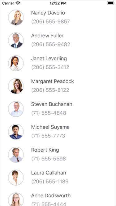
Run the application. The Collection View now displays a photo, name, and phone number for each contact.
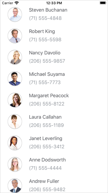
Sort Data Items
You can sort data in the DXCollectionView component. Make the following changes in the MainPage.xaml file to sort data items:
- Create a SortDescription object, and specify its FieldName and SortOrder properties.
- Add this object to the DXCollectionView.SortDescriptions collection.
<dx:DXCollectionView ItemsSource="{Binding Data}">
        <!-- Define ItemTemplate here.-->

        <!--Sort items.-->
        <dx:DXCollectionView.SortDescriptions>
            <dx:SortDescription FieldName="Name" SortOrder="Descending"/>
        </dx:DXCollectionView.SortDescriptions>
</dx:DXCollectionView>
Run the application. Contacts are now sorted by first name in descending order.
You can also sort list items by multiple data fields. To do this, create a SortDescription object for each field that should be sorted. The order of these objects in the DXCollectionView.SortDescriptions collection defines the sort order in the DXCollectionView.
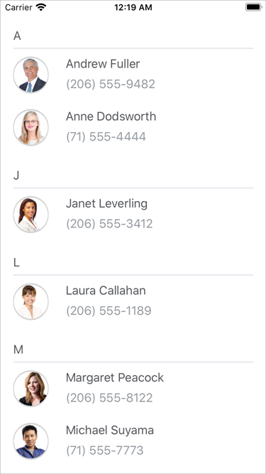
Group Data Items
You can group items in the DXCollectionView component. Make the following changes in the MainPage.xaml file to group data items:
Assign a GroupDescription object to the DXCollectionView.GroupDescription property. Set the GroupDescription.FieldName property to
Nameand GroupInterval toAlphabetical.Use the DXCollectionView.GroupHeaderTemplate property to specify the appearance of group headers.
<dx:DXCollectionView ItemsSource="{Binding Data}">
        <!--...-->
        <!--Group items.-->
        <dx:DXCollectionView.GroupDescription>
            <dx:GroupDescription FieldName="Name" GroupInterval="Alphabetical"/>
        </dx:DXCollectionView.GroupDescription>

        <!--Define the group header template.-->
        <dx:DXCollectionView.GroupHeaderTemplate>
            <DataTemplate>
                <StackLayout Margin="2, 0, 18, 10">
                    <Label FontFamily="Roboto-Medium"
                       Margin="0,20,0,1"
                       TextColor="#55575c"
                       Text="{Binding Value}"/>
                    <BoxView BackgroundColor="#ebebeb"
                         HeightRequest="1"/>
                </StackLayout>
            </DataTemplate>
        </dx:DXCollectionView.GroupHeaderTemplate>
</dx:DXCollectionView>
Run the application. Contacts whose first name begins with the same letter are now arranged into groups. Each group is identified by a header. Users can tap group headers to expand or collapse groups.