SearchLookUpEdit Class
The editor that provides lookup functionality using a dropdown feature-rich data grid (GridControl), and contains the built-in Find Panel, allowing end-users to quickly filter and locate dropdown records. You can display lookup records in a tabular format, banded tabular format, or as tiles (which can be arranged in one or multiple columns/rows, rendered as a list or a Kanban board).
Namespace: DevExpress.XtraEditors
Assembly: DevExpress.XtraGrid.v19.1.dll
Declaration
[ToolboxBitmap(typeof(ToolboxIconsRootNS), "SearchLookUpEdit")]
public class SearchLookUpEdit :
GridLookUpEditBaseRelated API Members
The following members return SearchLookUpEdit objects:
Remarks
A lookup editor is an editor with an embedded dropdown window which displays lookup records (the records from which an end-user can select). When a lookup record is selected, the editor’s value (the BaseEdit.EditValue bindable property) and display text are modified accordingly.
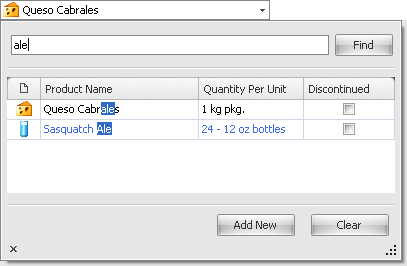
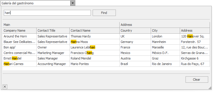
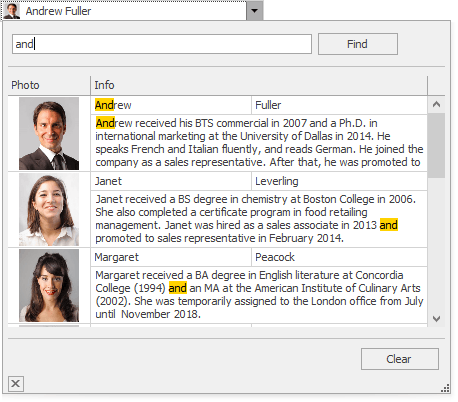
The SearchLookUpEdit supports a built-in Find Panel, which allows an end-user to quickly locate rows by the text they contain.
The SearchLookUpEdit can display lookup records in the dropdown using multiple data presentation formats (Views), which you can choose with the RepositoryItemGridLookUpEditBase.PopupViewType property:
Grid View (default) - Displays data in a tabular form. The following features, and many more, can be employed for the Grid View embedded in the SearchLookUpEdit: data sorting, grouping, filtering, summaries, hiding column headers, changing row height, etc. See Grid View to learn more.
Tile View - Displays records as read-only tiles, using one of the following layout modes: default (one or multiple columns/rows), list (without spaces between records) and Kanban. This View provides the advanced field positioning feature, which helps you arrange fields relative to other fields, specify absolute or relative field display bounds, etc. See Tile View.

Banded Grid View - Displays data in a tabular form and allows grouping of columns into bands. See Banded Grid Views.
Advanced Banded Grid View - Displays data in a tabular form, allows grouping columns into bands and supports complex data cell arrangements. See Banded Grid Views.
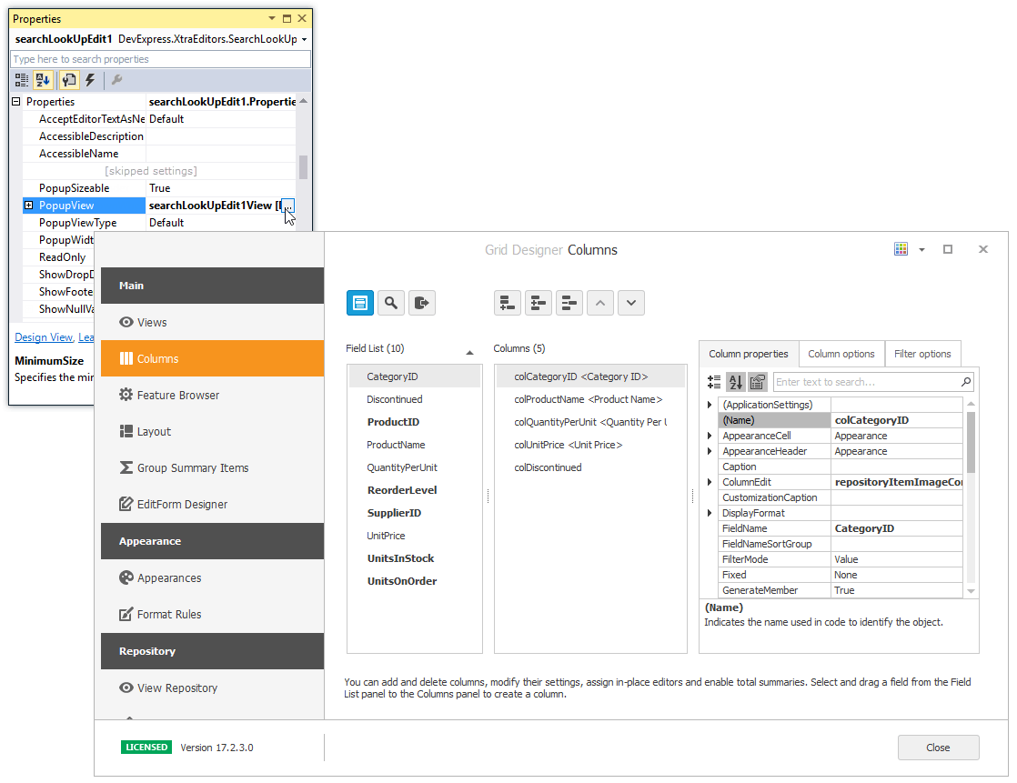
After you have set the RepositoryItemGridLookUpEditBase.PopupViewType property, the SearchLookUpEdit control creates a corresponding View object. This View can now be accessed and customized from the RepositoryItemGridLookUpEditBase.PopupView property. At design time, you can customize the View with the Data Grid Designer, which you can open by clicking the ellipsis button for the PopupView property in Properties grid, or by invoking the Design View command (from the Properties window or the control’s smart tag).
To learn how to set up lookup editors in different binding modes, see the following topics:
- Standard Binding (to Simple Data Types)
- Advanced Binding (to Business Objects)
- Using a Dictionary Lookup Data Source
You may want to filter the popup data source of one (secondary) lookup editor based on a value of another (primary) lookup editor. This scenario is covered in the following topic:
The SearchLookUpEdit and GridLookUpEdit controls have many features in common. These controls are identically created and customized (except for the additional features that are only typical to the SearchLookUpEdit control). Please refer to the GridLookUpEdit topic for an example.
Additional Customization
The following list shows some of the members that help you perform the additional customization of the SearchLookUpEdit control.
- RepositoryItemGridLookUpEditBase.PopupViewType - Gets or sets the type of View used to represent data in the dropdown.
RepositoryItemGridLookUpEditBase.PopupView - Gets or sets the View used to represent data in the dropdown.
The View property provides settings to change the grid appearance, access columns, create unbound columns, apply data grouping, filtration and summaries, etc.
For instance, if you use one of the ColumnView descendants (e.g., GridView), you can use the ColumnView.Columns property to customize the column collection. To set up columns at design time, use the GridControl’s designer, which can be invoked from the RepositoryItemGridLookUpEditBase.PopupView property in the Properties window.
- RepositoryItemLookUpEditBase.TextEditStyle property - Enables the text editing feature in the edit box.
- RepositoryItemSearchLookUpEdit.AddNewValue event - Fires when the “Add New” button is clicked, and allows you to add new records to the dropdown data source..
- RepositoryItemLookUpEditBase.BestFitMode - Gets or sets the “best-fit” mode for columns in the dropdown window.
- RepositoryItem.NullText - Gets or sets the text that presents the editor’s null value (null, System.DBNull.Value and RepositoryItemDateEdit.NullDate - for DateEdit).
RepositoryItemSearchLookUpEdit.ShowAddNewButton - Gets or sets whether the “Add New” button is displayed within the editor’s dropdown.
Clicking the “Add New” button fires the RepositoryItemSearchLookUpEdit.AddNewValue event. You can handle this event to manually add a new record to the dropdown data source when required.
RepositoryItemSearchLookUpEdit.ShowClearButton - Gets or sets whether the “Clear” button is displayed within the editor’s dropdown.
Clicking the Clear button sets the editor’s EditValue to null.
Search Settings
There are two search modes - automatic and manual. In automatic search mode, a search starts following a small delay after an end-user has stopped typing text. In manual search mode, a search is started manually by pressing ENTER or clicking the Find button.
Automatic search mode is in effect in the following cases:
- the RepositoryItemSearchLookUpEdit.PopupFindMode property is set to Default (default value), the control functions in regular binding mode and the number of data source records is less than 10,000;
- the RepositoryItemSearchLookUpEdit.PopupFindMode property is set to Default and the control functions in Instant Feedback Mode;
- the RepositoryItemSearchLookUpEdit.PopupFindMode property is set to Always.
Manual search mode is in effect in the following cases:
- the RepositoryItemSearchLookUpEdit.PopupFindMode property is set to Default, the control functions in regular binding mode and the number of data source records is greater than 10,000;
- the RepositoryItemSearchLookUpEdit.PopupFindMode property is set to Default and the control functions in regular (sync) server data binding mode;
- the RepositoryItemSearchLookUpEdit.PopupFindMode property is set to FindClick.
The RepositoryItemGridLookUpEditBase.PopupFilterMode property specifies how dropdown rows are filtered - using the Contains or StartsWith filter. By default, this property is set to PopupFilterMode.Default, which is equivalent to the Contains filter.
The PopupFilterMode property also affects columns against which data is searched. See the PopupFilterMode topic to learn more.
To embed a SearchLookUpEdit in a cell within a container control (XtraGrid, XtraTreeList, etc), use the RepositoryItemSearchLookUpEdit component. See the Repositories and Repository Items topic, for more information.
Note
The SearchLookUpEdit clears the active filter after closing the dropdown window.
Note
Instant Feedback Mode is supported by the SearchLookUpEdit when the control is used as a standalone control and when the control is used as an in-place editor within a Grid Control.
Note
The GridLookUpEdit and SearchLookUpEdit controls do not have a connection to their underlying data sources while their dropdown windows are closed.
So in this instance it is not possible to access the underlying data or a grid’s calculated data using methods provided by the embedded Grid Control and its View. You can use these methods only when the controls’ dropdown windows are open.
While the dropdown windows are closed, you can access the underlying data using methods provided by the underlying data source.