CheckedListBoxControl Class
The checked list box control, in which each item can be checked, unchecked or set to the grayed state. The control can be populated with items from a data source.
Namespace: DevExpress.XtraEditors
Assembly: DevExpress.XtraEditors.v19.1.dll
Declaration
[CheckedListBoxControl.CheckedListBoxControlCustomBindingProperties]
[ToolboxBitmap(typeof(ToolboxIconsRootNS), "CheckedListBoxControl")]
public class CheckedListBoxControl :
    BaseCheckedListBoxControl,
IBehaviorPropertiesFilterRelated API Members
The following members return CheckedListBoxControl objects:
Remarks
By default, the CheckedListBoxControl renders its items as text strings with built-in check boxes that reflect item check states.
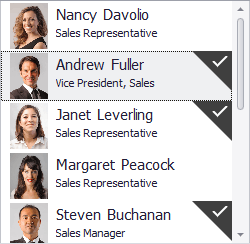
The Item Templates feature helps you render each listbox item as your needs dictate. Each item can display multiple text and image elements arranged in any manner, and painted using different appearance settings. There are no built-in check boxes when listbox items are rendered from a template. Instead, item check states are indicated with check marks.
An end-user can switch between item check states by double-clicking or clicking an item with the mouse (see BaseCheckedListBoxControl.CheckOnClick) or by pressing the keyboard SPACE bar.
The control’s main members include:
- BaseCheckedListBoxControl.Items - Allows you to populate the control with items in unbound mode.
- BaseListBoxControl.DataSource - Use this property to populate the control with items from a data source.
- BaseListBoxControl.Templates - This property supports the item templates feature. See Templated ListBox Items to learn more.
- BaseListBoxControl.CustomizeItem - Allows you to dynamically customize templated items.
- BaseListBoxControl.CustomItemTemplate - Allows you to provide a custom template for listbox items.
- BaseListBoxControl.ValueMember - Gets or sets the field name in the bound data source whose contents are assigned to item values.
- BaseListBoxControl.DisplayMember - Gets or sets the name of the data source field that provides display text for listbox items. This property is not supported when listbox items are rendered based on Item Templates
- BaseListBoxControl.MultiColumn - Gets or sets whether listbox items can be arranged across multiple columns.
- BaseListBoxControl.SelectionMode - Gets or sets whether a single or multiple items can be selected.
- BaseListBoxControl.ContextButtons - Provides access to the collection of context buttons displayed in the control.
- BaseListBoxControl.SelectedIndexChanged - Allows you to respond to item selection.
- BaseListBoxControl.ItemHeight - Gets or sets an item’s height.
- BaseCheckedListBoxControl.GetItemEnabled - Enables you to disable specific items, in bound mode.
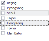
Checked States vs. Selection vs. Hot-Tracking
Make note of the difference between an item’s checked, selected and hot-tracked states. An item’s checked state is visually indicated by the item’s check box. Item hot-tracking (disabled by default) is highlighting an item on a mouse hover. Once the mouse cursor leaves an item’s bounds, the item loses its hot-tracked state. Item selection is the capability to select (visually highlight) an item (or multiple items) and keep this highlighting after the mouse cursor leaves the control’s bounds.
The following image demonstrates a CheckedListBoxControl, in which the ‘Beijing’ item is checked, and the two items (‘Seoul’ and ‘Hong Kong’) are selected.
When one or more items are selected, you can toggle the check states of all selected items at once by pressing the SPACE key or clicking a check box of any selected item.
An end-user can select an item using the keyboard navigation keys, by clicking an item with the mouse, and optionally by hovering (hot-tracking) the item. Multiple item selection can be enabled with the BaseListBoxControl.SelectionMode property. See this topic to know how items can be selected by end-users in multi-selection modes.
The item hot-tracking feature is initially disabled, and can be enabled with the BaseListBoxControl.HotTrackItems property. The BaseListBoxControl.HotTrackSelectMode property allows you to specify whether an item is immediately selected once it is hot-tracked, or not. Item hot-tracking is not supported in multi-selection modes.
Item Checking API
The table below shows members related to the item checking functionality.
| Properties | Description |
|---|---|
| BaseCheckedListBoxControl.AllowGrayed | Gets or sets whether check items in the checked list box should support three check states rather than two. |
| BaseCheckedListBoxControl.CheckedIndices | Gets the collection of indexes corresponding to checked items. |
| BaseCheckedListBoxControl.CheckedItems | Gets the collection of checked item values. |
| BaseCheckedListBoxControl.CheckedItemsCount | Returns the number of checked items in the BaseCheckedListBoxControl.Items collection. |
| BaseCheckedListBoxControl.CheckMember | Gets or sets the name of the data source field that provides check states for listbox items. This property is not supported when listbox items are rendered based on Item Templates |
| CheckedListBoxControl.CheckMode | Gets or sets whether single or multiple items can be checked simultaneously. |
| BaseCheckedListBoxControl.CheckOnClick | Gets or sets whether one or two mouse clicks are required to toggle the check state of an unfocused (unselected) item. |
| BaseCheckedListBoxControl.CheckStyle | Gets or sets a value that determines the look and feel of the check boxes. This property is not supported when listbox items are rendered based on Item Templates |
| BaseCheckedListBoxControl.PictureChecked | Gets or sets a custom image representing check boxes in the checked state. This property is in effect if the BaseCheckedListBoxControl.CheckStyle property is set to CheckStyles.UserDefined. |
| BaseCheckedListBoxControl.PictureGrayed | Gets or sets a custom image representing check boxes in the intermediate state. This property is in effect if the BaseCheckedListBoxControl.CheckStyle property is set to CheckStyles.UserDefined. |
| BaseCheckedListBoxControl.PictureUnchecked | Gets or sets a custom image representing check boxes in the unchecked state. This property is in effect if the BaseCheckedListBoxControl.CheckStyle property is set to CheckStyles.UserDefined. |
| CheckedListBoxItem.CheckState | Gets or sets the item’s state. |
| Methods | Description |
| BaseCheckedListBoxControl.CheckAll | Checks all the items in the list box. |
| BaseCheckedListBoxControl.CheckSelectedItems | Checks all selected (highlighted) items. |
| BaseCheckedListBoxControl.GetItemChecked | Gets a value indicating whether the item is checked. |
| BaseCheckedListBoxControl.GetItemCheckState | Gets the check state of the item specified by its index. |
| BaseCheckedListBoxControl.InvertCheckState | Inverts the check state for each item in the BaseCheckedListBoxControl.Items collection. |
| BaseCheckedListBoxControl.IsAllSelectedItemsChecked | Returns whether all selected (highlighted) items are checked. |
| BaseCheckedListBoxControl.SetItemChecked | Changes the state of the item to checked or unchecked. |
| BaseCheckedListBoxControl.SetItemCheckState | Sets the check state of the item. |
| BaseCheckedListBoxControl.UnCheckAll | Unchecks all the items. |
| BaseCheckedListBoxControl.UnCheckSelectedItems | Unchecks all selected (highlighted) items. |
| CheckedListBoxItem.InvertCheckState | Inverts the item’s check state. |
| Events | Description |
| BaseCheckedListBoxControl.CheckMemberChanged | Occurs when the BaseCheckedListBoxControl.CheckMember property value is changed. |
| BaseCheckedListBoxControl.ConvertCheckValue | Occurs when the field value is fetched from the data source and then posted back. |
| BaseCheckedListBoxControl.ItemCheck | Fires after an item’s check state changes. |
| BaseCheckedListBoxControl.ItemChecking | Fires before an item’s check state changes and allows you to cancel the action. |
Item Selection API
The following members support the item selection feature:
| Properties | Description |
|---|---|
| BaseListBoxControl.HighlightedItemStyle | Gets or sets the paint mode for the selected and hot-tracked items. |
| BaseListBoxControl.HotTrackSelectMode | Gets or sets how items are selected when item hot-tracking is enabled. |
| BaseListBoxControl.SelectedIndex | Gets or sets the index of the currently selected item. |
| BaseListBoxControl.SelectedIndices | Gets a collection containing the indexes of all currently selected items in the list box control. |
| BaseListBoxControl.SelectedItem | Gets or sets the currently selected item. |
| BaseListBoxControl.SelectedItems | Gets currently selected items. |
| BaseListBoxControl.SelectedValue | Gets or sets the currently selected item’s value. |
| BaseListBoxControl.SelectionMode | Gets or sets whether a single or multiple items can be selected. |
| Methods | Description |
| BaseCheckedListBoxControl.CheckSelectedItems | Checks all selected (highlighted) items. |
| BaseCheckedListBoxControl.IsAllSelectedItemsChecked | Returns whether all selected (highlighted) items are checked. |
| BaseListBoxControl.SetSelected | Sets the specified item’s selection state. |
| BaseCheckedListBoxControl.ToggleSelectedItems | Inverts the check states of selected items. |
| BaseCheckedListBoxControl.UnCheckSelectedItems | Unchecks all selected (highlighted) items. |
| BaseListBoxControl.UnSelectAll | Unselects all items when multiple item selection is enabled. |
| Events | Description |
| BaseListBoxControl.SelectedIndexChanged | Allows you to respond to item selection. |
| BaseListBoxControl.SelectedValueChanged | Occurs after a value of the selected item has been changed. |
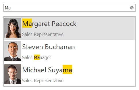
Search & Filtering
You can provide end-users with the ability to filter items in a CheckedListBoxControl. For this purpose, attach the CheckedListBoxControl to a SearchControl by using the SearchControl.Client property.
When an end-user types a search request into the SearchControl, the CheckedListBoxControl automatically filters its items, and highlights the requested string in the filtered items.
Note
If items are formatted using the HTML tags (see BaseListBoxControl.AllowHtmlDraw), the items are filtered, but not highlighted.
Example
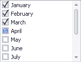
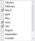
The following sample code demonstrates how to create and populate a CheckedListBoxControl at runtime. The image below illustrates the control’s look & feel after sample code execution.
using DevExpress.XtraEditors;
using DevExpress.XtraEditors.Controls;
// ...
CheckedListBoxItem[] items = {
                                 new CheckedListBoxItem("January", false),
                                 new CheckedListBoxItem("February", false),
                                 new CheckedListBoxItem("March", true),
                                 new CheckedListBoxItem("April", false),
                                 new CheckedListBoxItem("May", false),
                                 new CheckedListBoxItem("June", true),
                                 new CheckedListBoxItem("July", true),
                                 new CheckedListBoxItem("August", false),
                                 new CheckedListBoxItem("September", false),
                                 new CheckedListBoxItem("October", false),
                                 new CheckedListBoxItem("November", false),
                                 new CheckedListBoxItem("December", false)
                              };
private void CreateCheckedListBoxControl(CheckedListBoxItem[] items){
   CheckedListBoxControl checkedListBoxControl = new CheckedListBoxControl();
   Controls.Add(checkedListBoxControl);
   checkedListBoxControl.Left = 20;
   checkedListBoxControl.Top = 20;
   checkedListBoxControl.Width = 200;
   checkedListBoxControl.Height = 150;
   checkedListBoxControl.Items.AddRange(items);
}
// ...
CreateCheckedListBoxControl(items);