Kanban Board
- 5 minutes to read
This document shows how you can create a Kanban board with a Tile View. A set of properties and events provided by this View help you enable the Kanban layout mode and implement edit operations common to Kanban boards.
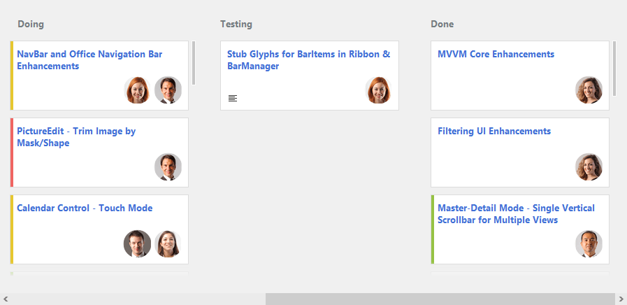
What is a Kanban Board
Kanban (‘signboard’ in Japanese) is a method of managing business processes, and the Kanban board is a tool for providing a visual flow of work.
A typical Kanban board consists of cards (tiles) combined into groups (columns or rows). Groups identify workflow stages (statuses), and cards represent workflow items. A user can move cards within and between groups using drag-and-drop, thus changing the status and order of cards. Additionally, the Kanban board may provide the card editing feature.
The following sections describe the basic steps needed to implement a Kanban board using the Data Grid’s Tile View. A complete example can be found in the Tile View Kanban Board demo module, which is included in the Data Grid and Editors demo.
Note
In this topic, the term “tile” will be used to refer to Kanban board items.
Prepare Data
First, create a data source that contains data for your Kanban board. Each record from this data source will be rendered as a tile in the Tile View. The data source must contain a dedicated field that specifies the status for each tile. According to these statuses, all tiles will be visually combined in groups.
Once you have prepared a data source, bind it to the Data Grid using the GridControl.DataSource and (optionally) GridControl.DataMember properties.
Create a Tile View and Enable Tile Grouping and Kanban Layout Mode
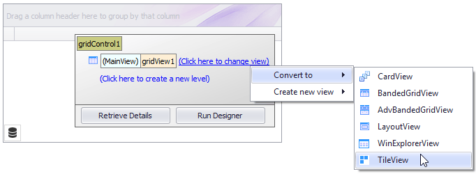
Create a Tile View. At design time, you can create a Tile View from the Level Designer.
Tip
To learn about basic design-time customization operations, refer to Getting Started With Data Grid and Views and Level Designer.
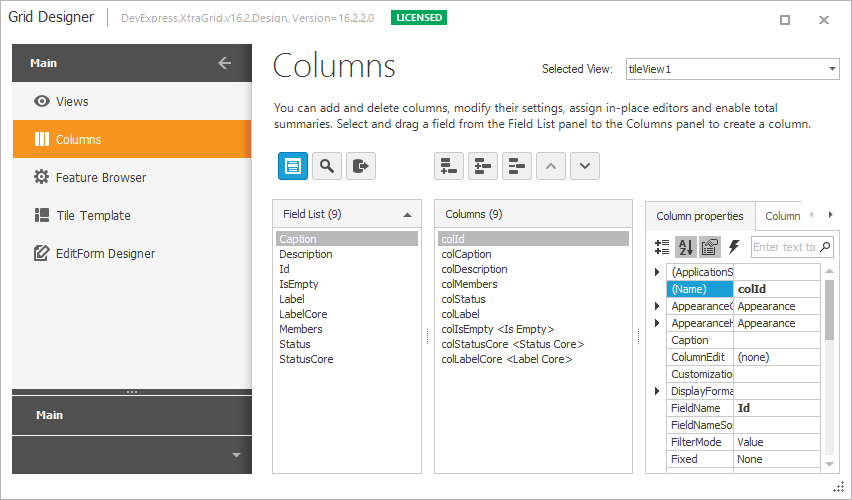
Ensure that the Tile View’s column collection (ColumnView.Columns) is populated with columns bound to fields in the underlying data source. If you assign a data source to the grid at design time, you can populate the column collection (or ensure that it is populated with columns) using the Columns page of the grid control’s main Designer. In code, you can call the Tile View’s BaseView.PopulateColumns method.
Note
Beside columns that provide data for tiles, the column collection must contain a column that identifies the tile status (this column must be bound to the data source status field).
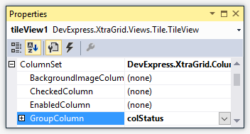
Enable the tile grouping feature by assigning the status column to the TileViewColumns.GroupColumn property (TileView.ColumnSet.GroupColumn). This organizes all tiles within groups (columns or rows depending on the TileViewItemOptions.Orientation setting) according to their statuses. The order of tiles within each group will match the order of underlying data records in the data source.
Set the TileView.OptionsTiles.LayoutMode (TileViewItemOptions.LayoutMode) property to Kanban. In this layout mode, each group displays tiles either vertically (when TileViewItemOptions.Orientation is Horizontal) or horizontally (when TileViewItemOptions.Orientation is Vertical). The contents of each group can be scrolled independently of other groups.
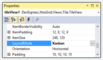
Set the TileView.OptionsTiles.VerticalContentAlignment (TileViewItemOptions.VerticalContentAlignment) property to Top. This aligns tiles to the top of the View.
If you enabled the vertical orientation for the TileView with the TileViewItemOptions.Orientation property, set the TileView.OptionsTiles.HorizontalContentAlignment (TileViewItemOptions.HorizontalContentAlignment) property to Near.
Specify the Tile Template
The layout of elements (fields) within all tiles is specified by a tile template. You can build this template using the Tile Template page in the grid control’s main Designer, and in code using the TileView.TileTemplate property.
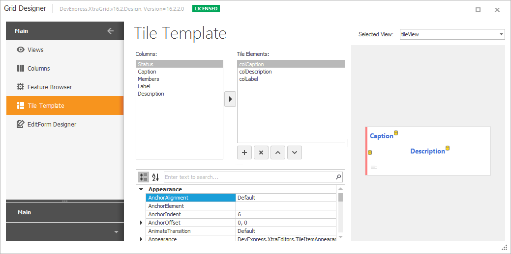
See the Tile View topic to learn more about creating tile templates.
Enable Tile Drag-and-drop
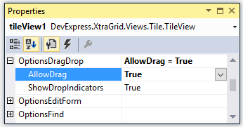
By default, the built-in tile drag-and-drop feature is disabled. You can allow users to drag tiles within and between columns with the TileViewOptionsDragDrop.AllowDrag (TileView.OptionsDragDrop.AllowDrag) property.
Drag-and-drop operations in data-aware controls, including the Data Grid’s Tile View, must be performed on the data source level. Whenever a tile is moved to a new position using drag-and-drop, the Tile View moves an underlying record to a corresponding position in the data source. In addition, if a tile is moved to a different group (column), the record’s group field value (TileView.ColumnSet.GroupColumn.FieldName) is changed accordingly.
When using the built-in drag-and-drop feature, you the capability to customize and cancel drag-and-drop operations, with the following events.
- TileView.BeforeItemDrag - Fires when a tile drag operation is about to be started. Allows you to provide a drag image, or to cancel the operation.
- TileView.BeforeItemDrop - Fires when a tile drop operation is initiated.
- TileView.ItemDrop - Fires after a tile drop operation has been completed.
In advanced cases, you may need to disable the built-in drag-and-drop feature and implement this functionality yourself.
Enable Tile Editing Feature
See Tile Editing to learn how to enable the data editing feature.
Additional Customizations
This section covers additional tile customization tasks you may need to perform.
Dynamic Tile Customization
Use the TileView.ItemCustomize event to dynamically modify tile elements according to your logic. This event fires for each tile when it is about to be displayed.
Context Buttons
You can add additional actions (e.g., buttons) to tiles by adding context buttons to the TileView.ContextButtons collection.