Column Header
- 2 minutes to read
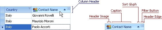
Column headers identify columns in Grid Views, Banded Grid Views, and Advanced Banded Grid Views. A column header contains the following UI elements:
The column header panel contains headers of all visible columns. Headers of grouped columns are displayed in the group panel. The Customization Form displays headers of hidden columns. A right click on a column header in the header panel or the group panel activates the column header context menu.
The following table lists the main properties that allow you to customize column headers:
Appearance | The GridViewAppearances.HeaderPanel property specifies appearance settings for all column headers. Individual columns may override these settings using the GridColumn.AppearanceHeader property. |
Custom Draw Event | |
Visibility | GridOptionsView.ShowColumnHeaders and GridOptionsView.ShowGroupPanel options specify whether to display the column header panel and group panel respectively. A column’s OptionsColumn.ShowInCustomizationForm option specifies whether the column header can appear in the Customization Form when the column is hidden. |
Contents | GridColumn.Caption, GridColumn.ImageOptions You can use HTML tags to format a column’s caption if the GridOptionsView.AllowHtmlDrawHeaders option is enabled. |
Tooltips |
If the view’s OptionsNavigation.AllowHeaderNavigation is active, a user can can navigate to column headers using the keyboard. You can also focus a column header in code:
using DevExpress.XtraEditors;
using DevExpress.XtraGrid.Views.BandedGrid;
using DevExpress.Utils;

public partial class Form1 : XtraForm {

    public Form1() {
        InitializeComponent();
        gridView1.OptionsNavigation.AllowHeaderNavigation = DefaultBoolean.True;
        focusBtn.Click += focusBtn_Click;
    }
    void focusBtn_Click(object sender, EventArgs e) {
            gridView1.FocusedRowHandle = GridControl.ColumnsRowHandle;
            gridView1.FocusedColumn = gridView1.Columns[0];
        }
}