Ribbon Control
- 4 minutes to read
This topic describes the features available in our Ribbon control implementation. Click the links below to jump to the corresponding section.
Tabbed Layout;
Ribbon Styles;
Paint Styles;
Contextual Tabs;
Keyboard Access;
ScreenTips;
Galleries;
Fading Animation;
Help Button.
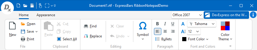
Tabbed Layout
The Ribbon control arranges commands into tabs and tab groups for easy access:

The Ribbon always automatically docks to the top form border.
Ribbon Styles
The following Ribbon styles are available:
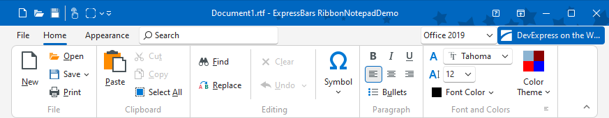
Office 2019 Ribbon. To apply this style, set the Ribbon control’s Style property to rs2019, and link a TdxRibbonBackstageView component to the control’s ApplicationButton.Menu property. You can animate tab activation and customize backstage tab appearance settings.
Office 2016 Ribbon. To apply this style, set the Ribbon control’s Style property to rs2016, and link a TdxRibbonBackstageView component to the control’s ApplicationButton.Menu property.

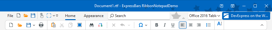
Office 2016 Tablet Ribbon. To apply this style, set the Ribbon control’s Style property to rs2016Tablet, and link a TdxRibbonBackstageView component to the control’s ApplicationButton.Menu property. We recommend that you enable Touch mode for this Ribbon style to more closely emulate the Microsoft Office Tablet Ribbon UI and improve user experience on touch-enabled devices.
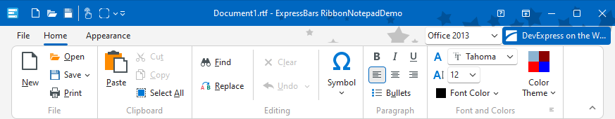
Office 2013 Ribbon. To apply this style, set the Ribbon control’s Style property to rs2013, and link a TdxRibbonBackstageView component to the control’s ApplicationButton.Menu property.
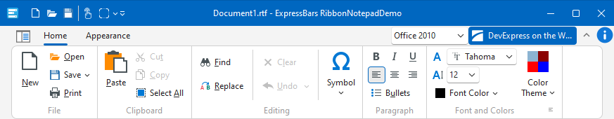
Office 2010 Ribbon. To apply this style, set the Ribbon control’s Style property to rs2010, and link a TdxRibbonBackstageView component to the control’s ApplicationButton.Menu property.
Office 2007 Ribbon. To apply this style, set the Ribbon control’s Style property to rs2007 and link a TdxBarApplicationMenu component to the control’s ApplicationButton.Menu property.
Paint Styles
Office 2019 Ribbon. For this style, our Ribbon implementation provides four built-in paint styles available in Microsoft Office – Colorful, White, DarkGray, and Black.

Office 2016 Ribbon. For this style, our Ribbon implementation provides five built-in paint styles available in Microsoft Office – Colorful, White, LightGray, MediumGray, and DarkGray.

Office 2016 Tablet Ribbon. For this style, our Ribbon implementation provides one built-in paint style available in Microsoft Office – Colorful.

Office 2013 Ribbon. For this style, we provide the White, LightGray, and DarkGray built-in paint styles.

Office 2010 Ribbon, Office 2007 Ribbon, and Windows Scenic. For these styles, we provide the Blue, Black, and Silver built-in paint styles.

ExpressSkins. If skins from the ExpressSkins Library are used in an application, these skins can also be applied to the Ribbon.
Use the Ribbon’s ColorSchemeName property to specify either built-in or external styles.
Traditional painting schemes (Standard, Flat, UltraFlat, Office 2003 and Windows XP theme) are not supported in the Ribbon.
Contextual Tabs
The Ribbon allows you to display contextual tabs, based on the current application context. You can explicitly set the current context in response to end-user actions, for example, when they select an object.

Keyboard Access
The Ribbon provides quick keyboard access to its elements by means of KeyTips.

ScreenTips
The Ribbon allows you to display explanatory information on its elements via ScreenTips.

Galleries
Galleries allow you to display commands with a result-oriented interface.

Fading Animation
Our Ribbon implementation supports built-in fading animation effects for the following Ribbon elements:
To enable fading animation effects within your application, add the dxFading unit to the ‘uses’ clause and use the dxFader.State property. You can customize fading animation options of Ribbon elements via the Ribbon control’s OptionsFading property sets.
Help Button
You may opt to display a Help button which end-users can click to access your application’s help system.
